
The Rule of Thirds.
That’s the topic for today’s page and something that probably should be a part of most any we create. The Rule of Thirds is a composition principle that is actually quite simple:
– imagine the thing; journal page, photograph, painting, etc, with a 3 by 3 grid overlaid on it. For the most pleasing aesthetic, align the focal image/s within the composition along one of the vertical or horizontal 1/3 dividing lines, or on one of the points where the lines intersect.
If you Google rule of thirds you’ll find a wealth of information that is far more detailed than my explanation. You’ll also find some folks who think the principle is rubbish and not anything that should be used. I disagree. It may not be the end all as far as composition is concerned, but it’s a great place to begin and is especially good or those just starting out. Randomly plunking elements on a page often results in a disjointed, not-cohesive piece that never quite works.
Do I think about the Rule of Thirds each time I create a page? No, but when I’m stuck and unable to figure out why one isn’t working, going back to basics and rethinking the layout of elements can be a helpful exercise.
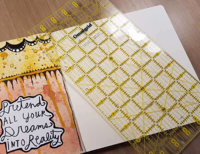
I’m working with a Dylusions Square Journal with pages that measure 8.25″. Dividing that by three results in 2.75, so that’s where my lines will be placed.
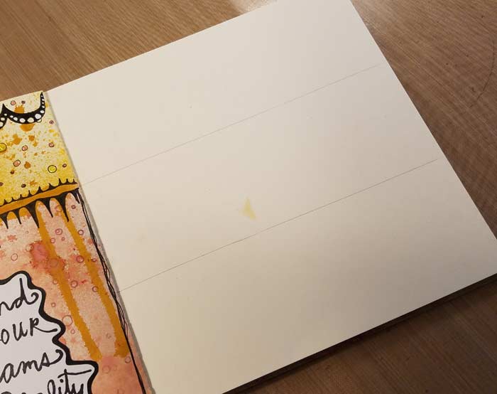
Measure 2.75″ (or whatever your 1/3 value is) from one edge and pencil in a line.
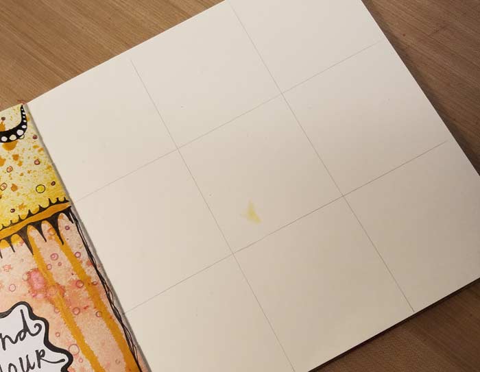
Then repeat the process in the other direction. Ideally, the 2 vertical axes (yes, axes is the correct plural of axis. I double-checked) are your reference points for placing your image/s. Often the horizontal ones are useful for placing the horizon line.
Will you actually draw the grid on your page? No, of course not. I’m doing it here just for reference purposes. :+)
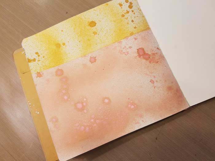
This is one of the photos from last week’s page. If you read the post (click here) you’ll see that I was going to divide the page in half, but came to my senses when my brain actually kicked into gear. While not a horizon line, visually delineating that top third of the page in another color works.
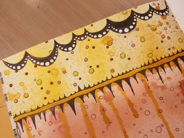
Adding the doodles doesn’t change the composition of the page when you consider where the grid would be. I’m maintaining that one third visually with the color, with the darker gold line, and with the doodles that further separate the two areas.
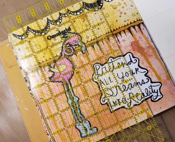
Remembering that my one third line would fall 2.75″ from the left side of the page, you can see that Rhonda (Virginia England’s wonderfully quirky stamp – click here to see her) was placed (give or take a fraction) along that vertical line. I centered the sentiment within the remaining 2/3 of the page. I suppose, technically, the placement might break the rule, but my eye tells me that it works so it’s fine for my purposes. Rules are made to be broken, though you have to understand how to use the rule before you can break it successfully. I think, anyway.
When you’re deciding how to compose a journal page, give the Rule of Thirds some consideration and I bet you’ll be happier with the result!








2 Comments
I am tickled and delighted to happen upon your site again. I watched some of your you tube videos today ( 2/2/17), mostly short ones. I am intrigued by your incredible backgrounds. The stencil introduction video. You have some marvelous stencils, but the journals that you were using with those backgrounds. Wow! I am working y way through your blog to try and learn how you make so many layers come together in such harmony. Thanks
Thank you. I need to know this!!