For today’s page I decided to try something different, right from the get-go. Typically I treat the background of a page or spread as one entity and what I do in one area I generally continue over the rest. Not today, I’m going to go for something else, where the background is not the same all over.
My first thought was to divide the page in half, but as I played around that seemed less like a good idea and so I went with thirds.
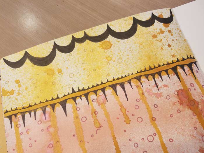
For this page I divided the area into two sections before I so much as added color. I started with a pencil line, then realized it was unnecessary since I needed to control where the color was going. My background was sprayed with two colors of Lindy’s Starburst Spray: Grab A Guy Gold and Wild Honeysuckle Coral.
I’m getting ahead of myself…
I used scrap paper to mask off the areas I didn’t want to spray with Grab A Guy Gold, shook the bottle to make sure all of the mica was distributed in the liquid, then sprayed the exposed space.
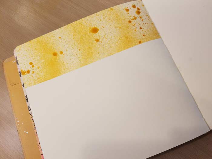
Using scrap paper is simple and effective. When the gold section was dry I reversed the placement of the paper to leave the bottom to third exposed…
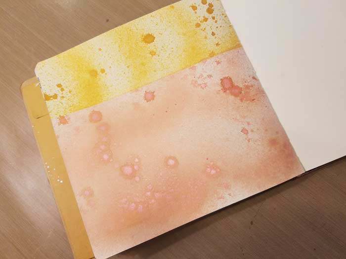
And sprayed Wild Honeysuckle Coral. Let it dry, then moved on to adding a divider between the two sections.
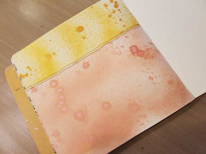
Just two lines made with a Black PITT Pen, but it ended up not the look I was aiming for. I like it, but am gonna change it.

This is better. I prefer the darker color where the two meet and especially like the drips. Making it was easy: spray some of the color on a palette or NonStick Craft Sheet, pick up color on a brush and keep adding it to the area till it drips. Let it dry. It’s pretty well soaked so either give it ample time or help it along with some heat.
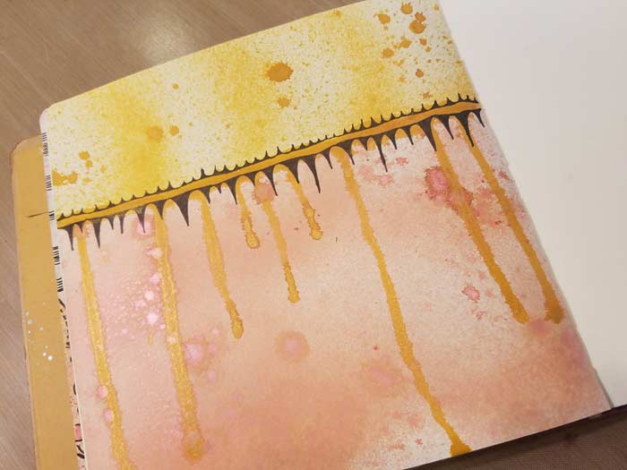
Once the area is good and dry grab your Black PITT Pen (Superfine or Fine tip will do) and add a doodled border to the area where the colors meet. This further emphasizes the separation between the two areas.
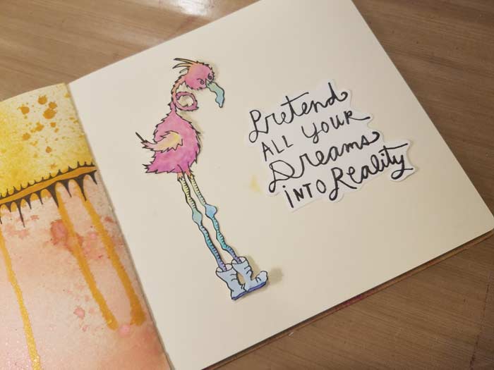
I’m very fond of Virginia England’s Rhonda stamp, so out she came and I stamped her on 90# watercolor paper. Same thing with the sentiment which is one of the Everyday Valentine stamps we introduced not that long ago. This one is named Pretend Your Dreams. The sayings are pithy and funny, and are suitable for lots of different projects. Both pieces are ready to go, but I’ve realized that they don’t really stand out from the background all that well. I know how to fix it, but before I do I need to add a bit more to the background.
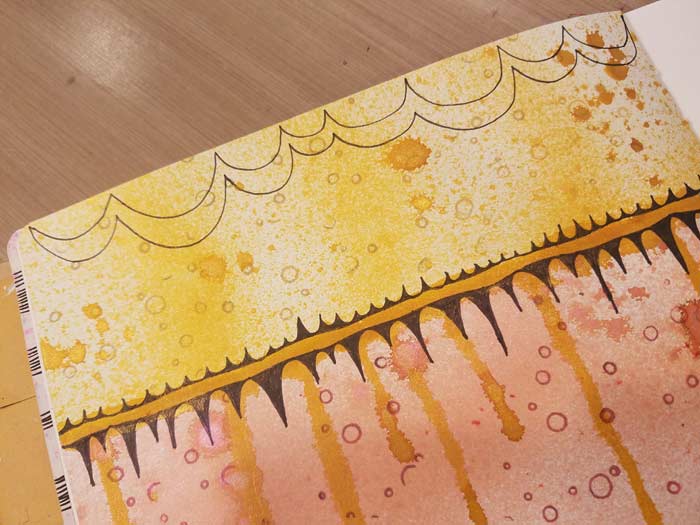
If you look closely at the gold section you can see the subtle circles made using a yellow ink and my Background Noise – Circles stamp.

See what I mean about the Rhonda and the sentiment not contrasting enough with the background?
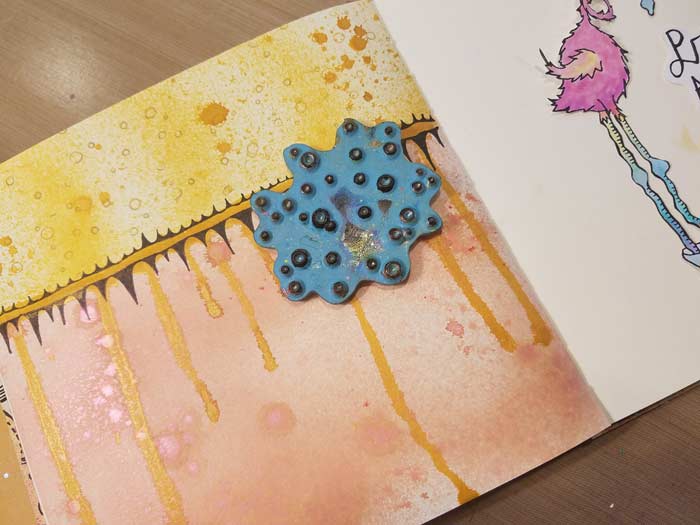
I decided to add a bit to the top section, thinking it looked a little bare.
Filled it in using a Black PITT Brush Pen, then decided it still needed something.
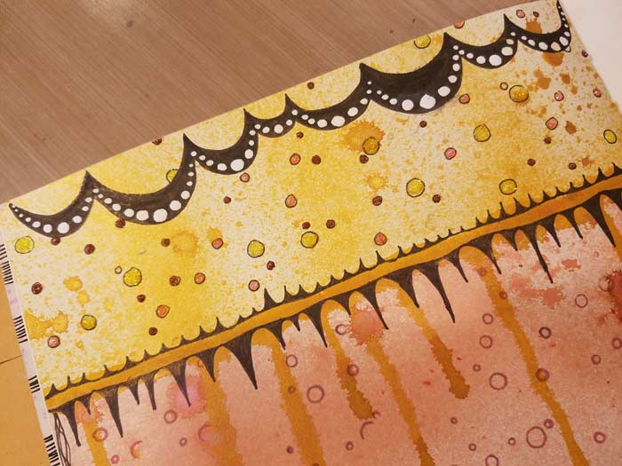
So I added some white dots. I also decided that the circles from the Background Noise – Circles stamp were boring, so I outlined them with a PITT pen and filled the three sizes with three colors of Stickles. Better. Much better. Now to fix the lack of contrast and call it done…
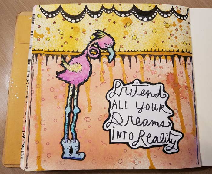
So I used Bonnie’s layering with black cardstock technique and liked the look much better. I like the idea of creating areas within the background and suspect I’ll try this again in the not-too-distant future.
10 Comments
Barb…I love love love this background…have to steal this idea for sure!!!!
Thanks so much. I can’t wait to see your version!
Absolutely love the page. Your doodles bring it to life! Time to get the Lindy’s Sprays out.
Thanks Gracie. Lindy’s really do make the page! Love them all, but especially Grab A Guy Gold. And me a silver person!
Wow! I really love this page. Amazing how the black makes everything just POP!
Thanks Kathy. As Bonnie likes to say, a little black is a good thing!
Hi Barb,
Can you send a link to the black cardstock layering technique? I’ve not seen it before. And did you fussy cut Rhonda? If you did, that’s amazing! How did you ever do that?
Hi Connie – my reply is in the AJA Facebook group, with links to a couple of techniques.
Fabulous! Love this page and the ideas you shared. This will be so much fun!
Thanks Faye. I will be looking forward to seeing your version!