Welcome to Week 8 of the Art Journal Adventure!
In today’s spread you’re going to see something completely different than the previous seven; I’m focused mostly on letters and writing. Most of the time my goal when creating a page or spread is to make something visually appealing. That’s how I “art journal”, but for a lot of artists an art journal is a place to experiment and try new things.
Why did I change course for this page spread?
In the last week, if you’ve visited the blog, you may have noticed a new entry in the sidebar: a section noted as “2016 AJA Facebook Group”, with a clickable link below the text. That link will take you directly to the Facebook group where you can request to join. The group is “closed”, meaning that you have to ask to join, but that’s just a formality. Everyone is welcome and I’m hoping you all will click that link.
Since the group opened a week ago a few people have joined us and the activity is just beginning to gain a head of steam. There’s chatter, photo sharing, and ideas being discussed. Bonnie Irvine has agreed to administer the day to day activities of the group, leaving me free to create and to deal with the day to day insanity at Joggles.
The group is meant to be a place for art journal enthusiasts to spend a little time each day sharing ideas, enjoying the company of like minded folks, and soaking up eye candy. And responding to the occasional question that Bonnie poses, which leads me back to today’s Week 8 spread.
On Wednesday last week Bonnie asked the question: “What kinds of products, techniques, or themes would you like to see make their appearance in up-coming Art Journal Adventure page spreads? Let’s give Barb some feedback…I know you have ideas.” Someone did make suggestions and my response is what you see in today’s spread.
I’m not going to say who, but the clue is right on the spread. Check it out, then head on over to the Facebook 2016 Art Journal Adventure group, request to join, and you’ll see the post that prompted the lettering!
There are not a ton of photos today since most of what I did was use a pencil to apply guidelines, then letter. I will talk a little about varying the size of letters and changing case mid-word. There are lots of ways to take your usual handwriting style and alter it. You don’t need to be a calligrapher or lettering expert to make the words on your pages a bit more lively. As you’ll see, the text can wander in a more or less straight line, curve and curl, and even intersect with a page border. All of these things lead to making interesting pages that a viewer can enjoy looking closely at.

I wanted a colorful background, but nothing that would compete with the lettering. I chose Liquitex Basics in Bright Aqua Green, Titanium White, and Light Blue Permanent and applied the colors with a baby wipe. I used only one wipe and let the colors mix on it and on the page, apply another before the first was completely dry. At the end of all that I added a bit more white to soften what was already there. One note of caution… if you scrub the pages hard enough, for long enough, the paper will pill!
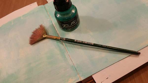
To add a little more interest to the background, I spattered Daler Rowney’s FW Pearlescent Ink (Waterfall Green) over the entire spread. To do this, put about half an eye dropper full on your work surface, grab a #4 Fan Brush, dip it in a little water, then mix into the Waterfall Green, and load the brush. Hold it in your dominant hand, stick out the forefinger of your other, and tap the brush on the extended finger. Splatters will happen. The more ink in the brush the larger the splatters. Less ink requires a brisker tap against your forefinger and should give you smaller spatters. Spatters have a tendency to travel what seems a disproportionate distance and you’re likely to find them in… unexpected places. Cover anything you don’t want spattered. You’ve been warned!

Since the background is reasonably plain, I did spatter freely, allowing the droplets to be reasonably dense on the pages.
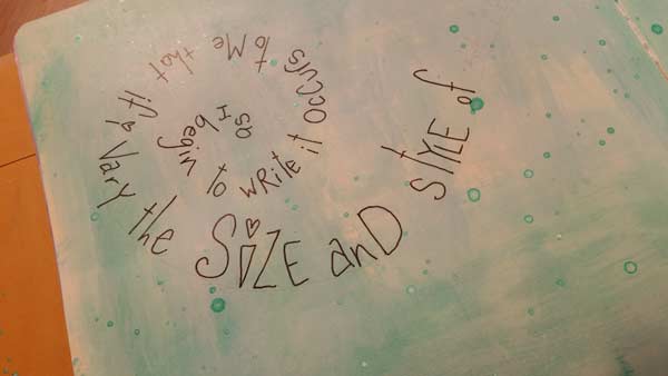
Then it was time to begin to letter, but before I picked up a PITT Pen to make a mark on the page, I penciled in a line so there was a baseline to work from. You can’t see it well here, but the words are written on the line that spirals from the inside out, getting more open as the spiral expands. As it travels across the spread it straightens to more of a curvy horizontal line.
Now, about those letters. I mixed cases, using UPPERcase letters and lowercase ones in the same word. I want this text to reflect my handwriting – you should expect yours to be different – that with some minor adjustments took on a funky, loose look. See the “I” in the word size? It looks more like a carrot than an I, but I like it and that’s what matters. Mix the letters: cross the letter t in different places, make the length of the long line of the t varied, so no two look the same. Alter the letter “Y”, making some curvy and others with all sharp angles. Alter the height of the letters in the same word. Funky is the goal, not perfection. Plus, funky is far easier to achieve.
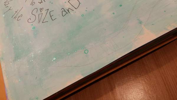
If you peer intently at your computer screen, you’ll just be able to see the parallel, curvy lines at the bottom of the page. Some text is there too, but it’s faint. Doing this page presented a challenge in as much as I wanted the lines really light so they would erase easily (use a pencil with a hard lead) but they needed to be visible in the photos. Everything I wrote on this page, with the exception of the text on the top of the spread was written following a guide line. It’s really the only way I could get the words to follow a curve correctly. Or follow a straight line for that matter.
My other hard and fast rule was to write the words twice. The first time with a pencil to test that everything would fit in the space, but also to get a look at how changing the characteristics of certain letters affected the overall look of the words.
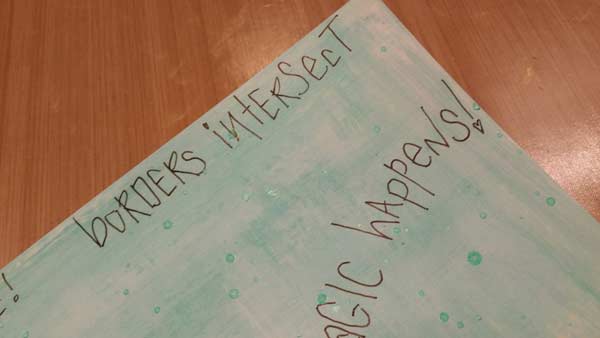
Look at the word “intersect” at the top of the page. There are two letter Es in it. I deliberately made them look very different. Same thing with the “ts”. Look a the exclamation mark after the word “happens”, just below. I used a heart at the bottom rather than a period. At various times I used a heart, an open circle, and a closed circle to dot the letter i. Variety is the spice of lettering!
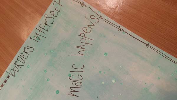
Borders can intersect words. Rules? There are no stinkin’ rules except what you decide to do on a given day. If you want words to intersect the borders, then do it. Not that you need it, but you have my permission to do anything you want. Really. Go for it.
I think the best advice I can offer is to vary your own handwriting rather than trying to invent a new style. Vary upper and lower case letters. Make some letters larger than the rest in word. Make an entire word noticeably larger than others.
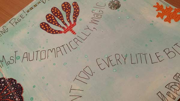
If you look at the sentence that includes the word “automatically”, you’ll see that it’s all uppercase letters that have squared off tops and bottoms, while the others are a merry mix. By making that one word so obviously different, it places emphasis on it and causes it to stand out. The other sentence where you see the fragments that reads “…TOO. EVERY LITTLE BI…” is comprised of words made of all uppercase letters. That causes the words to all have equal weight and emphasis. Color is another way to cause a word to have emphasis, but for today I stuck with black ink, which meant I had to find other ways to move the viewer’s eye to a place.

Once the lettering was finished, I took a step back and looked over the spread with a critical eye to see what might be missing. The whole thing seemed a little bare and forlorn, so I cut out some images from our Mod Elements collage sheet and glued them to the spread. I also punched some glitter circles. Because I like glitter. I’m just sayin’.
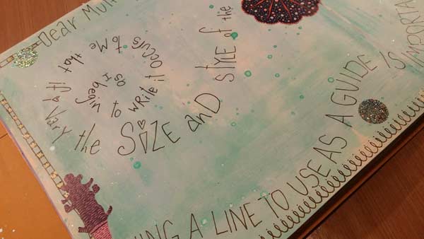
I let some of the collage elements overlap the borders, which you can see are not the same all the way around the page. Because this was an experiment more than a “pretty” page I’m quite content to leave it as is and call it done.
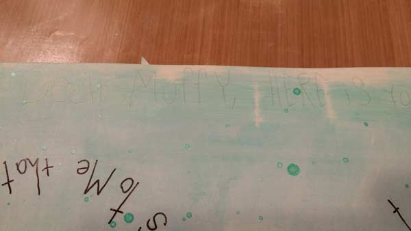
Dear Muffy… I hope this helps!
Barb
14 Comments
Yes, Barb, great help! Your spread is clever, and your suggestions for variations are good, easy-to-implement ideas. (There’s nothing like middle-of-the night creativity!) Thank you for making it happen for us “texters!” I’ll work on my own spread after my fiber deadline, and post a pic, maybe! The lettering ideas can be incpoporated over and over. 🙂 So I’m smiling!
Fabulous! I’m so pleased to be able to help. :+)
Barb
This week will be very hard for me. My handwriting and printing is at times unreadable. So what to do. I will think, try different techniques, look at my supplies and have at it.
I too have zero experience in art journaling. I have improved over the weeks and will get better overtime.
Thank you for this Facebook experience.
Hi Ginnie,
One of the keys to improving your letting is to slow down and be deliberate as you form each character. Most days my writing resembles the path of a bird walking on the beach, which is to say it’s a mess! If you’re patient and allow yourself the time to improve, with practice, I believe you will see positive changes.
Barb
haha! great way to answer the request! hopefully i will be able to work on this prompt today <3
Barb, I love the variations in your lettering. Most interesting!
Thanks Diana. The best part is how easy it is!
Barb
I love your new pages – colors and your text is very cool.
Hi Barb love the art journal adventure segment. I am a bit behind on mine so it will give me time to figure out what to write on mine when I get to this weeks. That always seems to be my problem is what to write and have it reflect in my artsy way. Any suggestions?
Hi Bobbie,
I’m not a diarist type journaler, so when it comes time to write on a journal spread I often feel as though I don’t know where to begin.
For the ones in this week’s AJA, I decided to write nonsense, kind of a stream of consciousness, as I went along.
I’ve been known to write nursery rhymes, poetry, and song lyrics in my journals. My days are not usually interesting enough to chronicle, so I go with the other things.
Barb
Thanks Barb, that gives me some place to start. My days are just full of waiting to hear from our contractor and hearing nothing so for me those are all upsetting thoughts lol. I think it will take my mind off of the bad and to the good and relaxing doing it your way for sure. Thanks again
OMG this was sooooo much fun! This quote is one I got from you Barb, several years back when you were doing a journal page with stampotique stamps. I can’t remember exactly when, but I did write it down and have used it several times since then. One of my favorites! The stamp is from Stampendous, also one of my faves. Thank you for all the great ideas on lettering. I did draw a line and then wrote out the quote before doing so with the Pitt pen. SMART IDEA as I have neglected to do so before with disastrous results!
i think all the journal pages are very easy to follow and it leads us to experiment with new techniques and style. i say it again, i am so happy i found you all.
see you on the fb group. i am missesk.
Week 8?