If you’ve joined the AJA Facebook group you may have seen a question Bonnie posted a few weeks ago, asking what techniques or ideas might be of interest, ones that I could feature as part of a page spread.
The one from Week 8 happened as a result of someone in the group mentioning that she was interested to know more about how spiff up her lettering. I played a bit and came up with what you saw two weeks ago.
Today’s page is covered with Ranger’s Texture Paste, but not straight from the jar. Another question posed in the group was about adding color to Texture Paste, so I brought out Distress Reinkers, some sprays, and a few other things that I was fairly certain would tint it. The methodology was different for most of them and I’ve included photos and a brief explanation about what I did with the options, right at the end of today’s post. Onward the page for week 10…
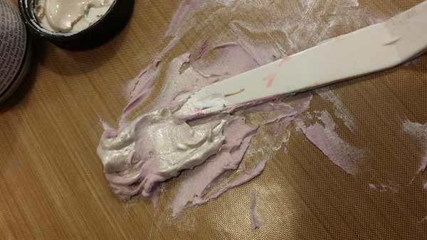
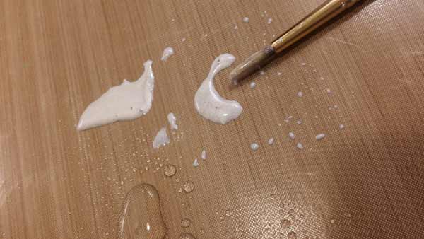
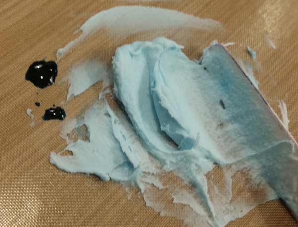
To tint the Texture Paste for my finished page, I used two colors of Lumiere Paint; Burgundy and Pearlescent White.
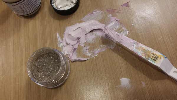
I decided that some glitter would be a nice addition (when isn’t it?) and pulled out Antique Silver from the Elizabeth’s Crafts Silk Microfine line.
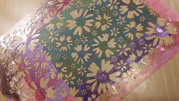
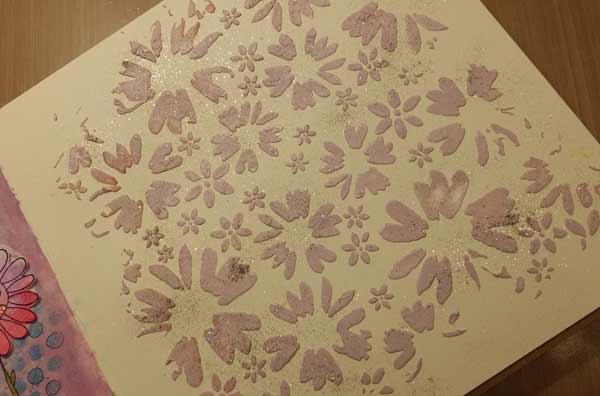
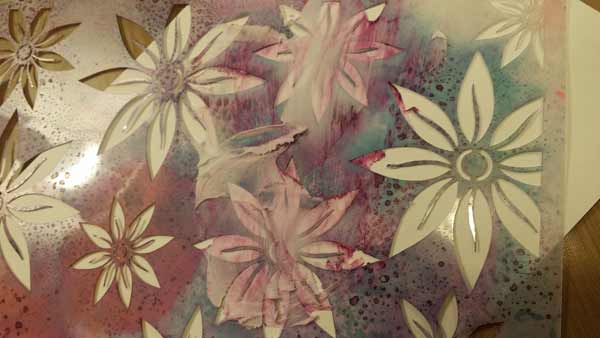
This is our Flower Patch Stencil (designed by Margaret Applin) and though it looks a mess, it’s ready to use. As you’ll see in the test photos at the end of the post, one way to add color to Texture Paste is to use a stencil that has sprays accumulated on it. If they’ll rewet, they’ll tint the Paste. Since I knew I wanted to color the Paste separately, I didn’t want to use a stencil that had dried spray and I believed this one did not; that everything you see here was permanent. Note the use of the word believed.
With the stencil laid over the page, I applied the tinted Texture Paste through the openings, deliberately not covering the page from edge to edge.

If you look closely at the group of petals in the upper left corner you’ll see evidence that my belief that this stencil was only messy with stuff that was permanent was… incorrect. The discoloration isn’t significant and not enough for me to stress about. Though I will admit to being a tiny bit miffed.
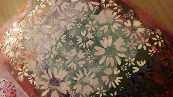
I added a tiny bit of glitter, just a pinch sprinkled here and there, while the Texture Paste was still wet. Glitter has a way of healing wounds and being miffed…
The background of the page looked a little boring, so I mixed Pearlescent White Lumiere with some water and applied it over the entire background, avoiding the flowers as much as possible. It was a little painstaking done with a small round brush, but worth it.
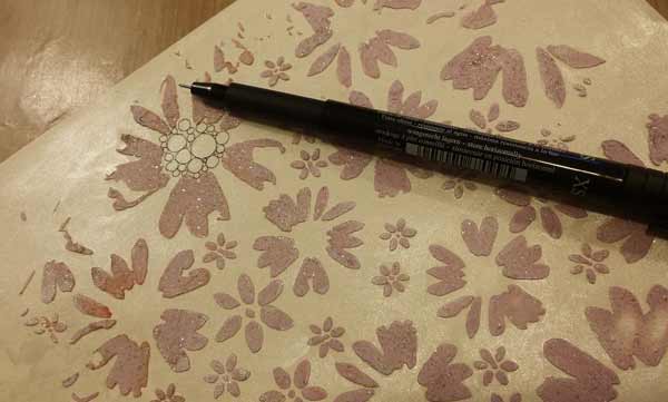
I was a little stumped about what else to do with the page. I didn’t want anything I added to compete with the flowers (and glitter) so decided some Zentangle inspired circles in the centers would be good. Because I wanted them to be very fine, I used a black PITT Pen with the XS (Extra Super Fine) tip.

That’s better! I like the centers, like the pearly white color on the background, and in general was happy with the page. Though I had no idea what to do next.
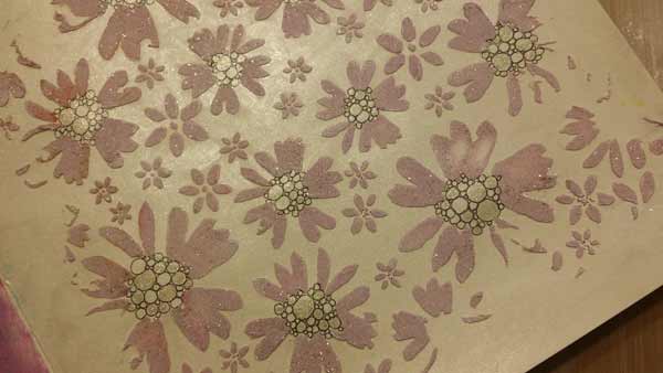
When all else fails, go for more glitter. I used a Gelly Roll Stardust Pen – the one named “Clear” that’s sold as a 2-pack – and use it to color in some of the circles.

Then the question became if I was done. Or not. I added some curlicues made from Pitt Pen dots around the perimeter of the page…

And some dots around the circles in the center of the flowers and called it done.
If you’re interested in some additional techniques to tint Texture Paste, read on!
Distress Ink Reinkers work perfectly. The color is so concentrated that it only takes a little to tint the Texture Paste, causing no change in the viscosity. Add a tiny bit at a time till you get the color you’re looking for, otherwise the color gets really deep, really quickly.
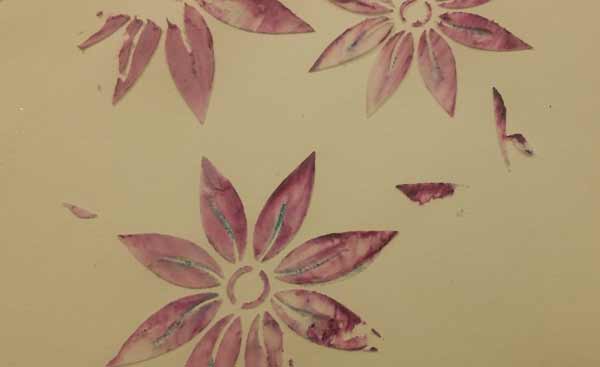
You can also color the Paste once it’s dry on your surface. The pink was done with Distress Ink, Picked Raspberry, applied with an Mini Ink Bending Tool. The turquoise was some Liquitex Basics Paint (Bright Aqua Green) added with a Mini Ink Blending Tool, too.
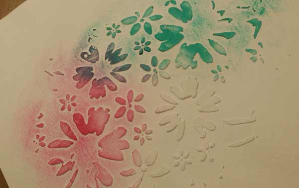
Texture Paste applied through a stencil that has a lot of inks dried on the surface yields this…
Tinted Texture Paste in a completely unpredictable pattern! That’s our Bloom Stencil
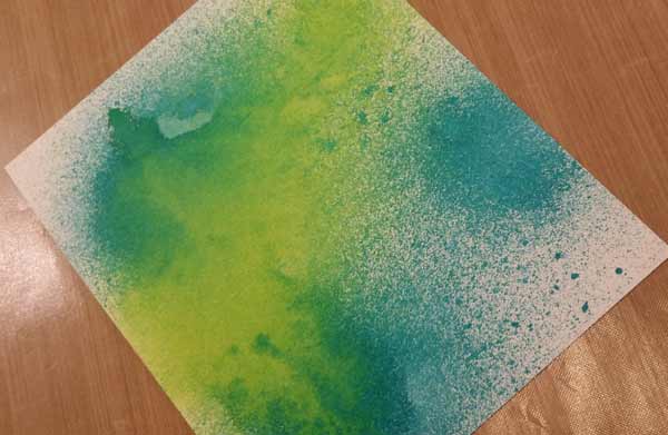
If you spray non-permanent ink (like Dylusions or Distress Spray Stains, or Color Wash Sprays) on paper and let it dry, then apply Texture Paste…
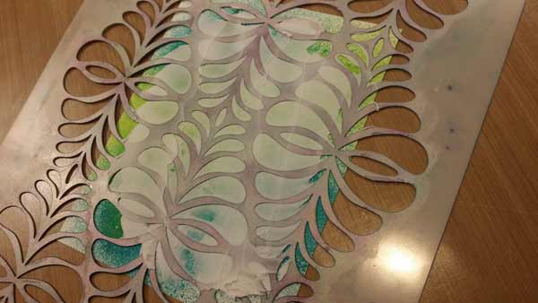
Through the openings of a stencil (Joggles Secret Garden), remove the stencil and let the Paste dry, you’ll see the color on the surface will tint the Paste
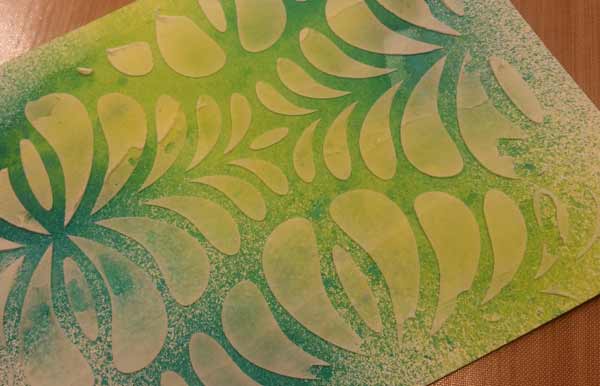
In the pattern of how the color was applied to the surface. The colors are both Distress Spray Stains. Twisted Citron and Peacock Feathers.
Dear Faye, I hope this page provides some interesting options for coloring Texture Paste!
16 Comments
I like how dimensional the first flowers look by simply adding the circles to the centers. 🙂
Thanks Barb, I can hardly wait to get started on this page. Will post when done. I have tried different methods of painting after it is dry. Depending on which paste you use, you get different results. If I think I can color it afterwards it doesn’t work, if I don’t, it does! Kind of like cotton and shrinking! Guess that’s called Murphy’s Law!
Hi…your circles in the flowers looked like bubbles and I do love bubbles. Made the flowers really pop, as the expression goes.
Thanks for the work up…really nice.
Love, love this! I’m a big fan of texture so I appreciate you sharing all the trial and error. Knowing after the fact that a shimmery background is desirable, could the page be painted with the Luminere wash before the texture paste application, or will it affect the application of the texture paste?
Hi Ann,
Thanks very much!
Yes, the page could have been painted with Lumiere first, I just didn’t think of it. Or decide that’s how I wanted the background before I went ahead and applied the Texture Paste.
Barb
Beautiful page – love the shine and sparkle.
This is a great way to perk up your page. I especially love the last one with the sprays. All those pages to try in the future!
Thank you Barb for all the suggestions. Here is my page. I used gesso first, then painted the page with acrylic paints. I mixed the texture paste with FW pearlescent inks (hot cool yellow, sun orange, hot mama red and sundown magenta) and used the flower patch stencil, blending the colors as I went. While still wet I dusted the paste with glamour dust. I drew circles with like colored stardust gel pens. Fun to experiment with the various products. I just wish that the texture paste didn’t mute out the pearlescence of the inks.
You’re welcome!
The only way to have the pearlescent effect from the Lumiere not be dulled out by the Texture Paste was to use quite a lot of the paint. Of course then you run the risk of thinning the Paste too much. It’s a balancing act!
The glitter helps too. :+)
My experimenting was only successful in that I learned what not to do next time. All I made is a mess. I am trying to decide if I should just gesso over everything and try painting it that way or leave it as a testimony that sometimes adding to something you don’t really like only makes it worse. I will see how I feel tomorrow.
To Lisa, I love your pages. They have beautiful colors and design. Please don’t gesso over it, that would be a shame. Looking forward to seeing more of your work.
Ginnie,
My daughter loved them too, and she is pretty quick to tell me if she doesn’t like something, so I won’t be gessoing over it. Thanks.
Love the unpredictablabity of the gel press. Basic Gray paper company has some old paper packs that look like someone used some sort of press to make their images ; they are fabulous. Who’s to say that our homemade ones aren’t just as gorgeous? It’s there we have to build confidence in our (my) artwork being “just fine!” Thanks barb for the experimentation right before our very eyes!
I would like to begin the art journal adventure, but I need access to the very first one. I have been able to find week 4, but that’s the earliest. Can you advise me, or am I too late?
Hi Ginger,
It’s not too late at all and I’m thrilled that you want to join in the fun!
There is a separate AJA category here on the blog that you can use to filter the posts you see. If you look up at the top of the page, where the menu is that reads “Blog Home Joggles Store Blog Categories”, you’re on the way to finding them. Hover your cursor over the word “Categories” and a list will drop down. Click on 2016 Art Journal Adventure and the blog will show you all of the posts to date. They’re in reverse chronological order, so you’ll have to look at page 2 to see the earlier posts.
There’s a Facebook group, too. If you look at the sidebar on the right side of any page, the third block contains the link that will bring you to the group. Just click to ask to join and Bonnie will approve your membership.
I’m looking forward to seeing you on the blog and in the Facebook group!
Barb
My week 10…