Hi everyone. It’s Bonnie here today subbing for Barb who was away this weekend giving workshops in Montreal…lucky her… Montreal is a gorgeous old city with lovely people. Anyway, I always jump at the chance to host AJA whenever she asks.This week, as usual, I had a kernel of an idea with no clue where it would take me. All I knew was that I wanted the background to include Drippage, as Donna Downey so descriptively calls it. Drippage is when you apply ink or paint to the page and tilt the page to allow drips to run in different directions. Spritzing with water helps this process and is quite necessary if the media you are using is thicker like acrylic paints.
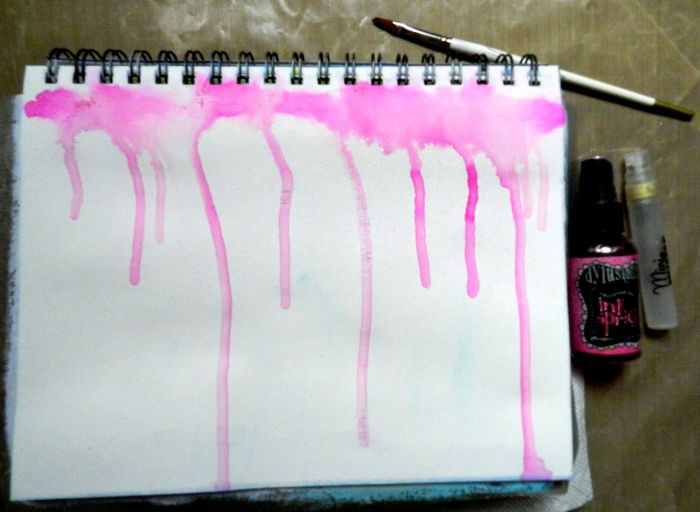
I decided to apply Dylusions Ink Sprays to my page, and although I know it reacts differently on a page coated with gesso, I chose to go that route, too. I wanted the colours to be somewhat muted and more watercolour-like. Gesso doesn’t allow the ink to sink into the page so the colours become less intense. I began by using a small paint brush to lay Bubblegum Pink Dylusions Ink Spray across the top of my page and then spritzed over that using a Mini Mister filled with water. The journal was then tilted upright to allow the drips to slide down the page.
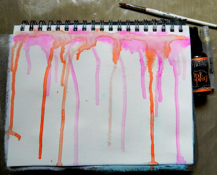
I repeated the process with Squeezed Orange Dylusions. Yummy drips!
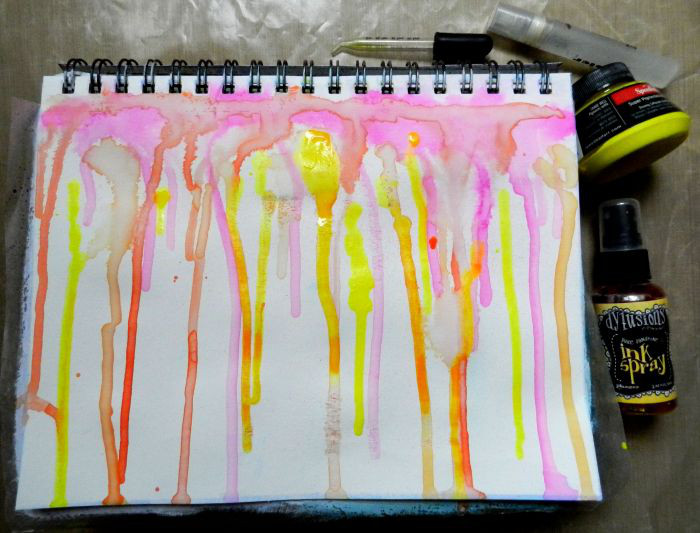
Then I added Pure Sunshine Dylusions Spray Ink across the top and spritzed with water. That colour was not yellow enough for me so I grabbed some Speedball Primrose Yellow ink (substitute any bright yellow ink like Daler Rowney Brilliant Yellow FW Acrylic Ink) and added it in a few places using a pipette. I wanted the intensity of colour and control of placement that a pipette gave me.
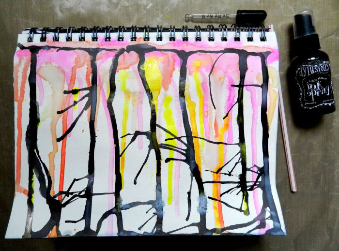
And then I went for the drama…LOL. I added Black Marble Dylusions Ink Spray with a pipette so that I could place the extra ink where I wanted the drips to occur. I did not add water to this layer because I wanted the black to be fairly opaque rather than graying out when it was diluted. I blew through a straw to move some of the puddles into the spaces between the drips and create some horizontal action. I was tempted at this point to turn the page upside down and finish it that way. It looked like a wintry forest with trees and bare branches.
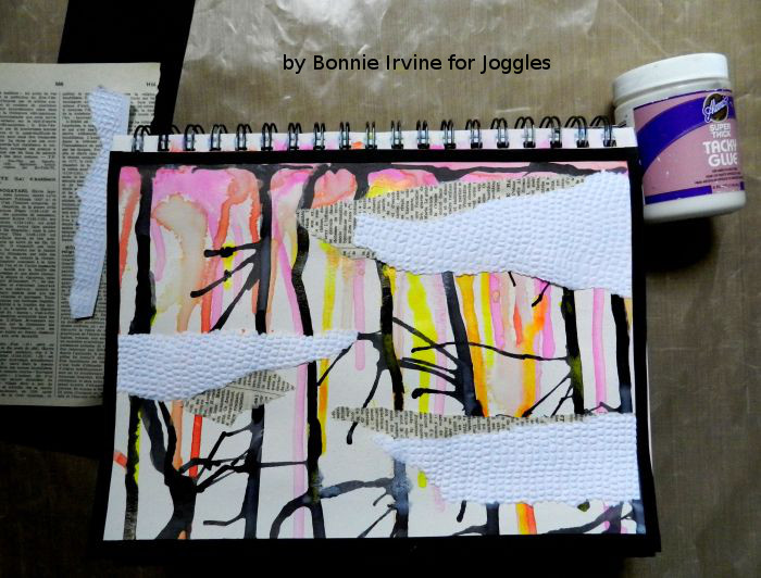
When I have a background this busy, I usually add layers intended to break it up so that it becomes less overwhelming. I had a piece of white card stock which I had previously embossed as well as some French book paper so I tore three strips of each to create more horizontal interest. These were adhered with Aleene’s Super Thick Tacky glue with the white strips overlapping the text. The embossing adds texture and takes away the plainness of the white which still gives the eye a place to rest among the riot of colour. I cut and adhered .25 inch strips of black card stock to frame the edges of the page and help the eye stay on the page rather than following those drips right off it.
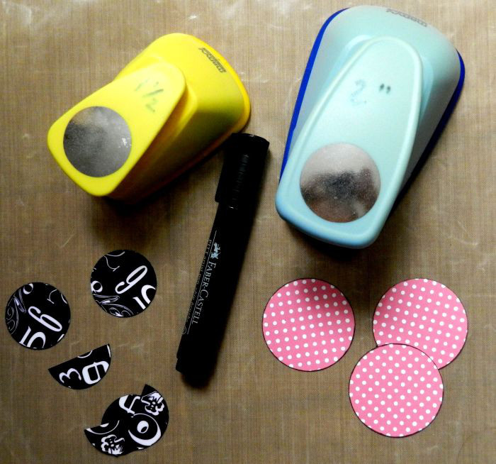
Since the page was still very linear with the drips and horizontal scraps, I decided to add some more solid pops of colour and pattern in the form of punched circles. The pink is patterned paper and the numbered ones are printed Duck Tape applied to white card stock. The edges of all the circles were inked with Faber Castell Black Big Brush Pitt Pen.
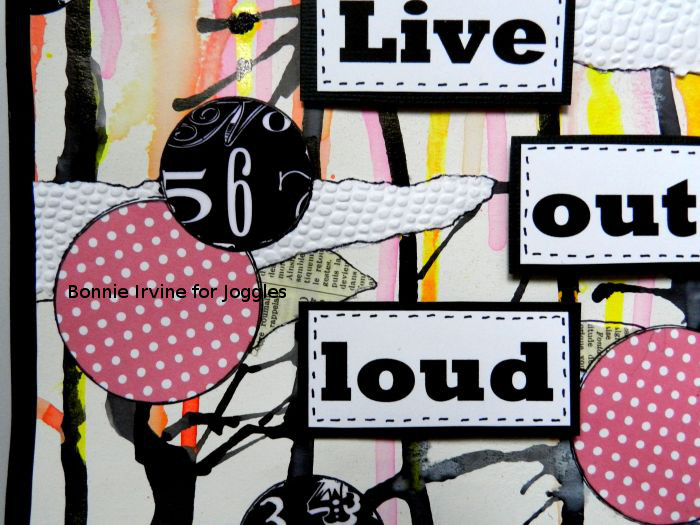
Once adhered, the circles and the horizontal scraps were both outlined with a Super Fine Black Faber Castell Pitt Artist pen to give them more visual weight. A couple of the black circles were cut in half and placed along the black border. The sentiment was printed on white card stock, cut apart, and each word was matted with black. The edges were faux stitched with the same black pen used to outline. Self adhesive 3D foam squares were used to pop up the sentiment and create natural shadows.
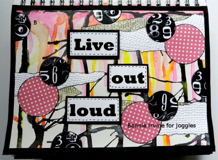
And I called it done like dinner! If I had used tamer, less vibrant colours for the Drippage, the results would have looked entirely different. I am hoping that some of you might do just that so we can all see when you post in the Joggles Art Journal Adventure Facebook group! Thanks for visiting today 🙂
3 Comments
Fantastic! Love the drips. Such a fun and vibrant page.
Nice journal page. And yes, the black drippage does look like bare winter trees and branches. That would be a good idea for a journal page.
The printed duct tape is a great addition to this page. Nicely done!