Today’s prompt: Less is more.
My journal pages tend to have completely covered backgrounds, or at most, a bit of it peeping through. It has not been lost on me that there are a multitude of beautiful pages where this is not the case and with that in mind I decided it was time for a change. Thus, less is more.
I decided if I was gonna go for it, I really needed to go for it, which meant I needed mostly uncovered background.
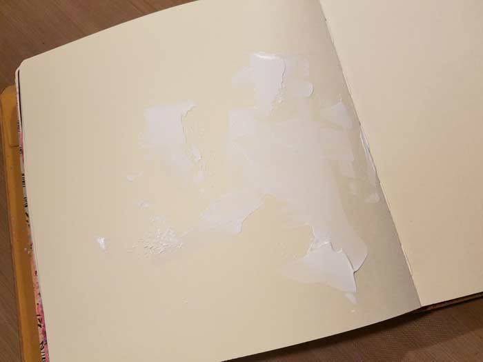
The pages in the Dylusions Square Kraft Journal are manila colored, so I knew I could scrape on gesso and it would be visible. I grabbed a jar of Dina Wakley’s White Gesso and her Palette Knife and did just that, applying it quickly and randomly.
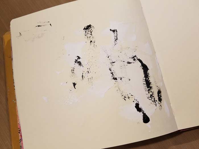
I like what I had but decided I needed something for contrast and since I was also of the mindset to limit the colors I used, I went for Dina’s Black Gesso, though I added quite a bit less.
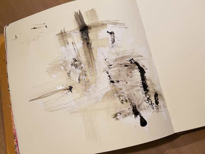
Before the Black Gesso dried I grabbed a brush, dipped it into some water, and used it to dilute some of the gesso and move it around. Mostly I was trying to provide some movement so the viewer’s eye wasn’t drawn to the middle where the white gesso was concentrated. Once I did this I realized that the little section in the top left looked odd without any of the diluted gesso.
So I smooshed a little there too.
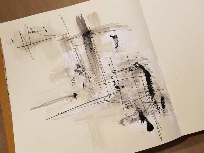
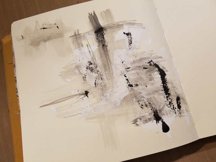
I liked what I had, but felt as though the page needed something graphic that would also pull the sections together. Enter a Fude Ball Black Pen and I scribbled enough so that there was a connection between all of the sections. The cool part about this pen is that it writes over just about anything. I had no difficulty writing over the gesso, none at all.
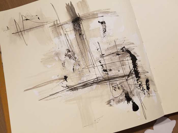
By this point I’d chosen the character from the Anthropomorphic 2 Collage Sheet, the sitting one. Since he’s sitting he needed somewhere to perch, otherwise he’d look like he was just floating. With that in mind I scribbled an area to suggest a horizontal place to park him.
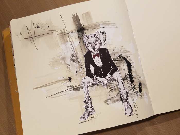
Once I glued the image to the page I used the Fude Ball pen and added the suggestion of ground under his feet and the page was done. Though this is not my usual style, I really like how this turned out and suspect I’ll try this again. Another bonus? This type of page takes far less time to complete. I love detailed pages with lots of layers, but there’s definitely merit to this style.
2 Comments
Great page, Barb! I love your bright-n-colorful pages with sparkle, doodling, borders, etc, but this page stands out! Awesome!
This was a surprise and the muted colors just added the right amount of drama. I loved it.