
Hi everyone. It’s Bonnie here today with the Art Journal Adventure prompt for Week 34. The prompt for this week is to create or reference a mosaic or a patchwork design. I always have loads and loads of scraps, off-cuts, and mop-up pieces in my stash from previous projects. These can be covered in spray inks, paint, or regular ink and sometimes have bits of stamping, stencilling, or Texture Paste already on them. They come in handy for punching or die-cutting shapes, tearing to add another layer, or just an accent/embellie in a particular colour… plus I really dislike wasting yummy colour.
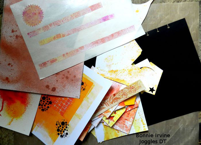
I began my spread by sorting through these bits and pieces to find a colour palette which spoke to me. I pulled out way more than I knew I needed because I love choice and never quite know where these pages are going to go. Above is the stack of random bits which seemed to play well together and also with my black background.
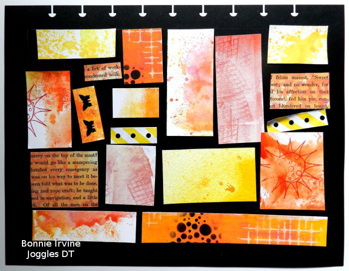
Before I began cutting rectangles to fit, I pencilled in the area I wanted to cover. I moved in .75 inches from each side so I would have a strong black frame around the mosaic when I was finished. Then I just started playing, auditioning various pieces and moving things around, cutting as I went along until I was satisfied. I made sure that I had at least two of every pattern to help the piece be more cohesive. I used scraps which were already punched (butterfly rectangle), a striped remnant from a USPS shipping tag, packaging which had been gel printed, and book paper which was sprayed for some project or other…plus my mop-up pieces. Some are card stock, some watercolour paper…I like the variety.
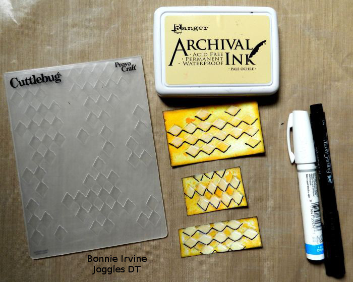
Once I had what I thought would be the final pieces, I wanted to embellish and add further texture and dimension. Before anything was adhered to the background, I grabbed the pieces from the same source and did the same things to each. For this first set of yellow spritzed watercolour paper rectangles, I embossed with a harlequin design, edged and deepened some areas with Pale Ochre Archival, and edged again with Jet Black Archival ink. Then I outlined one side of each diamond with black pen and highlighted on the diamonds with a white Sharpie paint pen.
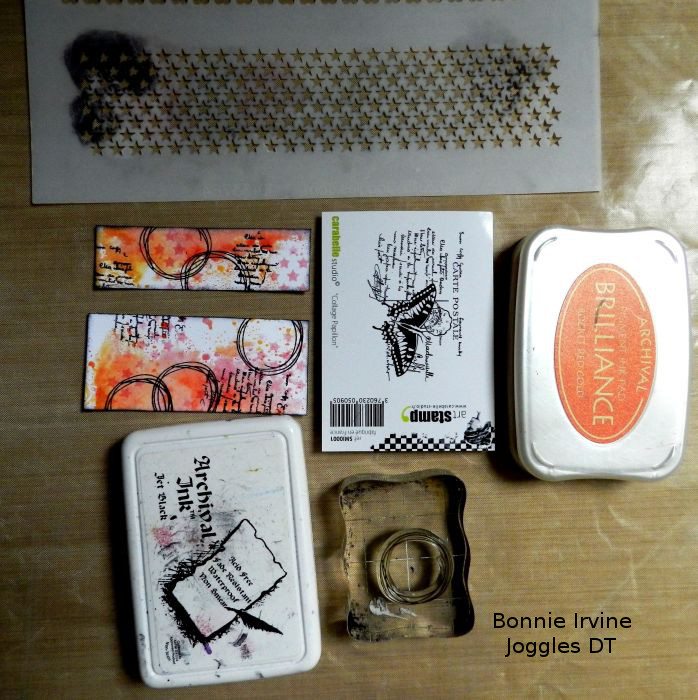
There were two rectangles cut from an orange spritzed background with a fair amount of white still showing. These were stencilled with stars from Joggles Punchinella Quintet stencil and Rocket Red Gold ink. Stamping was added with a messy circle stamp and also with the script part of Carabelle Studio Butterfly Collage Art Stamp. Again, Jet Black Archival Ink was used to darken the edges.
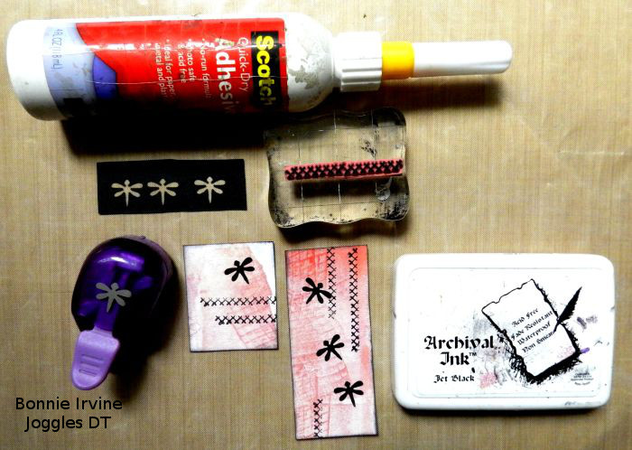
I really liked the black showing through the punched butterflies and wanted to repeat that using a dragonfly punch but the two gel printed packaging rectangles were too large to get the punch both where and in the direction I wanted so I cheated.(Don’t tell!) I punched them out of black card stock and adhered them onto the rectangles. I also added a stitching stamp and edged with Jet Black Archival.
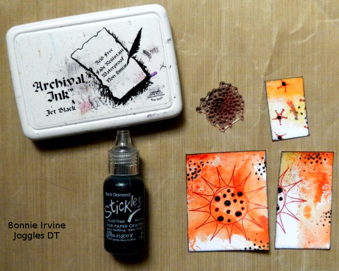
These three rectangles had been spritzed with yellow and orange Lindy’s Starburst sprays and stamped with Joggles Scribble Flower #4 stamp using Vermillion Archival Ink. I stamped the smallest square with the same ink and Joggles Background Noise Sparks stamp to tie it in with the other two and then added Black Diamond Stickles to the circles. I also stamped a tiny dotty stamp and edged with Jet Black Archival.
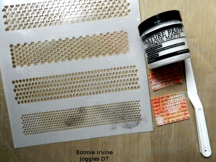
The rectangles of Starburst sprayed book text were given a simple design of tiny dots with Texture Paste scraped through another of the Punchinella Quintet stencil’s patterns.
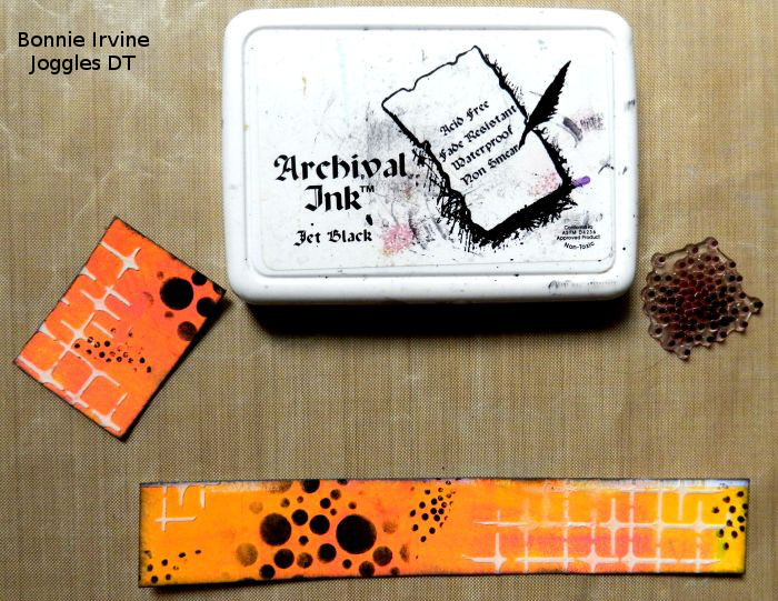
The final two rectangles which I altered were cut from the same scrap and already had Texture Paste and and bubbles stencilled on them. All I added was the black dotty stamp and the edging. By repeating the stamping and edging with black,as well as having some Texture Paste scattered throughout the page, all of these “tiles” were tied together making the piece seem cohesive.
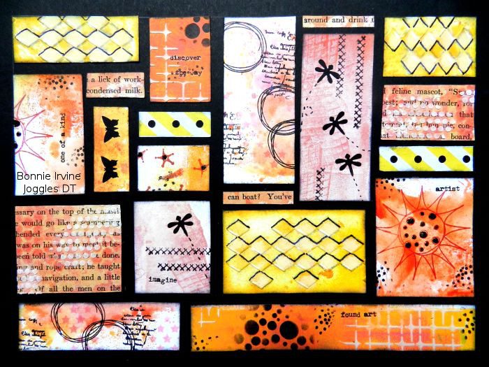
Scor tape was used to adhere everything in place. Once everything was adhered, I found that I needed two skinny strips to fill in so I cut single lines from the book paper. Because I like to add words to each of my pages, I placed a few Idea-ology rub-ons here and there. I chose ones that captured my process such as “found art” and “one of a kind” or “discover the way”. They make me smile and remind me of the fun I had creating this page.
So now, it’s your turn to create or reference a mosaic or a patchwork design. You don’t need to follow my path…life and families can be like a patchwork, quilts certainly are, or maybe you want to do a mosaic with words or include some lovely image of architectural elements which feature mosaics. Just like I did here, choose what speaks to you and play with it 🙂








3 Comments
This piece is super. Love how far you’ve taken it!
Thanks for the inspiration!
Normally, this kind of assignment isn’t something I would be attracted to. But after looking at what you did with your artistry, I absolutely love it. I can see another way to use my beautiful scraps and then kick them up a notch. I love the idea of the modeling paste and of course, using more BLACK! Thank you Bonnie for your take on helping us to take our own artistry to a new level.