As often is the case, I went into this week’s page with one idea and found myself with a finished page that looked almost nothing like what was in my mind’s eye.
I wanted to draw a mandala and then realized I had neither the time or patience to sit and actually do it. Plan B? Something mandala-like, but that would be easier and take less time to complete.
Your Week 31 prompt is either draw a mandala (how complex is up to you) or something mandala-like.
I decided on concentric circles and then realized that I didn’t want a perfect group of them, so decided to rough sketch and see what emerged.

Squint and you’ll see the pencil lines. I know they seem kind of faint, but because I waited to try to erase them until I had color in all of the rings, it wasn’t easy and I wasn’t successful on some parts. The good news is that the text and doodling either covers them or distracts your eye away.
Since I’m working on 6″ x 8″ pages and I wanted to have a decent amount of space in the rings, I drew large-ish ones and had them fall off the edge of the page. That not only give me room to work, it also looks better (in my opinion) that one group of concentric-ish rings sitting in the middle of the page.
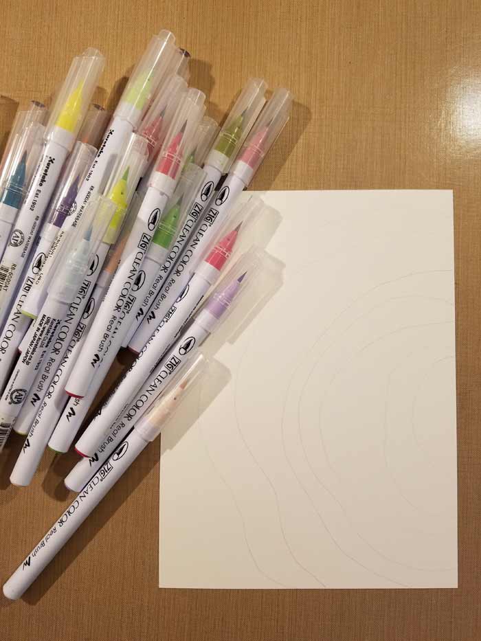
So color… I chose to use Zig Clean Color Real Brush Markers. I like the fact that there’s an actual brush with actual bristles rather than a piece of felt shaped like a brush.

I filled one ring with one color at a time but didn’t wait for the previous one to completely dry before moving on. As you’ll see, that causes color to wick from one area to the adjoining ones. You can avoid that by drying them before moving on. My basic technique is to lay color in the area and use a water brush to move it around till I’m satisfied with the coverage.
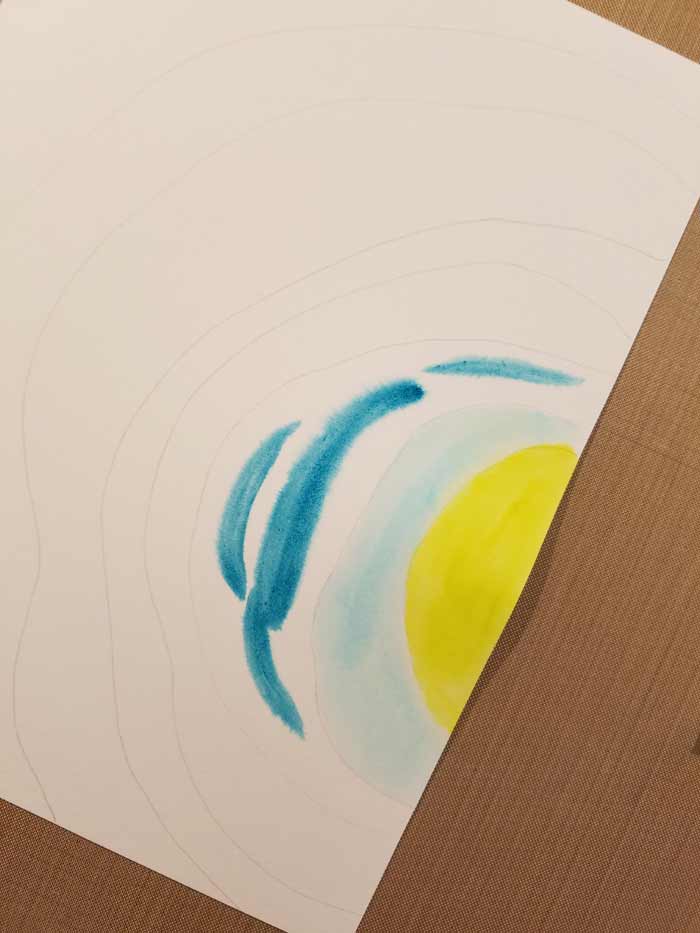
Some colors of the markers grab into the paper with a little more oooph which makes moving the color into an even layer difficult. Or impossible.

You can see it here – that original laying down of the color on the dry paper. Another option is to wet the area, then apply the color. That helps stop some of that color from grabbing the fibers of the paper and allows blending.
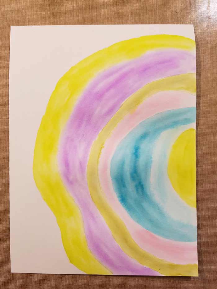
Rings completely colored.
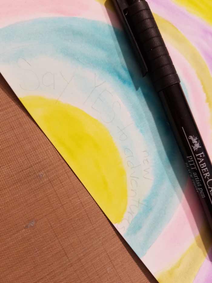
So it’s time for text and doodles. For both I used PITT Pens in S (Superfine) and F (Fine) tips. I sketched the text using a hard lead pencil which makes it easier to erase.

I wish I had time to develop Joanne Sharpe-like lettering skills, but since I don’t I just stuck with my own handwriting. With the text lettered I erased the pencils marks and moved on.

That moving on meant realizing that the first pass with the pen wasn’t enough and I wanted to strengthen the letters. And I also wanted to emphasize some words, so I went over them enough to make them stand out.

Doodles in process…

And completed. At least that round is.

More text and dots to add interest.

Details really do make a difference. More is often more when I doodle and I much prefer this look to the plainer one.

Adding more rounds of text and doodles.
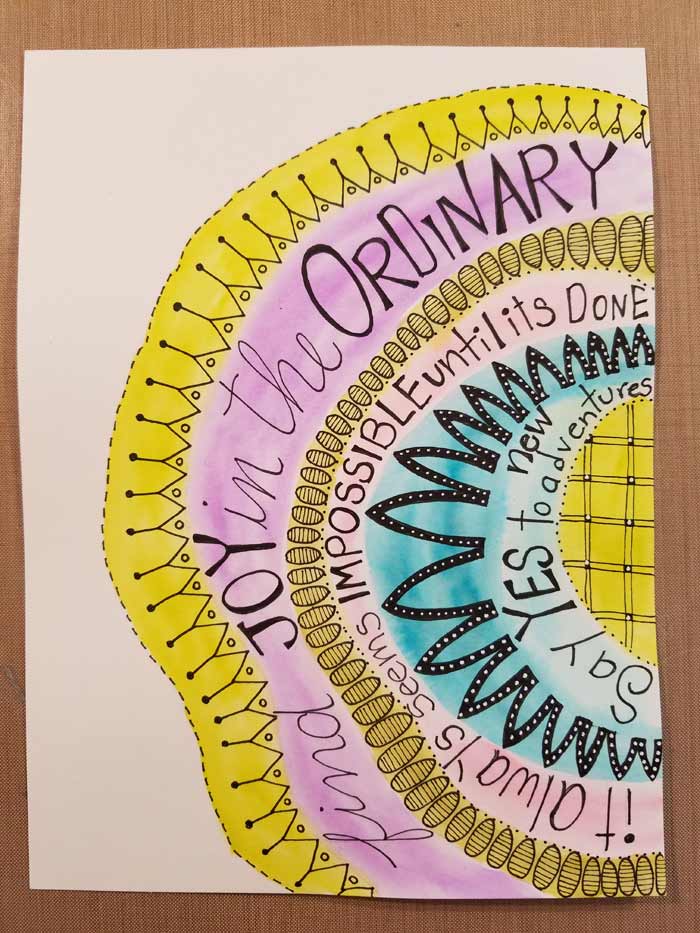
Finished.
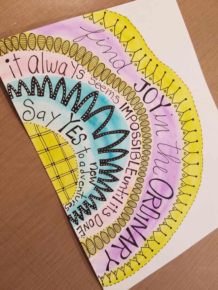
Another view. So while not a mandala, I’m satisfied. And some weeks that has to be enough!
5 Comments
Barb, thank you for this week’s page. I am a faithful reader of your blog/company. Anyway, I’m 84 years old and am down sizing to a new home. Hard to get motivated at my age but this did it!!! the sentiment
is perfect! Now I am excited…SEE not even do you motivate artistically but emotionally.
Thank you, Dorothy Kiebler
You’re welcome! I’m thrilled the page resonated with you. We all need a bit of extra motivation at times!
I love this Barb. Love my Zigs and they are so portable. And btw, your lettering is wonderful.
Thanks Diana!
Love this! Always interesting to see how thoughts and inspiration evolve.