
I tend to be an artistic minimalist who also likes complex, multi-layered work. A bit of a conundrum is my muse. Some of the time it’s like living with multiple people in my head. I admire busy pages that get it right and balance all of the elements so that a piece doesn’t make you feel overwhelmed with too much “stuff”. Dyan Reaveley, Teesha Moore, and the artists who create in similar styles make some awesome eye candy. Many of the talented folks who are participating in the AJA also fall into that group.
Some of the time my muse sticks out her tongue and refuses to come out to play. So, like many of you, I browse Pinterest to see what’s being made and to find inspiration. Today’s page was inspired by one I found while poking around various boards. I don’t know who the artist is. I did a little digging in what I thought was the correct blog but couldn’t find the piece, so will leave it as unknown.
What captured me the most was the color gradations and movement of the hues along the object. My eye is really attracted to that look and is one of the reasons you see images in our newsletters that, for example, depict a bunch of markers and the colors gradate from green to yellow to orange, then red, magenta to purple, and perhaps end in blue. Or some variation of that. Something like this…
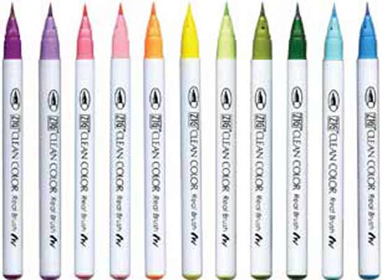
These are the Zig Clean Color Real Brush Markers that debuted on the site 10 days ago. I’m a complete sucker for this look which is why I take the time to arrange the markers in color order. That’s my art confession for the week. :+)
So with that in mind, the prompt for Week 23 is to create color gradations. Yours can be monochromatic, say moving from white or the palest of pink all the way to deep red. Or it can span colors like what you see in the pens and on my Week 23 page. No coincidence, I actually used the Clean Color Markers when coloring the elements. They’re pretty fabulous.
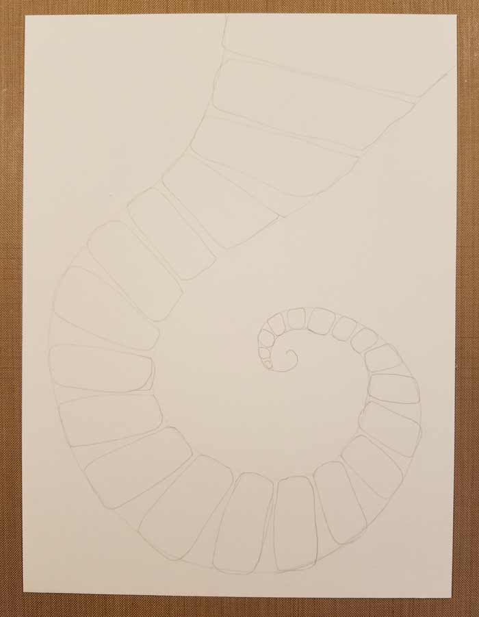
The first step was to pencil in the overall arcing shape, then add the rectangles with rounded corners within the confines of it.
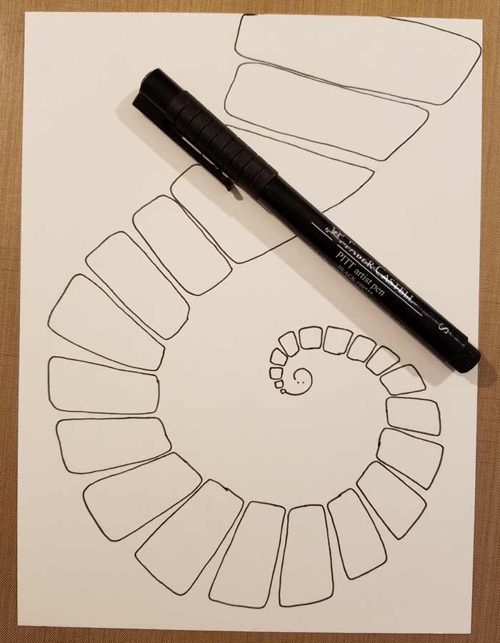
Outlined with a Black PITT Superfine Pen and then all of the pencil marks were erased.
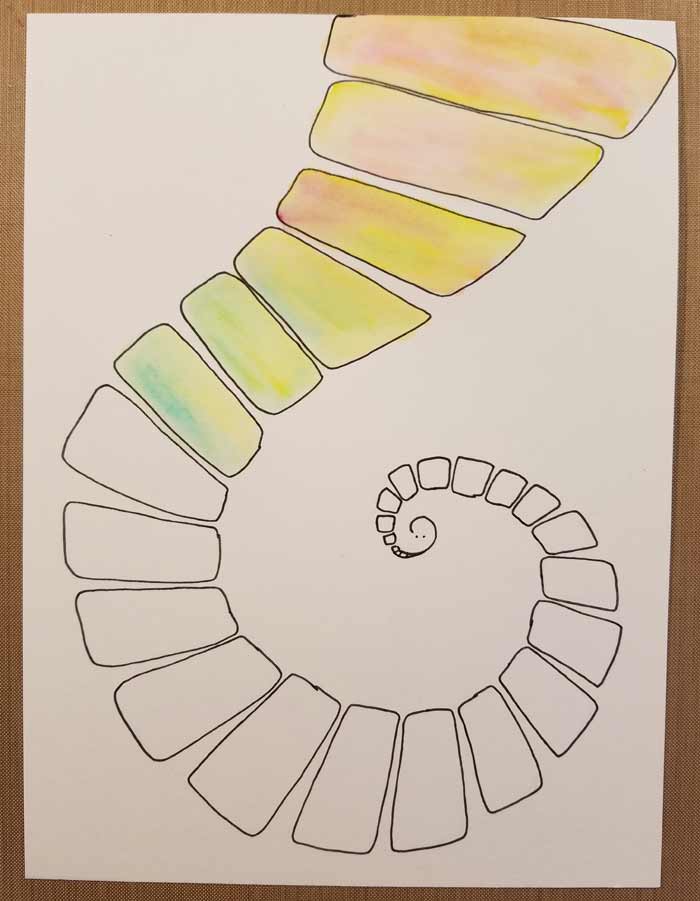
Adding colors with the Clean Color Markers and using water in one of Tim Holtz’s Detail Water Brush to blend them.
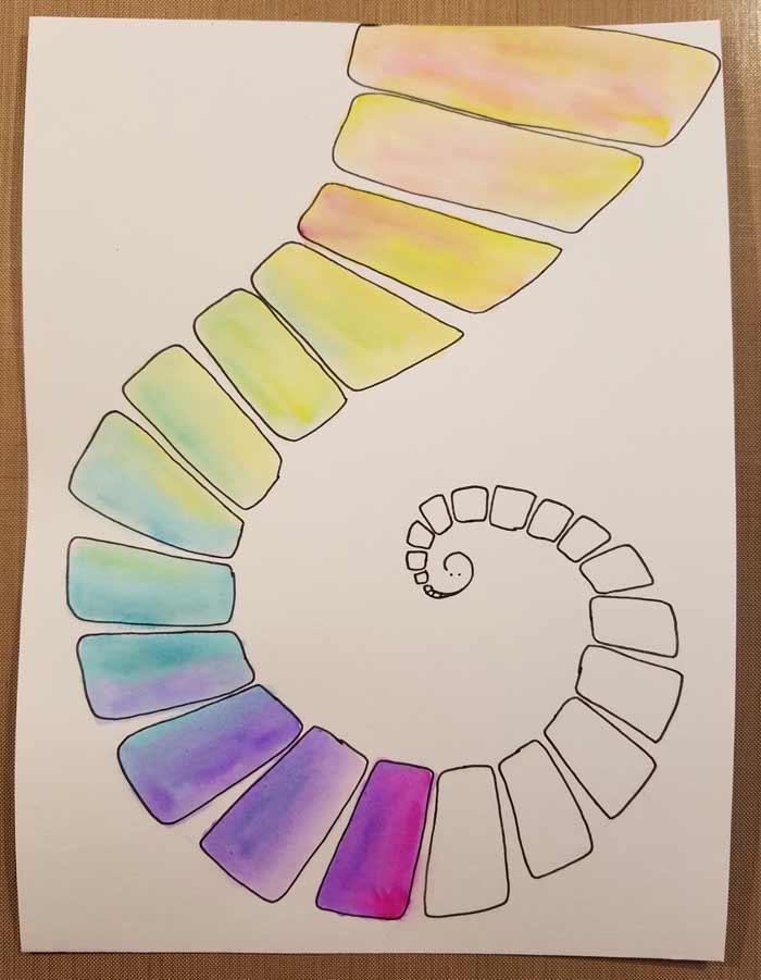
The order of colors is not set in stone. I could have transitioned from these purples tinted with magenta to blue purples and eventually to blue and then ended with green.
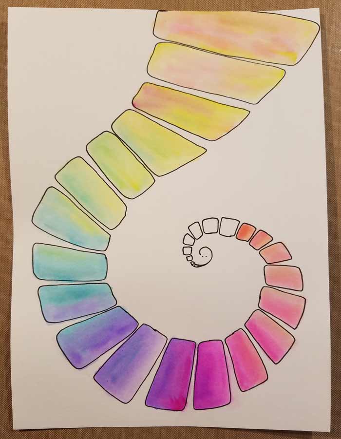
Instead, I moved to pinks, peaches, and…
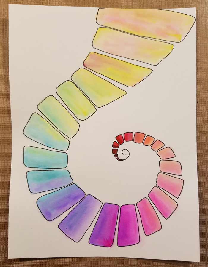
…ultimately ended with red. Your options? Whatever you want. Use colors you love. Use ones you don’t often and challenge yourself. Most of all, have fun. With the path finished I was mystified what to do next. Being a minimalist, I decided that less really was more and if I kept the background simple there was far less chance of me doing something I’d regret. (been there, done that. wallowed in the regret)
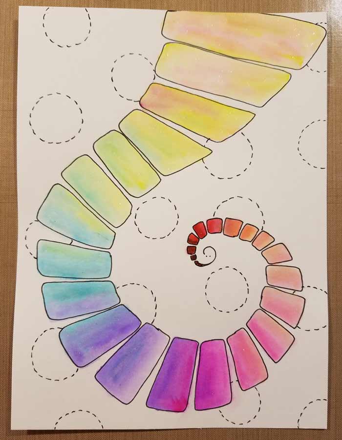
Circles made with dashes. I sketched them first in pencil, the added the dashed lines with the same black Superfine PITT Pen. Simple, but they satisfy my desire to add something to the background. Almost done…
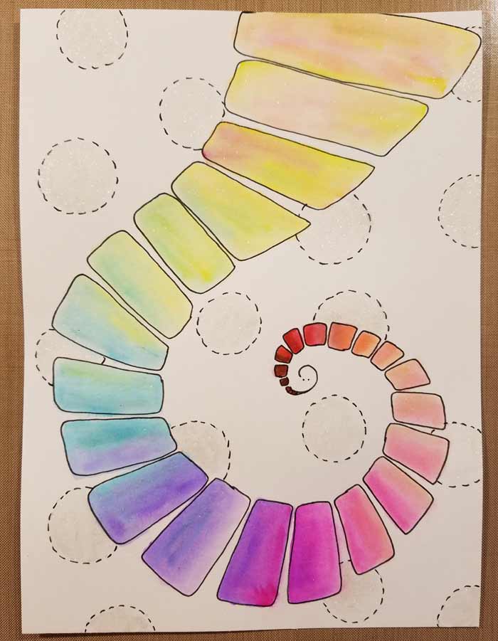
But for using a clear Wink Of Stella Brush Marker to fill in the background circles. I added some, very lightly, to the path too. Because what’s not to like about glitter on a path? Imagine how much better the Yellow Brick Road would have been with glitter. Now that’s a fabulous road.
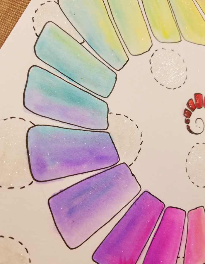
You can see the glitter a little better when the page is angled.
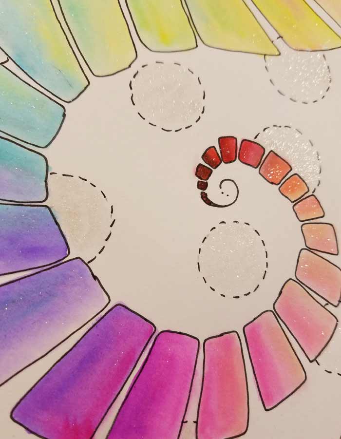
You’ll also notice that some of the colors bled beyond the shapes. Ooops.








6 Comments
Great page, Barb! What kind of paper were you working on? I use the Zig Clean Color Real Brush markers, but I’m still looking for the perfect paper to blend them on.
Hi Linda, I love these markers too. I use them with watercolor paper. They are very easy to blend. I’ve used them with bristol as well (both strathmore products).
Thanks Linda!
For this page I used the Global Art Materials Hot Press Fluid Watercolor paper.
I have found the some colors really grab when you apply the marker directly to the paper and others don’t. The majority blend well on this paper.
Thanks, Barb. That’s one paper I haven’t tried. I have the same problem with these markers – some seem to “stay put” more and it’s very difficult to get rid of the hard lines. I’ve gotten into the habit of keeping a small piece of whatever paper I’m working on to test each marker on. If it isn’t going to blend out, I scribble it onto a palette and pick it up with a brush. So many people like the Strathmore Bristol Smooth but I just don’t get the results I’m looking for – probably because I started this artistic journey as a watercolorist working wet in wet. Thanks for replying to my question.
I like the Strathmore too, Barb and Strathmore’s bristol. I love these markers.
Hi.
.I must say I’ll be very glad when you draw in the rest of this creature of questionable origin. Great tail, though.
Have a good week, girl.