
Hi everyone! It’s Bonnie here with this week’s Art Journal Adventure prompt for Week 2. Before I start both Barb and I want to say how delighted we are with all of the sharing of art that is going on over at the AJA Facebook group. Thanks you all so much for sharing your art with us. It’s so inspiring!
For week 2, I chose the theme of Exploring Texture. There are two main types of texture: physical or tactile texture which is the actual 3D feel of a surface or the texture you can actually touch like embossing or Texture Paste, for example; Visual Texture which refers to the illusion of texture created by the artist such as you see when you add stamping or texture captured in a photograph. While I did add a little of the second kind of texture, I mostly wanted to focus on tactile texture with today’s page.
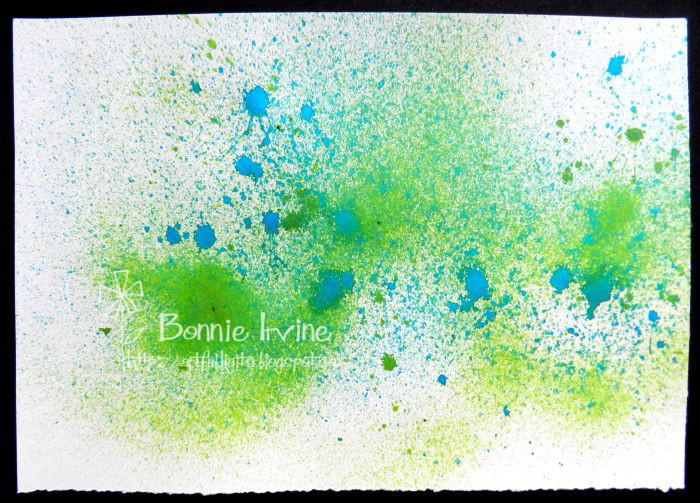
I began by spritzing my page with Lindy’s Stamp Gang Delphinium Turquoise and Freaky FrankenLime Starburst Sprays. A little extra spritzing of water was added in a few areas just to change the visual texture from speckled to smooth.
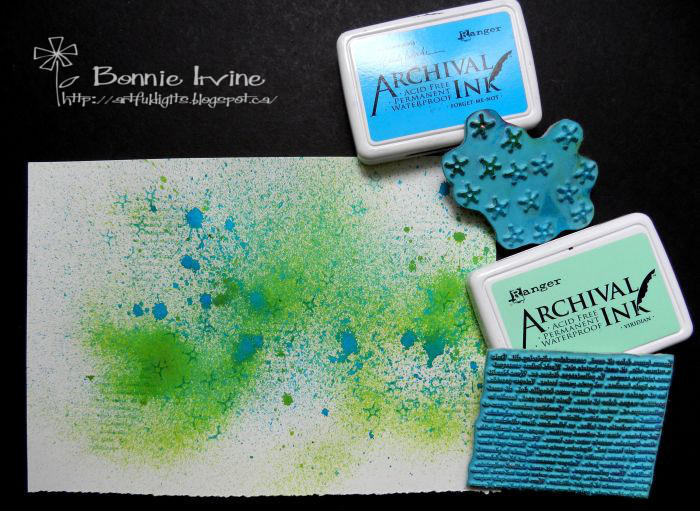
I added some stamping here and there using Viridian Archival Ink to apply the Joggles Nonsense Latin Text stamp and Forget-Me-Not Archival to apply Joggles Sparks Background Noise stamp. I wasn’t going for perfect images so I didn’t use a stamp mount but rolled the stamp onto the page instead…no hard edges 🙂 I chose the ink colours so they would be tone on tone with the background colours.
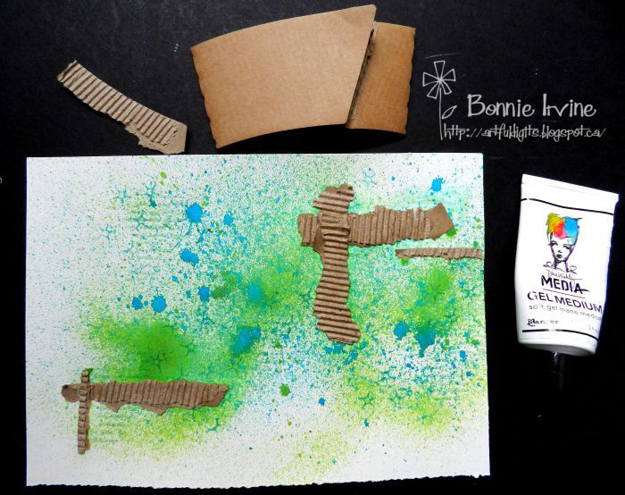
Corrugated cardboard is one of my favourite textures to add so I have people saving their coffee sleeves from take-out places. I love these because they are thin enough to punch or die cut, tear easily, have ridges which are close together, and don’t add as much bulk as box cardboard does. I just tore some pieces up and added them with Aleene’s Super Thick Tacky Glue.
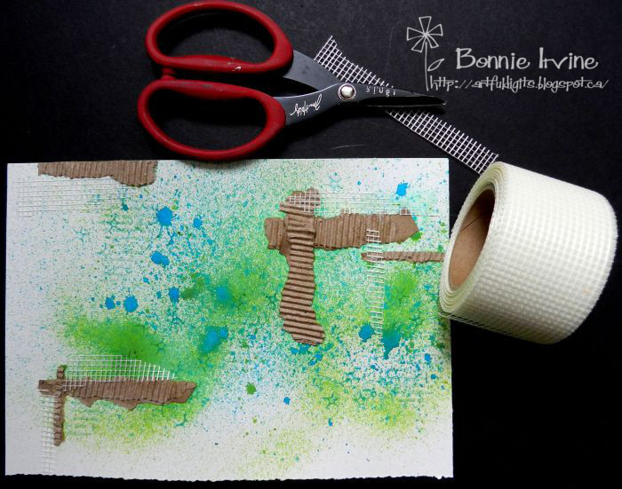
Another of my go-to sources of texture comes from the hardware store (or my husband’s workshop…Shhh! Don’t tell) It’s a roll of drywall mesh which is used to tape up drywall seams before the joint compound is applied. I love this stuff and the best part…it’s sticky on one side. I also really like the grid pattern and it will take paint if you want although I usually leave it white. That’s because I have trouble leaving white space so I usually have to add white back in…sigh.
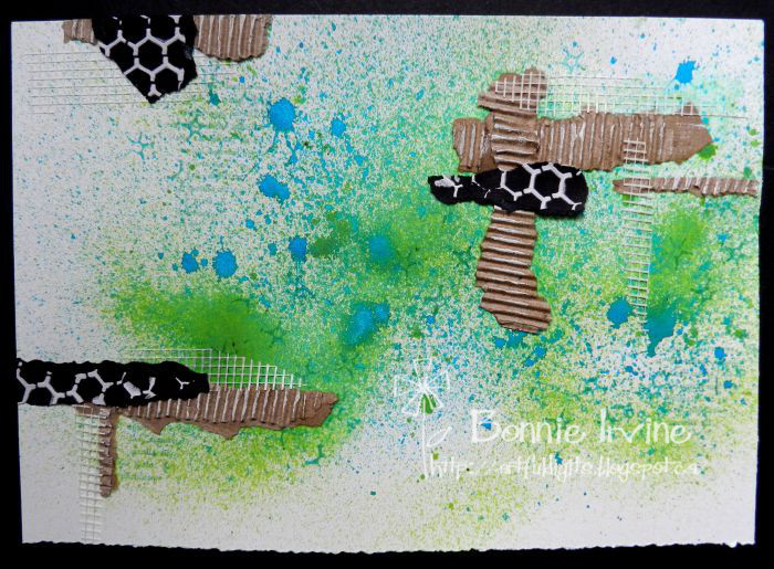
I keep scraps of textured papers in a plastic sleeve on my desk and that’s where those bits of black card stock with the white Ranger Texture Paste hexagons came from. I had used the majority of the stencilled paper on another project but had a scrap left so I tore it up to add my signature touches of black. It makes those little groupings of texture really pop.
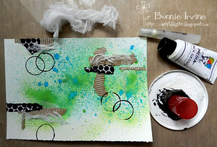
Next I added a little cheesecloth in the form of more scraps and tucked them in with the clusters I had already formed. Grouping creates wonderful contrast with the soft and hard textures together as well as with the mix of colours plus it creates repetition and flow. I used a bottle lid and a little black gesso spritzed with water to create open rings of black and extend those groupings of texture further onto the page.
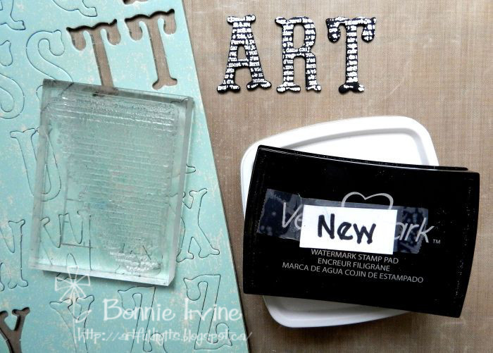
Then it came down to the sentiment and another opportunity to add something tactile. Not everyone adds words or a phrase to their journal pages but it’s something I usually do. It all comes down to personal preference. In the spirit of using up some of my old stash, I found these chipboard letters which were the right size but the wrong colour. I painted them black with gesso and once dry, stamped them with Versamark Ink using one of Bo Bunny’s It is Written stamps. White embossing powder was sprinkled over the Versamark and it was then heat embossed.
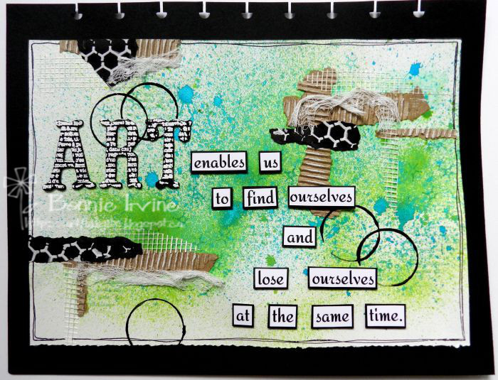
The remainder of the sentiment was printed on white card stock, matted with black, and popped upwith foam squares. A very simple border was doodled with a Fine black Pitt Artist pen and the page was adhered to the black card stock which I have chosen as the base for all my AJA pages.
So your mission, should you choose to accept it…LOL, is to explore ways of including either Visual Texture, Tactile Texture or both in this week’s page. Have fun! I’m excited to see your pages!








Comment
I love this piece on so many levels. At the same time it is simple and layered. Very clever.