
By the time you read this post on Monday morning, May 8th, I will be in the car driving home from demoing at Scrapbook Centrale’s National Scrapbook Day event.
Natalie Weiser, owner extradinorere of SC, invited me to join… and how could I say no? Three days of fun for the participants and three days of demos and Make and Takes from Jen Starr (Brand Ambassaror for Gel Press), Els van de Burgt (owner of Elizabeth Crafts), yours truly, and Denise who works with Natalie, Francine and the gang at the store.
By Wednesday last week, when I needed to create this week’s page, all of my “usual” supplies were packed and in the car. That left me in the position of needing to work with what was left on my bench and a bit of a conundrum. With my go-to colors unavailable, what would I use??
And THAT, led to today’s prompt: Use colors outside of your comfort zone. I still worked in lighter and more pastel ones as I ordinarily would, but definitely not ones I would normally reach for and absolutely not ones I would typically combine. I might use one in combination with my happy colors, but that’s about the extent of it.
It’s called a “comfort zone” for a reason, and I don’t want you to be stressed. Nothing says you have to completely alter your palette; just add something you don’t usually use to the mix. If you’re feeling brave, throw caution to the wind and pull out ones you never use. Or find a place between those extremes and give it a whirl.
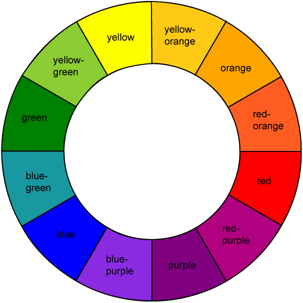
If you’re unsure about combining those not-so-usual colors, stick with a safe group like a monochromatic or analogous color scheme.
- A monochromatic scheme is derived from a single base hue and extended using its shades, tones and tints. Tints are created by adding white. Shades by adding black, and tones by adding grey.
- An analogous color scheme uses colors that are next to each other on the color wheel.
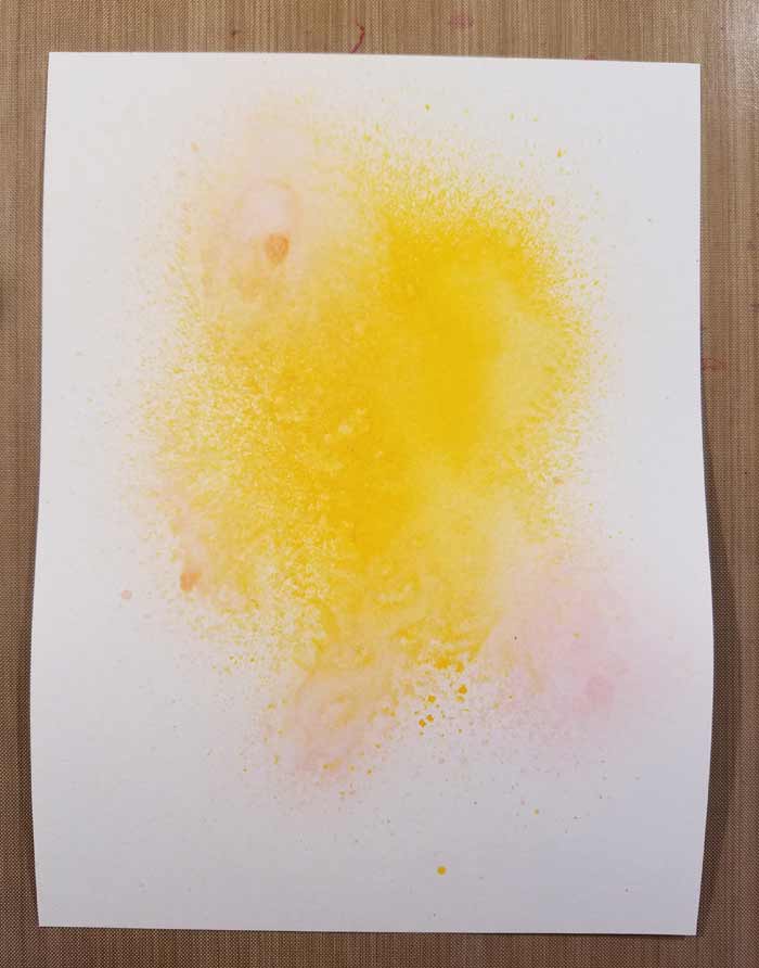
The three I chose were Distress Spray Stain in Mustard Seed and Spun Sugar and Dylusions Pure Sunshine. Pure Sunshine is predominant and you almost don’t see Mustard Seed, but there is a small bit there.
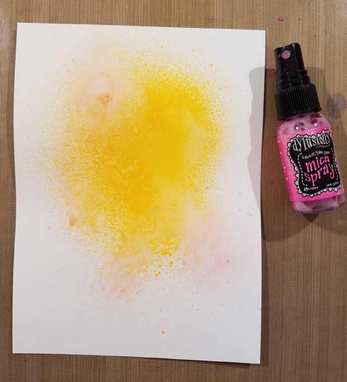
Added a bit of glimmer (very subtle on white paper or light colors) with the Dylusions Mica Spray in Bubblegum Pink.
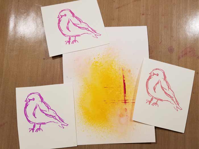
From this photo you can see that the background changed a little because I added magenta horizontal and vertical lines using Funky Fuchsia Dylusions Paint. The birds are from Dina Wakley’s Scribbly Birds stamp set. I chose the one I wanted to use and test stamped it with Archival Ink in Cactus Flower (lower left), Magenta Hue (top), and Rose Madder (lower right).
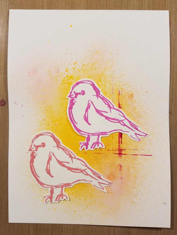
I’ve narrowed it down to Magenta Hue and Rose Madder. The background needs something else before I make a final decision on the bird.
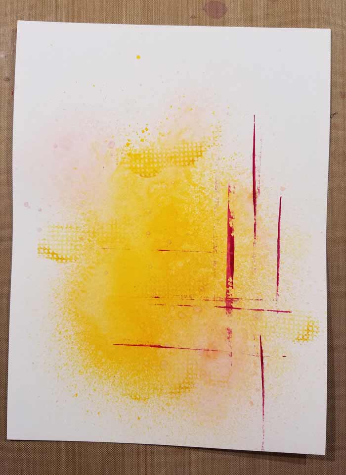
So I grabbed Saffron Archival Ink and the grid stamp from Dina’s Textures Set and added a few sketchy and incomplete impressions of it.
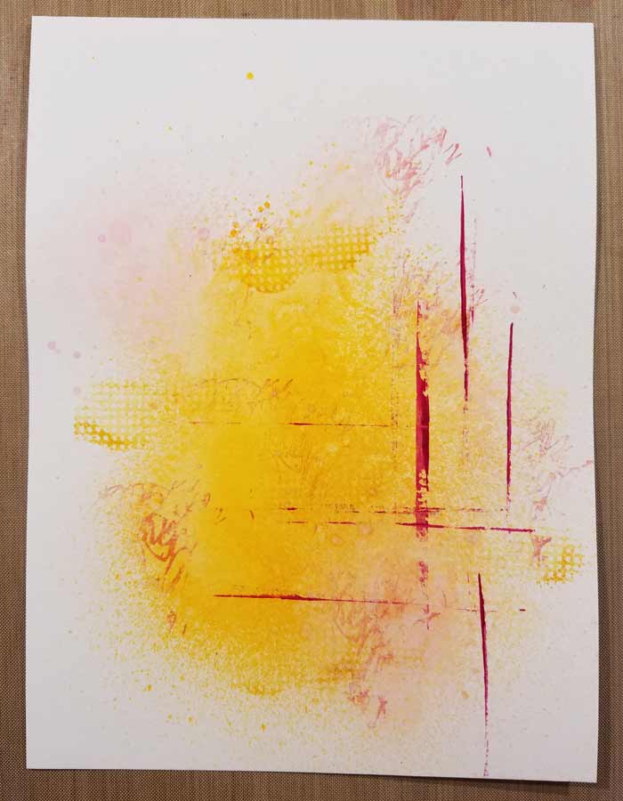
And did the same thing with the script/scribbles stamp in the set and Rose Madder Archival Ink. Better. It was incomplete looking and boring before, but has a bit more life now. This page ended up as one of my more minimalist style.

To complete the page I stamped one of the quotes from the Scribbly Birds set on a piece of watercolor paper. Rather than cut it out as a block of text, I cut the lines apart and placed them in a scattered fashion, which I prefer. The bird I ended up with is the one I stamped with Rose Madder Archival Ink because I felt it best fit the overall color scheme.








2 Comments
I really like this journal page, Barb. Sometimes less is more.
thanks for this walkthru ….. me likey!! Smiles, Jane