Hi everyone. It’s Bonnie here with the Week 14 prompt for the Art Journal Adventure. Next week Barb will be back but this week, I get to host. The prompt which I have chosen for Week 14 is to include strong vertical and horizontal elements in your page. Stripes, checks, and plaids immediately come to mind but a horizon line is a great starting point and a page done in a grid format also works beautifully. I started with vertical and horizontal drip lines and went from there.
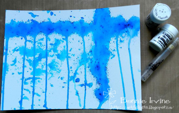
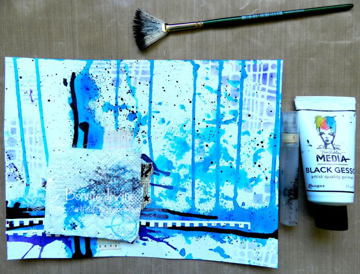
I started by sprinkling Turquoise and Ultra Marine Colourcraft Brusho crystals in a horizontal and vertical line like an exaggerated t onto my 7.5 x 10 inch rectangle of bristol paper. I spritzed the crystals with water from my Mini Mister, keeping the spray closer than usual to the Brushos so that it didn’t blow them out of line. The page was then tilted so that the liquid paint would run in vertical lines. The paint which dripped onto the craft mat was blotted up with the background paper to create splotches of colour once the drippy lines were dry.
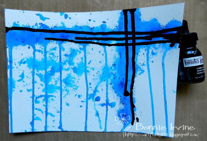
I had no idea where I was going with this page yet but I knew that I wanted to emphasize the horizontal and vertical lines so black ink was added to the top of the original lines and allowed to drip down. I had to do this one orientation at a time and dry in between in order to keep the black running in the direction I wanted.
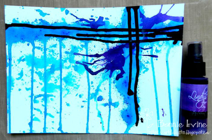
Although the Brusho Crystals are called by one colour name, they always have other colours in the mix which emerge when spritzed. One of the colours in these two was purple which I really liked and wanted to see more of. I splattered some Lindy’s Stamp Gang Witch’s Potion Purple Starburst Spray into three separate puddles. I did this by only partially holding the pump part down so that I got drips instead of spray/mist. It’s messy but effective 🙂 Then I pulled out my trusty straw and blew into it moving the purple where I wanted it to go and creating tiny tendrils in all directions.
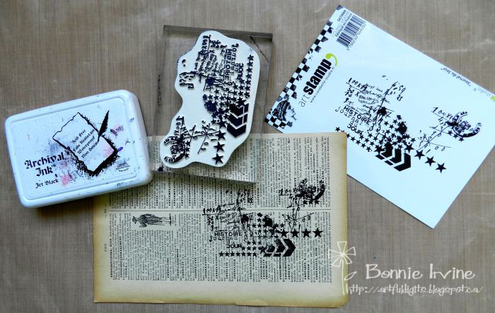
At this point, I was thinking that a cluster or stack of elements would look good if placed at the intersection of the two main lines. I wanted some ephemera, some texture with fabrics, and a main stamped element. Carabelle Studio Day Diary stamp was added to a vintage dictionary page using Jet Black Archival Ink and then the stamped area was torn around to become part of the stack.
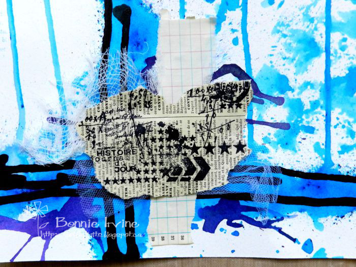
Another torn piece of vintage grid paper was layered under it along with a piece of tulle and a scrap of cheesecloth. Scor tape was used to adhere everything because a liquid glue or medium would have reactivated the Brushos. You can see at this point that I had turned the paper upside down so that the strong horizontal line was now along the bottom edge. I did that to suit the top element I would be adding.
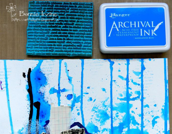
Before I got to that, I wanted to add some light stamping to add interest and texture to some of the white areas. Using Manganese Blue Archival Ink, which is quite a strong colour, and Joggles Nonsense Latin Text Rubber Stamp, I added second generation stamping in several places. That’s where you stamp first on scrap paper and then the second time on your background without re-inking in between. It gives a faded version which seemed to suit the page better.
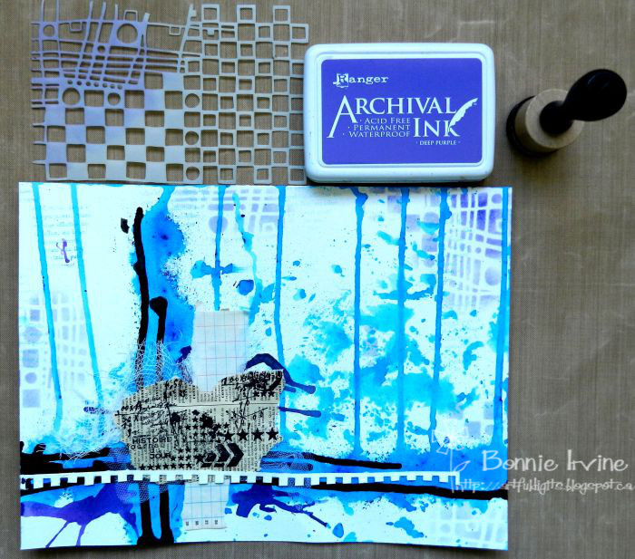
The purple at the bottom next to the lines looked great but there needed to be some purple at the top of the background add unity and increase flow. Out came Carabelle Studio Squares and Circles Art Template, Deep Purple Archival Ink, and a mini ink blender tool. I also added the top section cut off when a piece of watercolour paper was removed from the pad. I always save those bits to add to my pages and the white broke up the heavy band of colour.
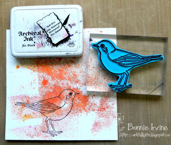
Jet Black Archival Ink was used to stamp Joggles Tweet Tweet Cling Mounted Rubber Stamp onto a piece of mop-up paper covered in Lindy’s Starburst Sprays. I chose orange because it’s opposite blue on the colour wheel and I wanted him to pop. The bird was fussy cut, edged with Black Big Brush Pen, and then shaded and highlighted with coloured pencils. A black rhinestone was glued to his eye. He was then matted with black card stock and fussy cut leaving a narrow border to help him stand out against the background.
At this point, I decided I wanted black splatters so I cut a piece of paper towel to cover the bird, added water to black gesso, and splattered with a fan brush. I also added a second piece of the watercolour topper under the first coming as far out as the beak of the bird.
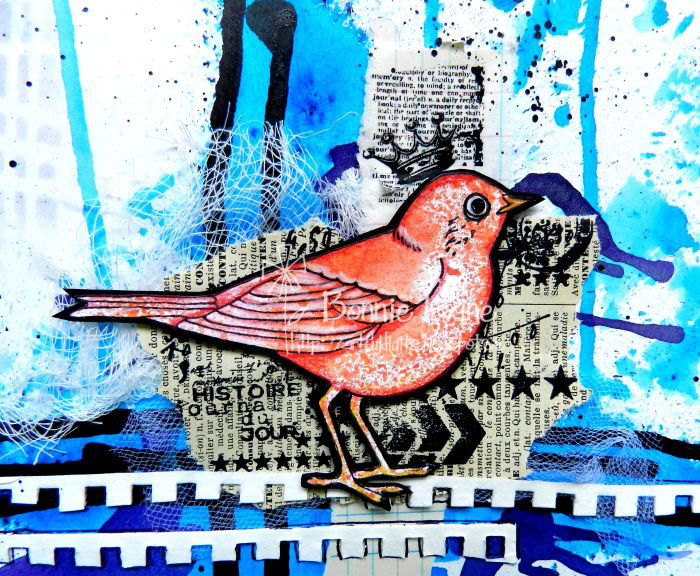
Some Idea-ology Remnant Rubs were added to the grid ephemera behind Birdie’s head because it didn’t show up enough plus I wanted to add the crown. Outlining was added around the watercolour bands and a simple border was doodled around the page.
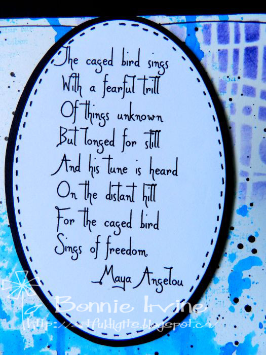
At this point, I was looking at the background and the bird and realized that all those drips reminded me of the bars of a cage. That led to including Maya Angelou’s poem about the caged bird. I used a tiny font and kept the poem as a unit to add yet another horizontal (the lines) and vertical (the poem) element. It was cut into an oval, matted with black, and faux stitched. Both Birdie and the poem were added to the page with foam tape.
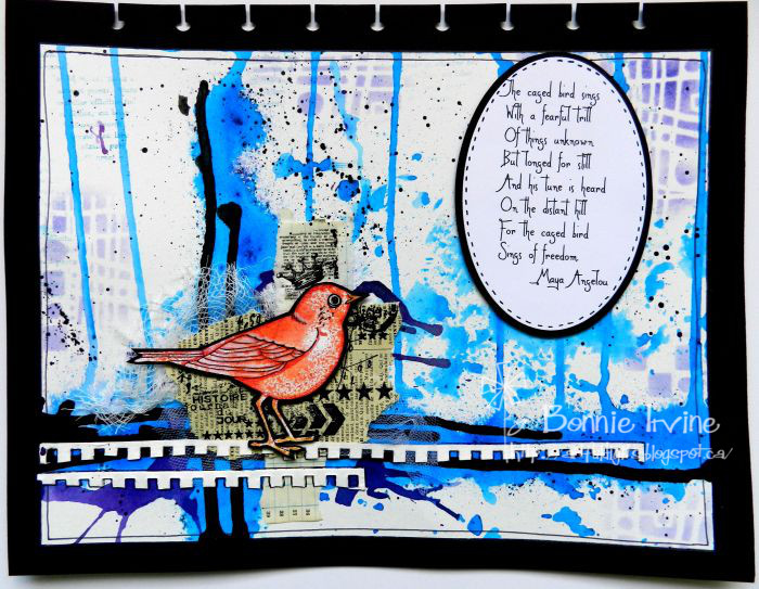
Adhering the background to the black card stock, which is common to all of my pages, finished this off and framed it. I’m not 100% sure that it’s finished but, at least for now, it is. Now it’s your turn to feature vertical and horizontal elements on your art journal page or spread. There are lots of possibilities so I can’t wait to see what you choose 🙂
4 Comments
Wow! Love this challenge!
Thanks so much, Pam. I had so many ideas for it that I might just have to do a second one 🙂
Bonnie this is beautiful! I love Maya’s poems you can always find one to suit no matter what the style is. xx
Thanks, Sharon. I am a huge fan of Maya Angelou poems and quotes. They really speak to me and there have been many times where one has inspired my art journal page. She was a wise woman!