Having just arrived home from Salt Lake City very late Friday night (the 15th) meant I had little time to recover from a week that left me pretty darn tired AND get today’s page done and posted here on the blog. If you find this post and the page less than stellar, you know why.
The idea was to create layers of interesting color and glimmer, then white out the negative space so only the areas I chose to highlight would be visible. I mostly achieved that goal, though in hindsight, there are some things I would do differently. That’s fodder for another blog post however!
So this week’s prompt is to create a background you like and selectively allow only parts to appear; effectively blanking out the negative space to focus the viewer’s eye on the positive elements.
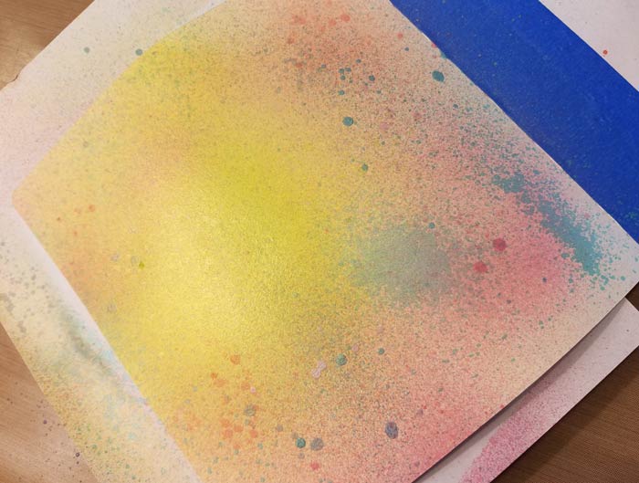
Since Heidi Swapp Color Shine is more or less permanent once dry, I decided to use them on the background rather than paint like Dylusions or Dina Wakley’s Media line. Or Distress Paint for that matter. There is a difference between dry to the touch and cured to permanence. I didn’t have time to wait, so went with Color Shine which tends to be mostly permanent a bit quicker. Note the word “mostly”. You’ll see some of one of the pinks bleed through the paint I covered the background with. Ah well, (sh)it happens.
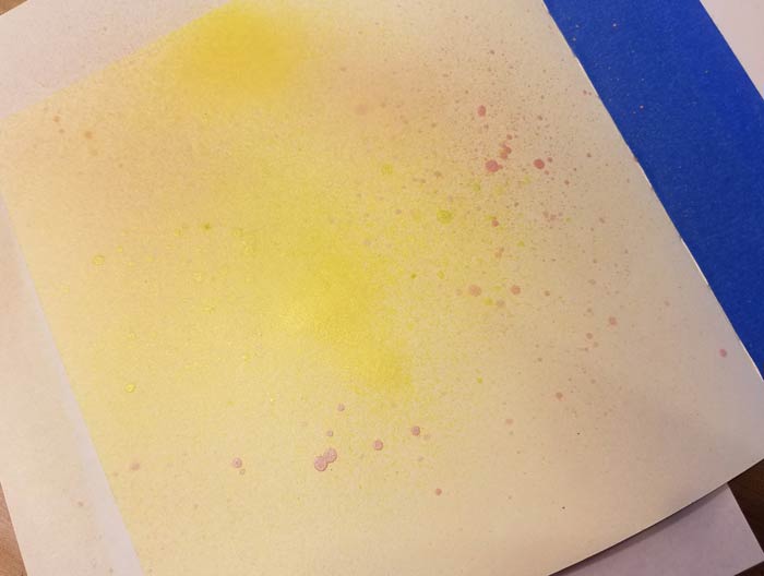
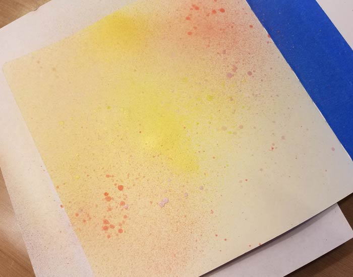
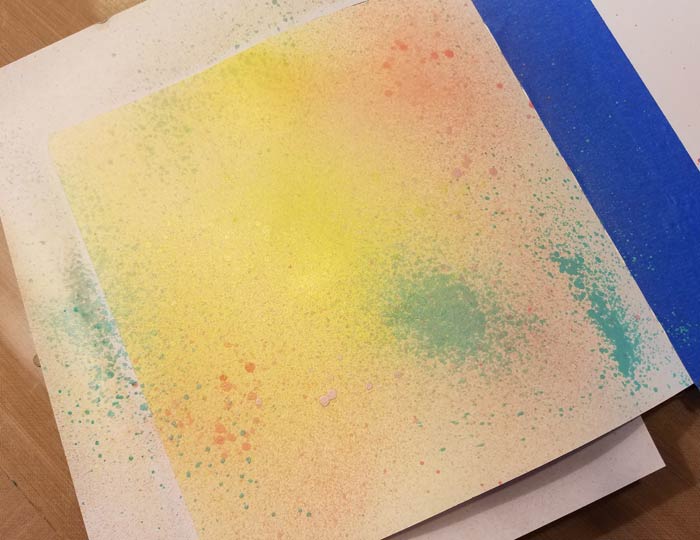
I chose these colors in the Color Shine line: Butter, Citron, Hot Pink, Patina, Pink (no longer available, sorry), Salmon, Sweet Mint, and Teal. Then I began to spray, a little at a time, beginning with Butter, then Citron, then down the line from lightest to darkest. If I felt like I’d obliterated one color once I sprayed another, I went back and added a new layer till I was satisfied.
Here is the progression in photos. I’m not going to comment on each. The process more or less speaks for itself. Commentary will resume after the 10th photo!


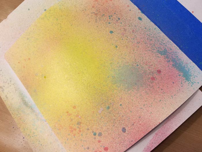
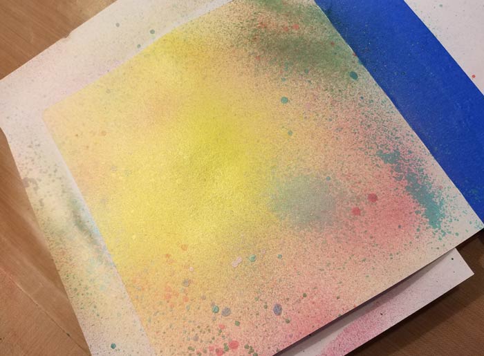

This is the final version of the background that was in place when I moved on to sketching the flowers using a hard leaded pencil. There isn’t a photo of that since the lines were so light. I had all I could do to see them once I began to apply paint to the background, so knew a photo was a squinty waste of time.
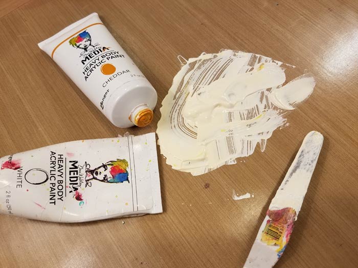
I knew I wanted to use Dina’s Heavy Body Paint since it would provide better coverage than Dylusions or Distress, with less layers needed. Since I didn’t want stark white I mixed a tiny bit of Cheddar into White, resulting in something that looks like Titanium Buff.
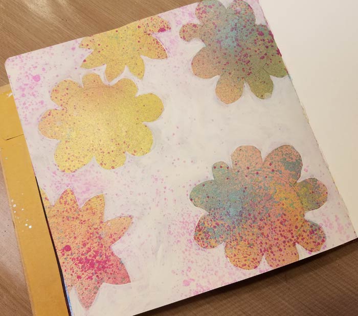
Squinting like a crazy person, I was just about to make out the pencil lines. Where I couldn’t see them, I guessed. You’ll notice that the shapes are not perfect, with oddly shaped petals that are not the same size. The next step will cure all of those ills…
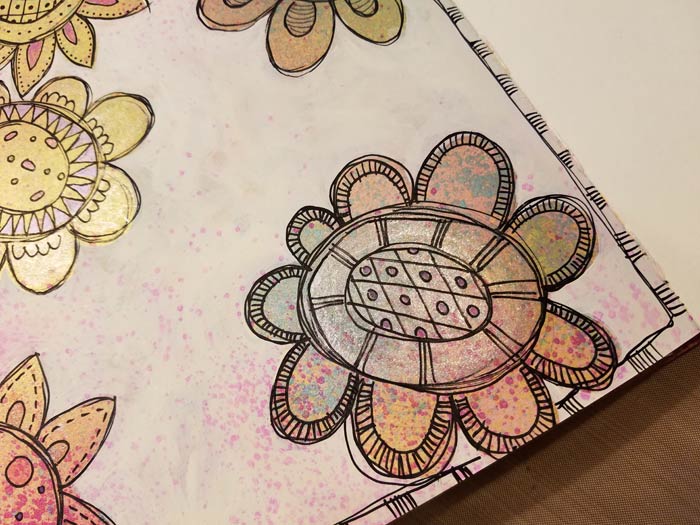
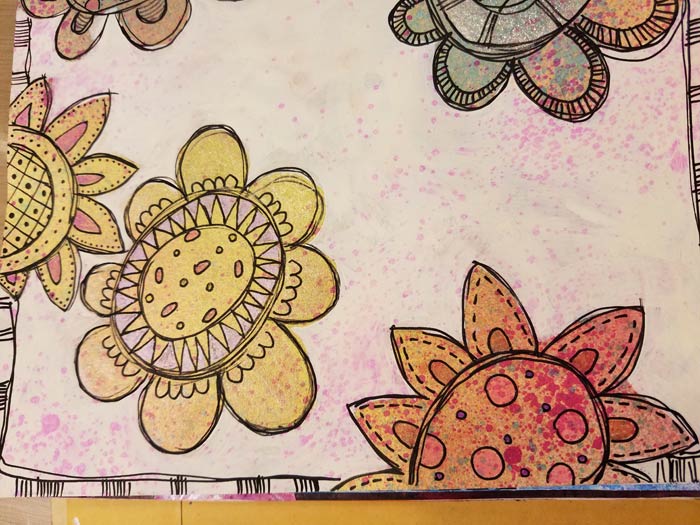
By lining the flower centers and petals very loosely with a Black Extra Fine Point Sharpie Water Based Paint Pen, it brings the flowers into focus, but in a hazy kind of way that’s very forgiving. These are more or less the way I tend to doodle flowers in a less precise way. And yes, that’s one of the pinks that’s bleeding through the white paint on the background. I think it provides a bit of interest rather than having it be a solid sheet of white.
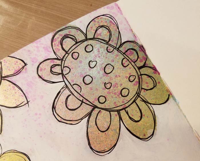
Adding details, using the same Sharpie Pen.

More details using Gelly Roll Pens.
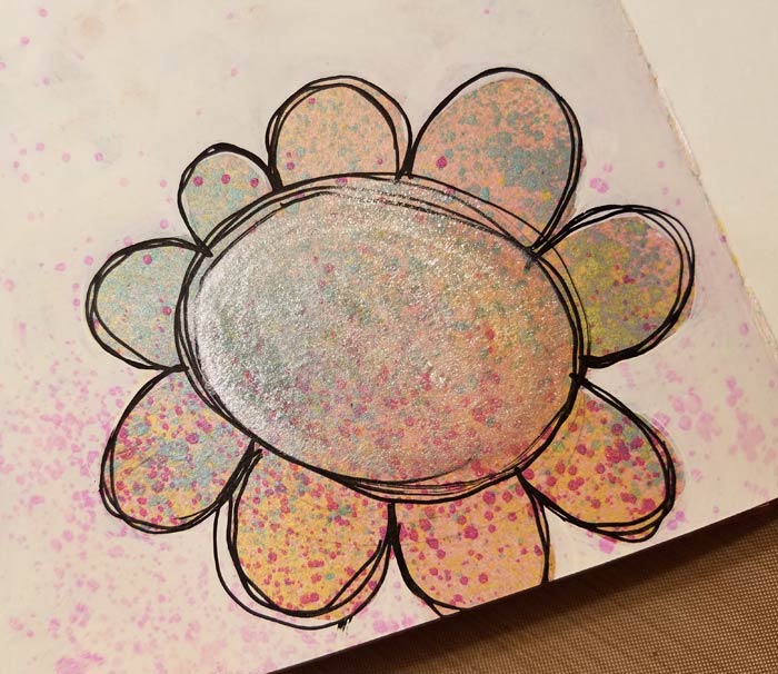
I used the Clear Wink Of Stella Brush Marker and added a layer of glimmer in the center of this flower. I also used it on the petals of one of the others.
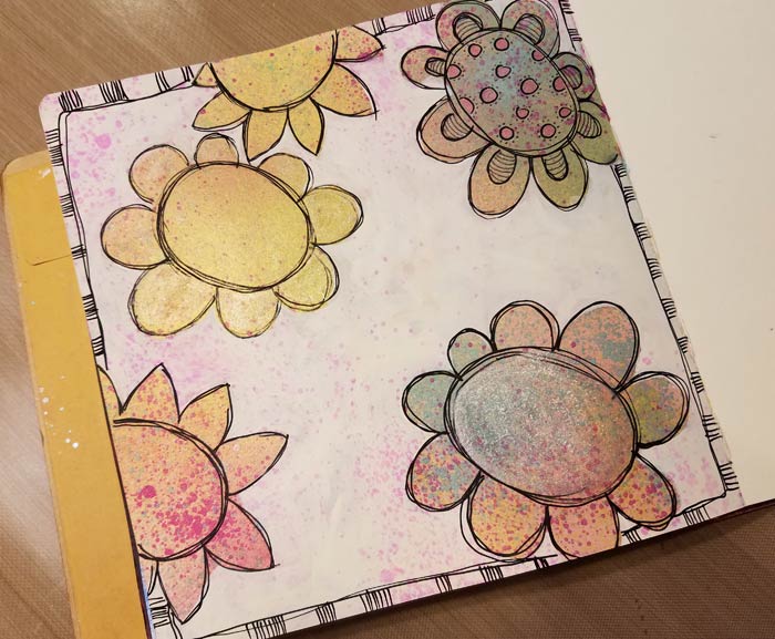
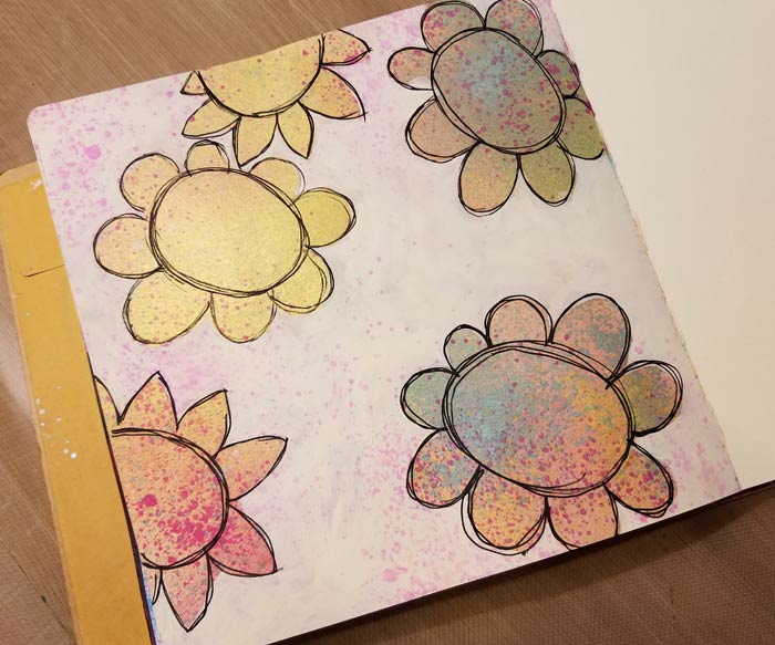
At this point I decided the page needed a border, so I added what you see here and went to work on the rest of the flowers till I was satisfied.
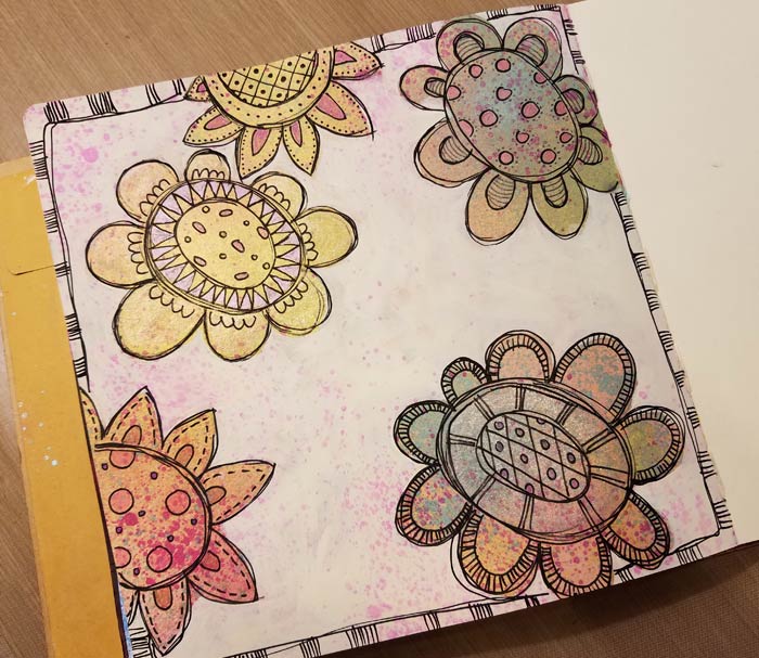
I debated whether to do anything more with the background, but it was getting late and I needed to finish, so I left it alone. My original idea was to cover the negative area to allow the positive space of the flowers to shine – no pun intended – and am satisfied that I achieved that goal.

6 Comments
Even as a tired person you shine with your creativity Barb. I love this page. This will be one I add to my journal.
That’s a lot of work when you are tired. Thanks for your dedication to the process! My doodling at its best doesn’t look that good. Great demonstration of the concept.
Good job, you should be exhausted more often! Hee Hee Bows to the great doodle master.
This is a great idea! Wondering if masks would work too. I may try that as my drawing skills are still at the beginning stages! Thanks for all you do for us.
I am with you Faye, I am going to try masks. I have only a few but for me that’s better. Love the page Barb.
Love the colors and the doodling. Thank you for taking the time when you were tired. G