Welcome to the beginning of May and Week 18 of the Art Journal Adventure!
This week’s page incorporates elements from a number of things I’ve either had in process or continue to work on. The most obvious is the bird – Spike – who is one of the nine Bloobel images that debuted last week. As part of the prep to film the introductory video, I stamped some of each and began to add color. All are Distress Spray Stains, Color Wash, or Dylusions Ink Sprays. As always, they were loaded into Detail Water Brushes and diluted with some water.
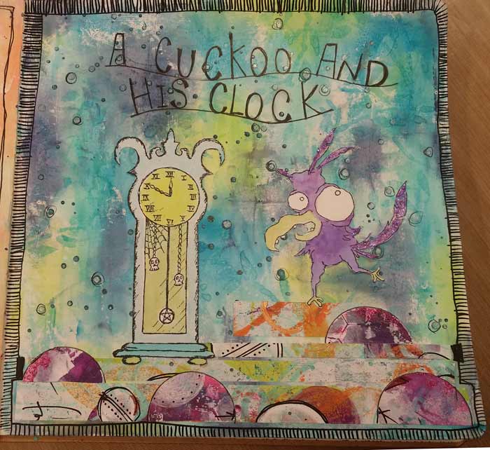
Because my workbench tends to be an accumulation of whatever I’ve been working on, or whatever I may have pulled out to consider using, it’s usually a good bet that there are lots different types of products scattered about. A benefit of that is options to combine ones that I might not otherwise consider using together. That’s how I ended up with the Stampotique Goth Grandfather Clock with Spike. And because my brain works in weird ways, I put Spike with the clock and realized it was a bit of a play on words. Instead of a cuckoo clock I decided I had a cuckoo and his clock. And that’s how we ended up here, with this week’s prompt to illustrate a play on words.
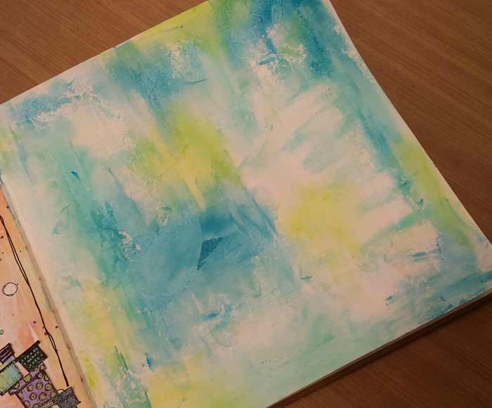
This page began with a thin layer of Dina Wakley’s White Gesso scraped on and allowed to dry. As you’ll see in the photo, I chose colors and then didn’t use them all. That’s just the way it goes some of the time.

My original choice was to use Turquoise, Ocean, and Blackberry Violet, but I ended up subbing Night for the Blackberry Violet And I added some Lime because it felt like the page needed a kick of color.

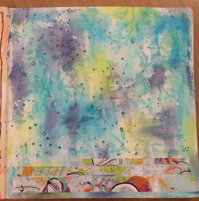
Here’s the completed background. I was very engrossed in what I was doing and missed taking a photo after the Night paint was added, but before I spattered some Petrol Maya Gold Paint.
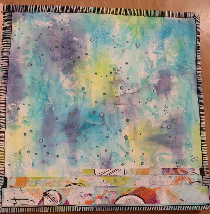
I added a border, because it feels like a page is incomplete with out them. For this one, I used a Extra Fine Black Sharpie Water Based Paint Pen.
Straight lines, when added close together, make a fab border.

Testing placement of the cuckoo and his clock. I need to make sure there’s enough space above them to place the text.

If I’m going to letter, I’m going to lay it out first. That’s the biggest lesson I learned from Week 8’s Lettering Prompt: take the time to put baselines in and pencil in the letters first. If you missed that post, click here to see it.
I grabbed my usual PITT Pen, this time in the “F”, Fine tip. Once the ink was dry, I carefully erased any remaining pencil marks. One thing I’ve learned is that even a PITT Pen will erase when it’s on top of dried acrylic paint like Dina’s or Dyan’s. Acrylic paint is nothing more than plastic with pigment (ok, it’s a little more than that, but you get my drift), so it forms a slick-ish surface when dry.
7 Comments
Adorable!
I love this Barb
Very cute! Now to put on my thinking cap!
I love the new stamps and your journal page. What are paper strips at the bottom of the page?
Thanks everyone!
Gracie – those strips at the bottom are something new that’s coming in a couple of weeks. Wicked fun to make and even more to use!
Even though I don’t have these particular stamps, I am inspired by the background (it appears that you also used a stencil there) and the structure of your painted papers at the bottom of the page. Kudos, Barb.
This is so cute! I don’t have the stamps, but as usual it opens up all kinds of other ideas.