Color and color theory fascinate me. I really enjoy mixing colors and combining them on a page to create a mood or overall feeling.
When I say mixing, I mean the blending of two or more hues to create a new one. Yellow + blue = green.
The “combining” reference has everything to do with using colors together, without necessarily allowing them to mix to create a new one. In the case of today’s page, that means working with colors that when used together, create a lively, vibrant feeling; a complementary scheme. There are other color schemes that are lively and vibrant, but that’s a discussion for another blog post!
If we’re going to discuss color theory, a color wheel is essential. Wikipedia displays this one:
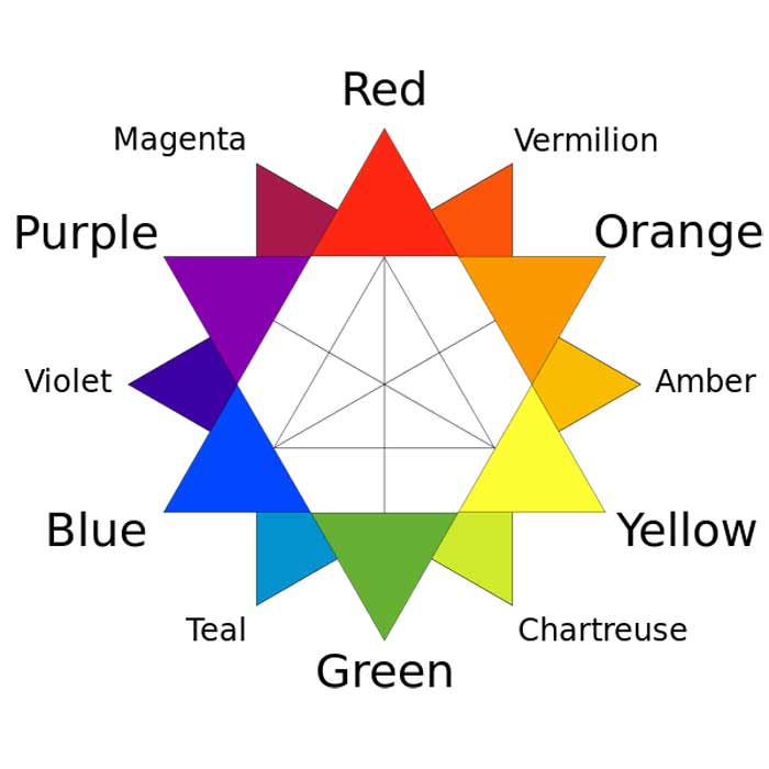
And says “This is a traditional color star developed in 1867 by Charles Blanc. The traditional complementary colors used by 19th-century artists such as Van Gogh, Monet and Renoir are directly opposite each other.”
If you find my orange background color on this wheel, and interpret the “directly opposite each other” more loosely (as I did) as “generally opposite each other”, you’ll see that the complementary colors for orange are green, blue, and purple.
Creating this page began with an application of Dina Wakley’s Gesso, applied very thinly (scraped on really) as you’ve seen in previous weeks.

I wanted softer, more pastel colors, so once the gesso was dry I got out the Dylusions Paint (White Linen, Tangerine Dream, Lemon Zest) and began by applying a light layer of White Linen over most of the page.
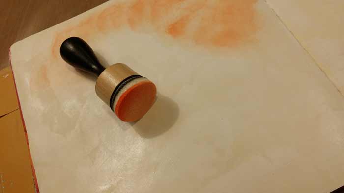
I wanted to blend the Tangerine Dream and Lemon Zest right into the wet White Linen, allowing the mixing to happen right on the page, which offer a more loose and less blended look. Here’s the beginning of the Tangerine Dream. You can see I’m not using a lot of paint in the Mini Ink Blending Tool and that the White Linen is still damp. So far, so good.
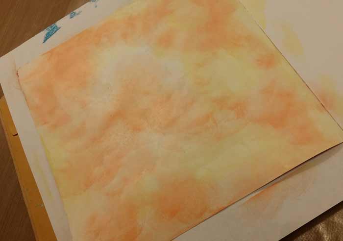
Progress. With most of the page covered with paint, the background was done and allowed to dry.
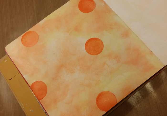
I’m sure it comes as no surprise that I felt the need to include circles! I made these with the Mini Ink Blending Tool. Just apply it to the page and twist to form the circle.
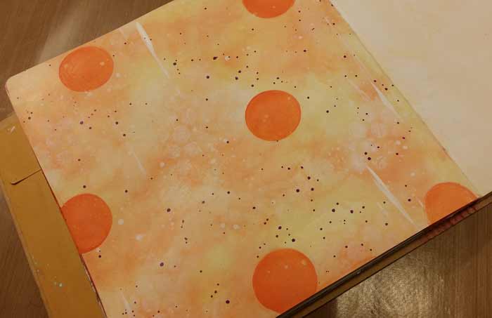
Here comes the first of the complementary colors: Crushed Grape Dylusions Paint was thinned with water and spattered with a #4 Fan Brush.
After the purple spatters were dry I added circles with a Superfine Black PITT Pen and filled them in with white.
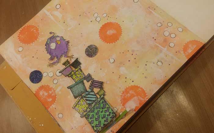
I’ve begun to think about placement of the characters and props and you can see that the complementary colors are in full bloom. I’ve used green, turquoise, and purple to color the images. One of the hallmarks of a complementary color scheme is the high contrast of the colors. They really do pop.
The stamps are Stampotique Piling Thing (CORRETION: That stamp is actually Towering Gifts – apologies for any confusion. You can see Tower Of Gifts here) and Bloobel Quirky Birds #1. I’m also testing the possibility of using glitter circles on the background. As you’ll see I swapped them out for stars…
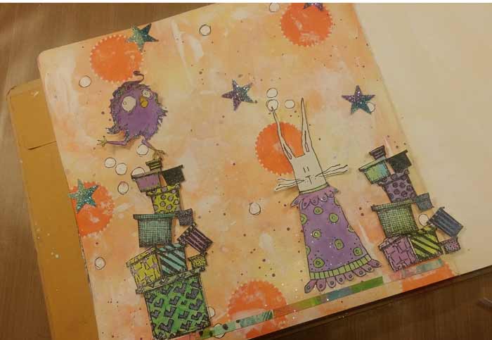
Though I ended up not using the 5 of them you see here. The bunny is another Stampotique image named Frock and I’m using a second of the Piling Things, though for this one I cut the big present on the bottom off. I glued a strip of my Deli Papers (that were mounted on watercolor paper) along the bottom of the page so that figure and boxes were grounded.
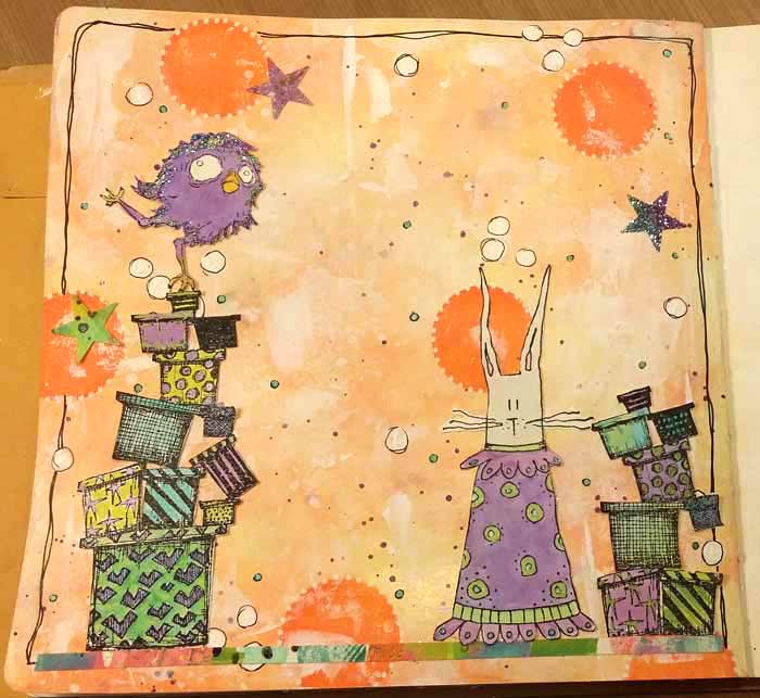
The finished page. I added a simple border (of course!), glued everything in place, and called it done.
13 Comments
This is great Barb! Color theory really makes a difference when planning a page. Love all the stamps you used (Frock is too cute) and the colors are perfect. I noticed that you used different shades of the complimentary colors. I like this idea a lot as it gives more options and creates a beautiful page. Thank you as always for sharing your talent.
What a great card! It would be so much fun to receive a card like this. I really appreciate your details on how you actually put it together, and the use of your color variation is inspiring. Thanks!
Wonderful use of complementary color!
As usual, a fun page. I like the way you use colors.
Fun and simple! Love the colors!
Just received my batch of Funky Flowers. Can’t wait to play.
Kay
Thank you again for sharing your endless and wonderful TALENT. This is sure no exception and hopefully I will give this a successful attempt myownself!!!
Love, love, love this Barb!!
this is the cutest thing …love all of it !
?
Thanks so much for another informational video.Your use of color and space just make the images pop.
Barb,
How did you get the scalloped edges on orange circles?
Hi Debbie,
The circles have white dots all around the edge which is what makes them look scalloped. :+)
Oh, silly me.