Here we are and it’s February 29th – or March 1st any other year – and we’re on to Week 9 of the 2016 Art Journal Adventure. Just over 2 months in and the 9th page or page spread is finished.
By this point in the winter I’m always fed up and longing for spring, which is the theme of today’s page. This time I’m working on a single page as there are less than 52 complete spreads in the Square Kraft Dylusions Journal. At some point I’ll probably tip-in a page which will help get me to 52 for 2016.
This spread incorporates a little lettering, a holdover from last week. As you’ll see I went back to what works; penciling in a baseline and the words before committing the letters with a PITT Pen.
Aside from my desire for warmer weather and flowers, part of the inspiration for the content of today’s page was drawn from a photo one of the members of the Facebook 2016 AJA Group posted. My page looks nothing like Jane’s, but for the fact that we both used flowers as the focal image. Nonetheless, I was inspired by the art she created. Click here to see Jane’s lovely page:
If you have not joined the Facebook 2016 Art Journal Adventure group I hope that you will. The warmth and supportive environment would make even the most dedicated lurker comfortable enough to chime in! Clicking here will take you to the group, which you need to ask to be a member of. Remember, that’s only a formality. Everyone is welcome!

Week 9 began with a piece of 90# Watercolor Paper – leftover from something I demoed while filming Wednesday’s video. The colors, courtesy of FW Acrylic Inks, were mopped off an Accordion Book. (Here’s a HUGE hint: if you would like some of the FW Acrylic Inks – wait until Wednesday to order them. I’m just sayin’.) There was too much on that surface, so I applied the spare piece of watercolor to the book. That caused the color to be spread on the paper too. Once it was dry I stamped a couple each of our Doodle Flower #1, #2, and #3 images using Black StazOn Ink.

These are the three I chose. They’re not quite as lively as I would like, but as you’ll see, Stickles will change that!
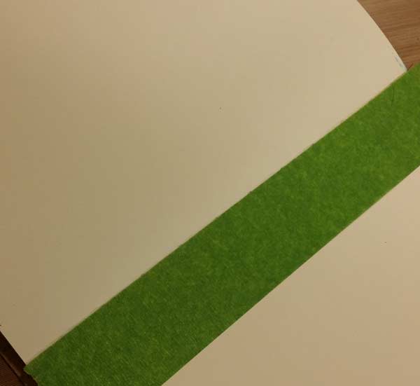
I knew this week would be a single page, so I used some wide Painter’s Tape to mask off the center and over part of the other page. That will keep the paint from where it does not belong,
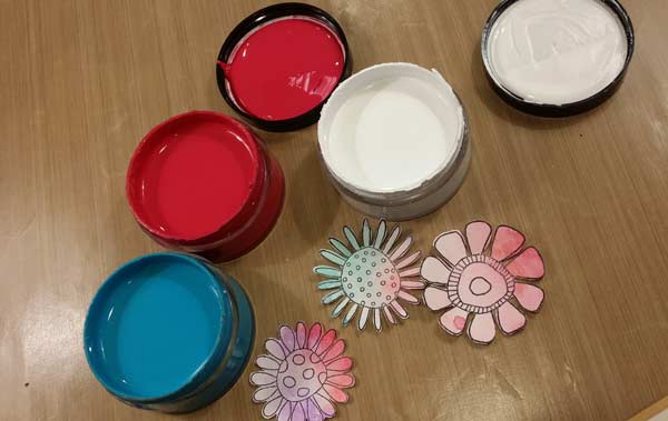
Having used two of the new Dylusions Paint colors in last week’s MidWeek Muse video, and loving the combination, I went right back to them: Calypso Teal and Cherry Pie. I brought out White Linen too because I knew a pastel tint of the blend would give me the look I was after.
Absolutely too dark!

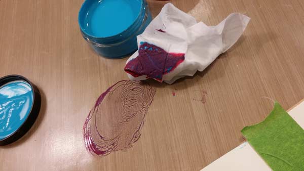
White Linen makes it far more appealing! I applied the color with a baby wipe, going for loose coverage. Ah, white space. How I have come to appreciate thee.
I like this color with the flowers, but still think it’s a little dark, so it’s back to White Linen…
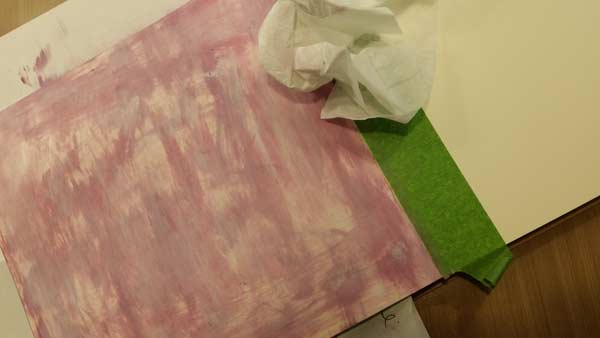
This time by itself on a baby wipe and applied all over the page.

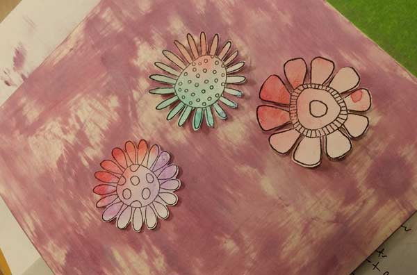
That’s more like it.
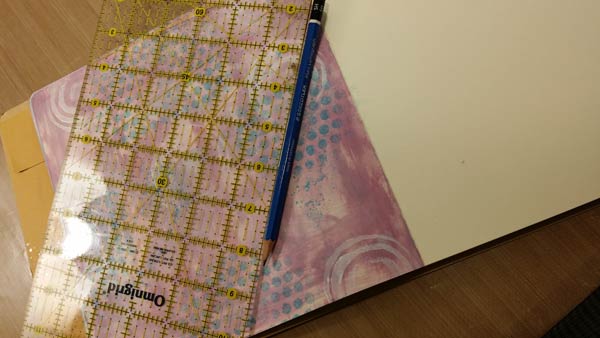
I also decided that the background needed a little help and applied some turquoise spray through our Punchinella Trio I Stencil. Those are 1/4″ dots from the center section and tend to be my go to thing when I want some texture. I’ll do more to the dots, which you’ll see in a few photos. I used a ruler and pencil to mark the baseline for my lettering.
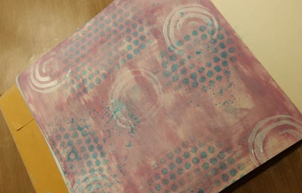
The white circles are from a foam stamp which will be coming. You heard it here first – Foam Stamps are coming to Joggles!

Look closely and you’ll see the baseline and my penciled in letters. I didn’t trace over them exactly, but they did act as a guide.
I also penciled in the stems and the leaves on the page, then…

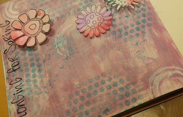
I painted them with a little Genesis Green FW Pearlescent Ink. I also used a PITT Pen to add wobbly lines for the border around 3 sides of the page. At this point the flowers have not been glued in place. Primarily because they need Stickles to make them a bit more interesting.
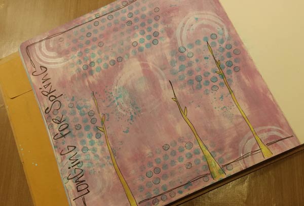
If you look closely, you’ll see that I outlined some of the turquoise dots made with Punchinella Trio I Stencil and added some Xs to a few, just to keep the background from being too samey-samey. I used a really light touch and a black PITT Pen in the SX (Extra Super Fine) Tip. I can make really delicate lines with that pen because the tip is so fine. Some of the time that’s exactly what’s needed.
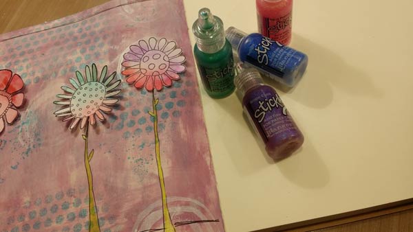
There are 4 colors of Stickles here: Peacock, Grape Crush, Neon Flamingo, and Twilight. I ended up not using Twilight, thinking it was a bit too blue. I used Stickles on the centers of the flowers. Just enough glitter to amp them up a bit without it going overboard. (Is there such a thing as too much Stickles? Methinks not)
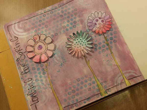

Done! And there’s Week 9 completed. I look forward to seeing your photos in the Facebook AJA Group.
15 Comments
Barb this is beautiful. Did you glue the flowers down on the page or use glue dots to raise them up? I see shadows in the pictures under the flowers.
Hi Faye,
The flowers kind of curled inward when I was cutting around the petals, giving them that raised appearance around the edges.
I only glued the centers and left the petals free and the shapes are glued directly to the page – I did not use glue dots.
Barb
The FW pearlescent inks are wonderful, Barb. I use them all the time with a dip pen to journal or outline on rougher acrylic painted surfaces.
Oops, I forgot to mention that I really like the page. I ordered the six new Dylusion colours today and can’t wait to get them.
Thanks Cathy! I need to get my pen out and use it with the inks.
You’re going to love the new Dylusions colors! Thanks for the order. :+)
Barb
Beautiful page, Barb!
I’m loving all the ideas and really enjoying the tips. Just found your site so I am anxious to get started.
Hi Cindy,
Welcome to Joggles and the 2016 Art Journal Adventure! please join us at Facebook – there’s a group devoted to the project which you can get to using this link:
https://www.facebook.com/groups/1747477262148576/
Barb
Hi Barb,
Awesome page. This one sort of reminds me of your two Joggles stencils, “Skinny Mini Flowers” and “Skinny Mini Flower Garden” – I was just about to dig them out to use on my calendar journal for April.
Thanks very much! I drew the stencil and the Doodle Flowers, so I guess it stands to reason they would be similar. :+)
What a pretty page Barb.
I am finally finishing organizing my craftroom again 🙂 and soon I will be able to resume my art journal pages. I can’t wait.
I am so happy to be part of this group. I have learned so many new techniques to try. Thank you Bonnie for the idea of using oil pastel crayons with gesso for a background — tried this out with this page. I love how it gives texture when used with watercolor paper. I used the FW pearlescent inks with the stamps (I remember Barbara doing this some time ago) and used the lettering technique from last week. Thank you again Barb for these wonderful blogs!
What a wonderful page – thanks so much for sharing your work.
It’s fabulous to see my ideas translated into actual pages and art!
I enjoyed making the flowers, but I obviously still need to work on my lettering.
My take on Week 9