With Valentine’s Day looming this weekend, I decided that week 6’s page spread should probably feature hearts and colors in the pink/red family, plus I knew I wanted a heart shaped tip-in. That’s more or less what I ended up with – which doesn’t always happen as my muse often has ideas different than mine – and with the exception of using Dina’s Blackberry Violet paint which is my little twist on the traditional colors of the day.
Though I took photos of my process for adding gesso and paint to the spread background, I’m also going to refer you to one of the videos where you can see it in real time. A link to that video will be there, with photos of the process of applying the paint. Count to the 11th photo in this post and you’ll find the link. Click it and the page will open in a new window so you don’t lose your place here.
Onward to week 6…
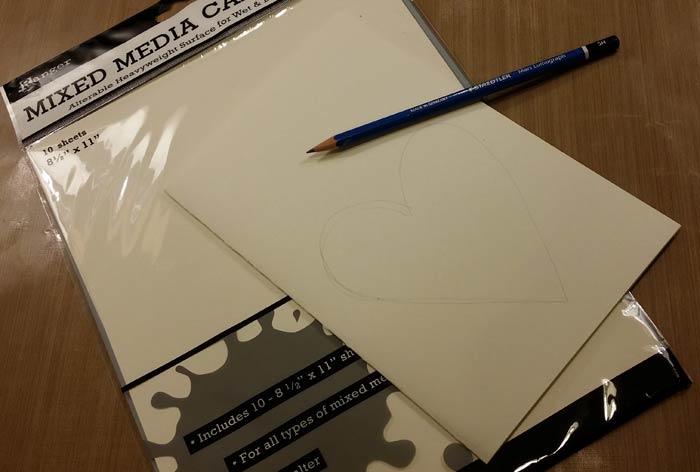
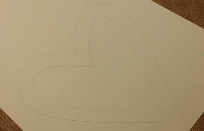
Since the pages in the Dylusions Square Kraft Journal are Ranger’s Mixed Media Cardstock, it seemed sensible to use that to make the heart tip-in. Sketch a heart shape on the paper and cut it out.

And then sketch and cut a smaller heart from the center. Hold onto both pieces!
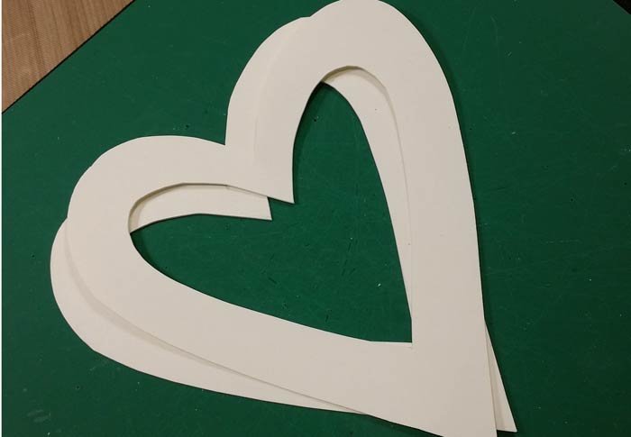
Since this is a tip in, and because I wanted to have a Fantasy Film center, you’ll need two hearts with the center removed.
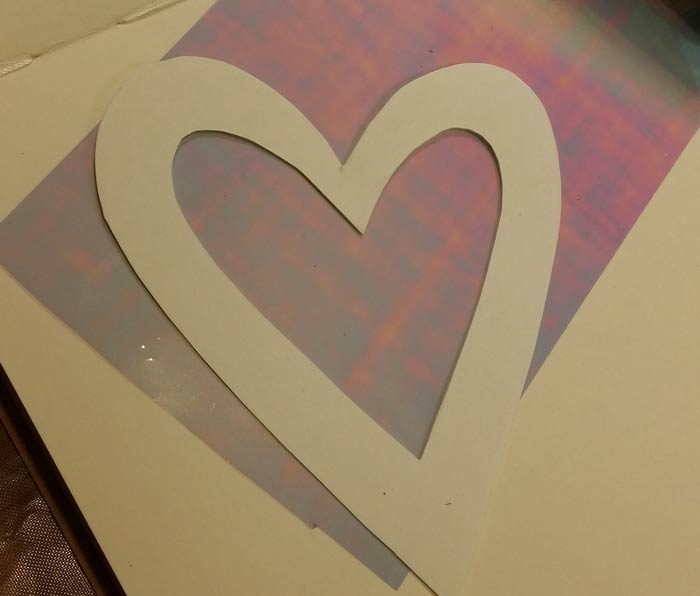
Cut a piece of Fantasy Film to the rough size of the heart, but do not glue it in place yet.
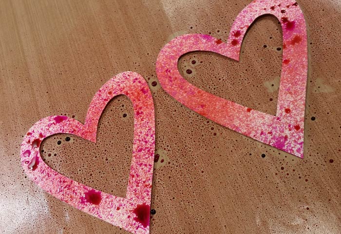
In addition to the 4 colors of Dina Wakley’s Media Paint, I used 3 colors of Lindy’s Starburst Sprays: Autumn Maple Crimson, Bougainvillea Fuchsia, and Hi Maintenance Magenta. Spritz them on the two hearts – you only need to spray one side of each since they’ll be glued together. See all of that luscious color surrounding the hearts, just sitting there on my Nonstick Craft Sheet? Don’t waste it! Move the hearts somewhere to dry and then use a sheet or two of Deli Paper to mop up what remains. Smile inwardly at your creative resourcefulness.
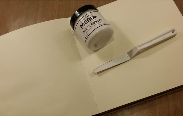
The next photos demo my process for applying a thin layer of Dina’s White Gesso to the page spread using her Palette Knife till the entire area has a haphazardly applied and very thin coat…
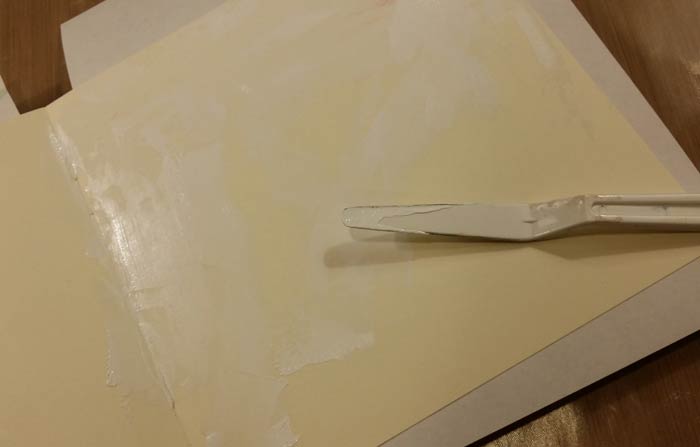
Let it dry. Completely. Or. You. Will. Be. Unhappy.
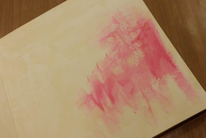
This is finger painting at its finest, no brushes required. Complete coverage is not what you seek. Beginning with Magenta Media Paint, apply a little with your fingers, scrubbing it around till you’ve made it a nice, thin layer. See the imperfections? You want them, so don’t try and cover the finger marks or fill in the rough areas where the gesso was not applied in a smooth layer. The color is darker in some areas too. That’s character and you want plenty as it keeps the background from being flat looking and boring.
Apply Magenta to other areas, but do not feel as though you have to fill it all in. Leave some for the other colors. Move on to Dina’s Ruby, using the same technique to apply it.
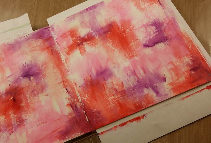
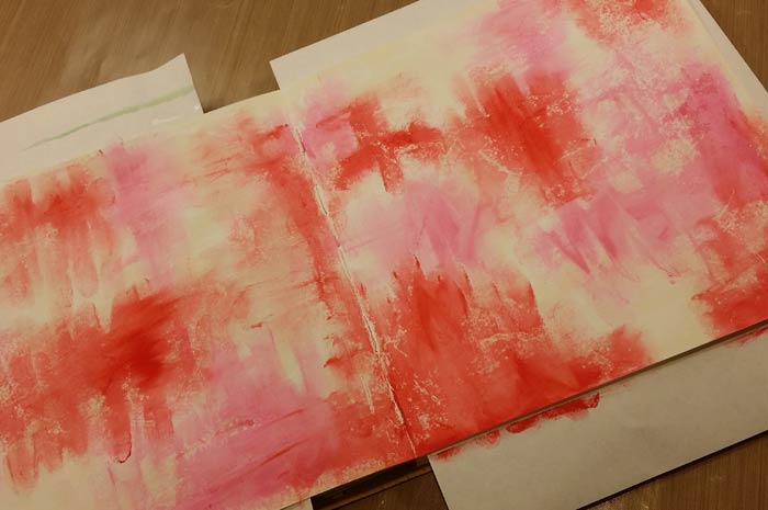
And do the same thing with Dina’s Blackberry Violet Media Paint.

Decide that the colors are darker than what you think looks good and apply Media White Paint to knock back some of the depth and add a little white space as relief for your eyes. Or not, depending on how you feel about the colors!
The video where you can see this process of applying the gesso in a very thin and uneven layer, then applying the paint with your fingers is here, part of the Art Cards project.
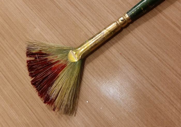
I liked the background at this point, but knew it needed splatters. Shake one color of the Starburst Sprays to distribute the pigment and mica, then tip a little out onto your Nonstick Craft Sheet. Using a Princeton #4 Fan Brush, pick up the puddle and get ready to splatter. (cover the things you don’t care to splatter) You can dilute the Starburst Spray with a little water if you want. I didn’t, but it meant I needed to use more of the color in order to have enough to cover the entire spread.
With the bristles positioned above the page spread, grasp the brush in you dominant hand. Extend a finger from your other hand and tap the handle of the brush against it. This will cause splatters to magically appear on the page spread. Repeat until you’re happy with the coverage.
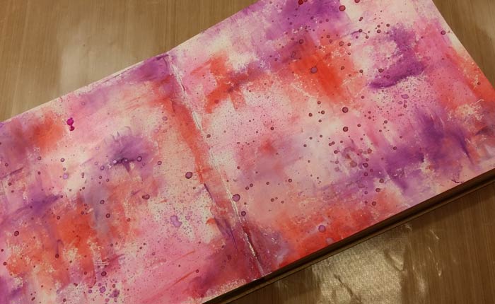
Decide that all looks good, but still a little dark, so get out the Palette Knife and the Media White Paint and randomly scrap some across the entire page spread…
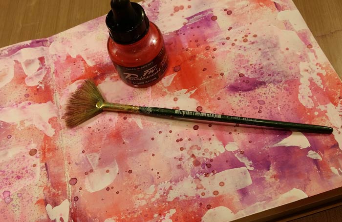
And get out the Daler Rowney FW Pearlescent Ink in Hot Mama Red and splatter more. Ah, that’s more like it!
It’s almost time to assemble the heart tip-in, but before you do, trace one on a half sheet of Media Cardstock. You’ll need 2 of the smaller hearts to use on the spread. Cut them out and set aside.

Since the Fantasy Film is a slick, nonporous surface you need a glue appropriate to it. Aleene’s Super Thick Tacky is perfect. Trim the Fantasy Film to a shape that roughly mimics the opening and glue it in place. Repeat with the other piece. Test fit before applying the glue to make sure you do not have one reversed. You’ll know immediately because the shapes will not align properly. Your tip-in is almost complete!
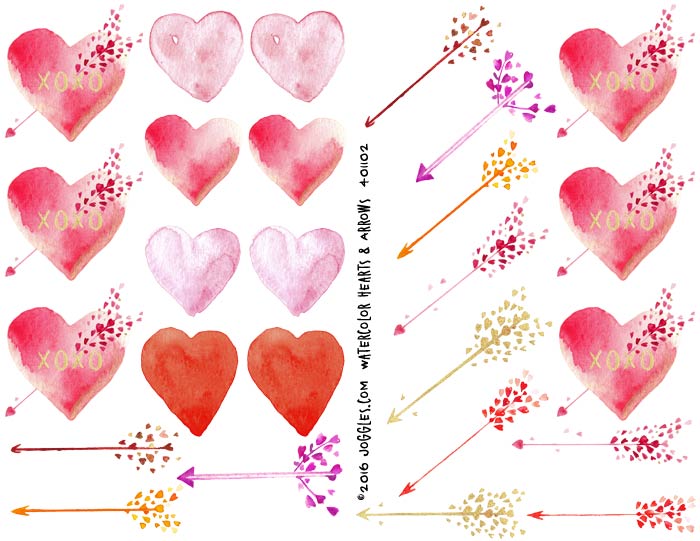
The arrows from this collage sheet, Watercolor Hearts & Arrows, are going to add a perfect finishing touch to your hearts and some other elements. I used almost all of them except the gold ones. Start cutting! In the next photo you’ll see how I carefully cut around the little hearts that are the fletching on the arrow. Just leave a little white border and cut rounded shapes around the hearts…
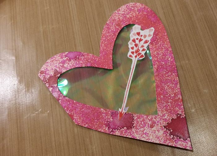
Easy and it looks wonderful. This is my assembled tip-in. There is a arrow on both sides to complete the look. Place the heart in the center seam of the page spread to get an idea how much you need to trim off of one side to get the heart to sit snugly. Eyeball it. Really. Trim similar to what you see here and the tip-in is ready to go.
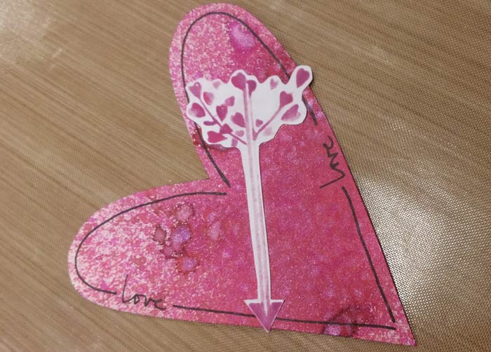
Grab those 2 smaller hearts you previously cut and spritz them with the 3 colors of Starburst Sprays. Unlike the heart tip-in, I went for more coverage. Let them dry, then use a PITT pen to outline the border, adding the word ‘love’ in a couple of places. Grab one of the arrows you cut out and glue it in place. Do this to them all.

Using a half sheet of the Mixed Media Cardstock, spray with the 3 colors of Starburst Sprays and splatter with the FW Hot Mama Red Pearlescent Ink. Let it dry or hurry it along with your heat tool.
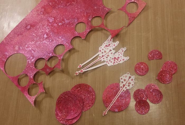
Cut or punch a couple of different sized circles from the half sheet you just colored and dried. More arrows – cut ’em out! I scribbled spirals of Stickles on the circles and let it dry. As you can see, the plan is to layer arrows on top.

Glue them in place. I ended up with 4 large circles, which with the 3 hearts (the tip-in and 2 smaller ones), gave me an odd number of larger elements on the page. Odd is good. And not just for numbers…

Here’s my rough layout of the elements. Nothing is in place yet, but I like the arrangement. I made a point of turning the circles so that the arrows were pointing in different directions. The first thing I want to get in place is the tip-in, but for that I will need to make a piece of tape to hold in in…
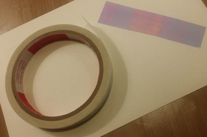
1/2″ Scor Tape will do the trick. Cut a length of Fantasy Film and lay it on the exposed adhesive of the Scor Tape.
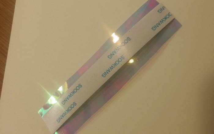
Trim with scissors. Use the edge of the backing on the tape to guide the scissors and get ready to attach the tip-in.
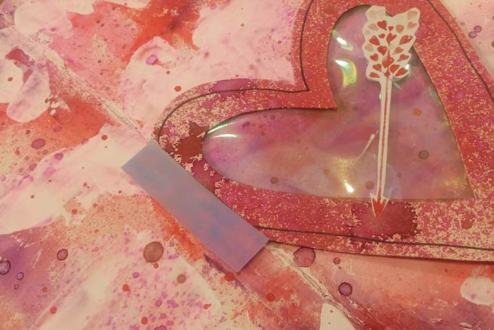
Cut a length of your custom Fantasy Film tape, peel the backing paper off and apply, visually splitting the tape so half is on the heart and half attached to the page. Press into place.
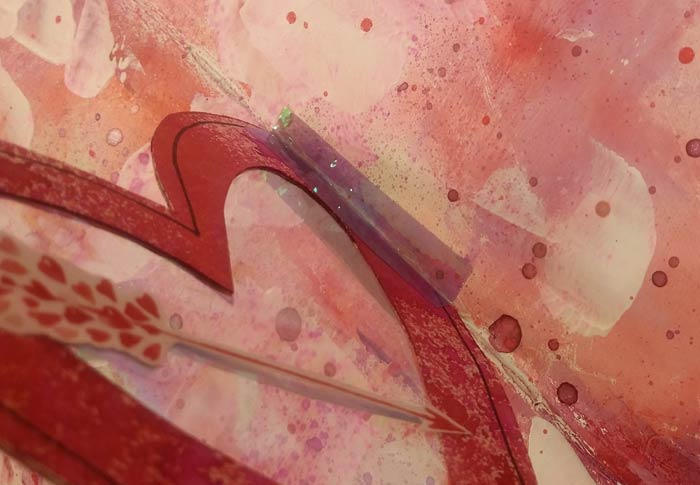
Do the same thing to the other side and flip that thing back and forth. You just added a page/tip-in to the spread!
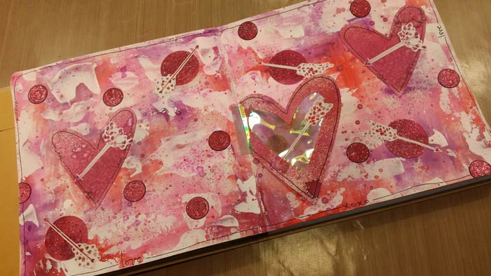
Glue the remainder of the shapes in place. Use a PITT Pen to write a few words around the border, much the same as you did with the small hearts, then draw a single line border around the spread, skipping around the words.
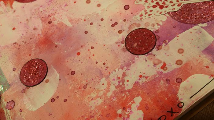
Because the colors are so similar, and because these circles are reasonably small (about 1″ in diameter) I outlined them with the black PITT Pen. It helps separate the shape from the background, making them pop a little.
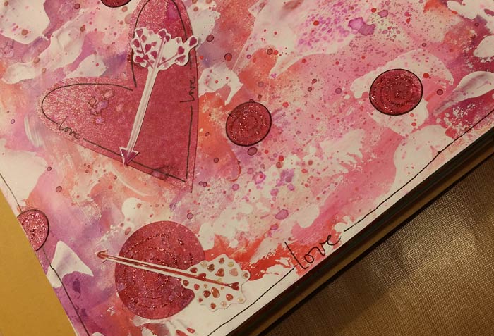
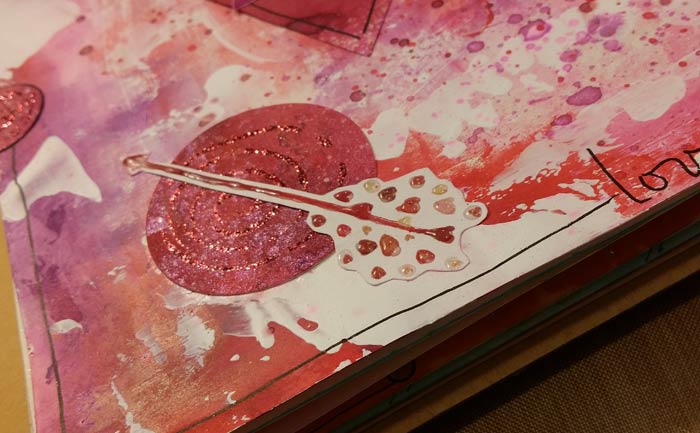
If you look closely at the hearts in the fletch of the arrow, you’ll notice a little shine and dimension. Use Glossy Accents, adding a tiny drop on each heart to emphasize it. Let dry before closing your journal or everything will stick!
10 Comments
Gee Barb this looks hard. I will do my best and see how it plays out.
Barb….I think I would have added a bit of Heart and Love confetti in the Tip In Heart….This is a very cute page…I love it.
Cute project! My fantasy film has been languishing. Close to the end of the post, I thought maybe we were going to make pepperoni pizza with all those red circles! Now I think I need a snack before journaling. 😉
I love your pages! I have been meaning to try a tip-in. I have the film on my desk and keep moving it around!
Love your valentine page with the tip in! Thanks for sharing.
Yummy layers and texture on this page. I love the idea of a tip-in and have just added Fantasy Film to my wish list. The shimmer and shine on this spread must be incredible in real life. Lots of ideas here to spark my imagination. Thanks, Barb!
Great page! Thanks for sharing new ideas. It is all about learning new techniques, so I was determined to give it a try. As I am doing only single pages, placing the tip-in in the middle just didn’t work for me. So I repositioned it on the page itself and made it so you could look behind it. Not sure if this still would be called a tip-in though. Fun to try. I have glitter in between the layers of the heart.
This is with the tip-in open.
Being new to this kind of thing, I have been trying to follow the general composition of Barb’s pages as best I can. I have so much to learn! Didn’t have all the same products, but came up with alternatives. Will have to order some of the Lindy sprays soon tho! Used alcohol inks on acetate in place of fantasy film that I don’t have…I tend to like brighter, more vibrant colors, and that showed up in by background, I think! Thx for the inspiration, Barb!
Guess I could add a pic with the tip in flipped over…..