Welcome to week 3 of the 2016 Art Journal Adventure. I hope you’ve enjoyed working on the spreads for weeks one and two. Please share the project with your art buddies and friends as it’s not too late to participate. I’m always happy to help if someone needs a bit of advice or encouragement. Joining in the fun is what’s important, not when someone begins.
The theme this time was to work with circles. Simple enough, right?
Uh, no. A lot of the time I felt as though I was working in circles, chasing my tail as I tried to decide where to go. Despite my thinking I knew how I wanted the spread to be, the process of putting the idea into practice left something to be desired. I started with a circle, drawn in pencil on the right page in the spread…
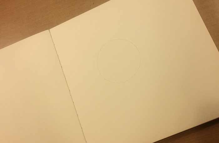
Then wondered where in the heck I was going. After some deliberation…

Dictionary Pages seemed like a good choice instead of drawing circles directly on the page, so I cut out a bunch of varying sizes and placed them on the spread. I like this. (at freaking last)
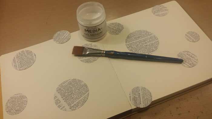
Dina’s Gel Medium and a wide flat brush work well to adhere the circles to the pages. I made sure to let some hang off the page to give the appearance of the design carrying on past it. Once the Gel Medium dried I used scissors to trim the overhanging circles even with the edge of the page.

Now it’s time to begin to fill in the background. I want a soft, blended look so began by using a baby wipe to lay down Dylusions White Paint around the circles of Dictionary Paper. One of the reasons I chose Dylusions Paint is because the jars are wide mouth, making it easy to dip a baby wipe in and grab a dab of color. Since I wanted the white paint to soften and blend into the other colors to come, I worked on roughly half of the spread at a time. That way it wasn’t dried out by the time I came back with the other colors.

On to those other colors. I decided to keep my palette warm, so chose Lemon Zest, Bubblegum Pink, and Postbox Red in the Dylusions line, and used a separate baby wipe for each to avoid mixing them. If the white on the background has dried to the point of not blending with the color you’re adding, dip your baby wipe into some white paint and blend it with the color you’re adding by moving the baby wipe around in a circular motion on Nonstick Craft Sheet or palette. Once it’s blended, begin to apply it in circles around the cut pieces of Dictionary Paper. Use a light touch and plenty of white if you want a soft, pastel look. For stronger colors, use less white and more of the color.
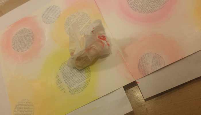
I like this look, but the colors around the paper circles have gotten a little darker than I wanted, so…

I added more white around them. You can see that I laid it on reasonably heavily to soften the look.
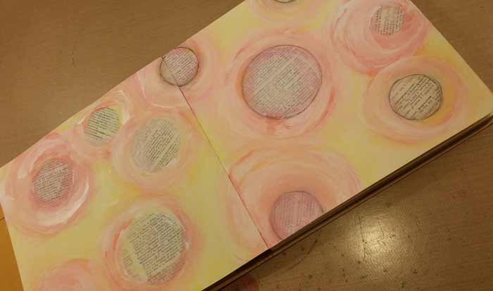
Then I decided the off white background looked too stark. Out comes a baby wipe and I picked up some White and a little Lemon Zest, blended them on the wipe, and then applied the color around the circles. Better now with the soft yellow background. Let it dry till every last bit has set. (or you’ll have very unhappy markers, pencils, and pens)
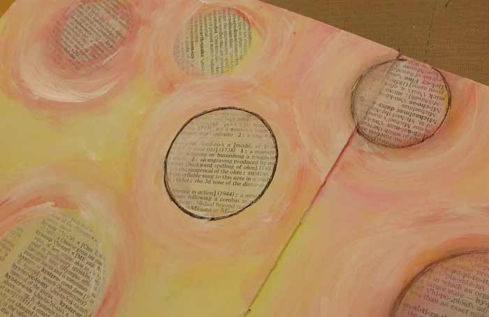
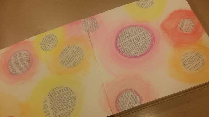
Now it’s time to add something around the Dictionary Paper Circles so they stand out from the background. A Charcoal Pencil drawn around the circle gives a dark line which was a bit too much (the large one in the center with the very dark black around it), so I smudged it with my finger…
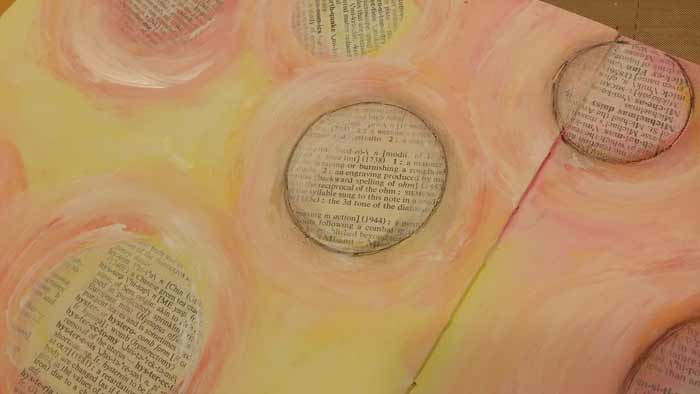
And it looked better, so I did it to all of them. Then I decided the black circles needed a bit of something more.
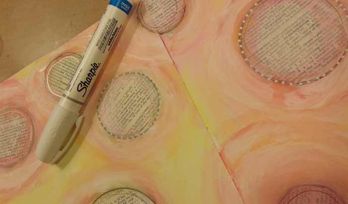
And in came the Sharpie Water Based Paint Pens, a white one with a medium tip, so I could dot around the circles. I like this too, so dotted around all of the circles and added a second row in some cases. I used a Superfine PITT Pen…

And drew a second round of small circles around a few of the Dictionary Paper Circles, then dotted inside of them with the White Sharpie Paint Pen.

The spread still needed something, so I brought out the Daler-Rowney FW Pearlescent Inks in Hot Cool Yellow and White Pearl. With a round brush I mixed the two colors of Ink together, then with water (just a tiny bit) and swirled circles around each of the circles. Yup, I like this much better now!
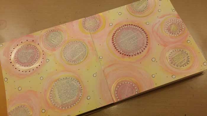
And then I didn’t, so I used pick Stickles to fill in some of the outer dots. You’ll also notice that I’ve filled in the yellow background a bit, drawing small rounds, filling them in with white and tiny ones that I dotted a tiny bit of metallic Gelly Roll Pen in to fill them. That’s better and this spread is finished. (and I’m relieved, truth be told. Some just are stubborn – this was one)
If you decide to place an order for items you need to create the spread – or other stuff – be aware that we currently have a discounted shipping promotion running if you spend at least $50, excluding Gift Certificates, shipping and any sales tax. For orders shipping domestically to anywhere in the US, we’ll discount the cost to ship your order by 50%. International folks who spend $50 will receive a 20% discount. Express Mail (domestic or international) is excluded. You will see the discount applied as you checkout. The offer is valid until 11:59 pm ET this Friday, January 22, 2016.
We continue to look at options for everyone who is participating in the AJA to post their photos. We’re getting close, I promise! It’s just a matter of making a final decision and getting the software installed.
Barb
26 Comments
It turned out great Barb! I’m enjoying your process so much and learning a lot also. Thanks for sharing.
Bobbye
Great page Barb. Have you tried a black stabilo pencil instead of a charcoal pencil ? They work great. Just go over the pencil lines with a damp brush and it gives a great smudged effect.
I use both Generals Mark and Wash and the Stabilo. General is available locally and is a lighter shade than the Stabilo.
I loved this project but truth be told I got a tad obsessed. Many hours went into creating it and I hope the pictures I sent can someday be posted.
By the way I chose the Rediform Technique. I saw it on Stamp TV . I looked for other sourses, came up with just a few and incorporated all I learned into the two page spread in my journal.
Stunning page! It makes me think of shimmering snowflakes — and sunshine all at the same time!
ooh!!! pretty! playing this afternoon 🙂
Thank you! You have inspired me to get regularly involved with my journaling again (I do write on pages too.) Looking forward to uploading Ability in the future!
The colors just makes one feel happy. And there is just something appealing about circles, all sizes! Nice spread.
Very pretty and soft pages – love pastels!
I love this page. My charcoal pen would not show up, so I used a Stabilo pencil also. The only problem was, it smeared if it got some paint on it.
LOVE THESE PAGES!!! Going to try my hand at this this a.m.
Your ideas are a wonderful catalyst for me and have not followed you exactly but my mojo got going and that is a wonderful thing ~ Yes, I agree would nice if we could post our creations somewhere ~ I put one on my blog ~ the ‘grid’ ~ and that works ~ would love to see the group’s work ~ Happy Week to you ^_^
I liked it very much.. as i do with all your things..have a happy week
I LOVE this spread! It’s lovely in its simplicity…yet I know that a lot of work went to to make it.
Hi Barb – I also started on a weekly art journaling project this year – Journal 52 – where they send you weekly prompts. I’ll probably alternate with your weekly ideas though to shake things up! Having fun with it so far — I like the little “nudge” to do something every week.
Hi! I used your circle and text page prompt as the basis for my 2-page spread. Since I do write in my journals, the right-hand page is ready for notations.
Here is a closeup of the left page. Because of the porosity of the handmade paper, I used a gesso base, then matte gel medium through a Dina Wakley stencil that had a spiral. Color was from Golden High Flow acrylics (like acrylic ink) and from iridescent sprays like Lindy’s. The text is from an old French dictionary.
I used several different circle stencils and stamps for my background. Then used circles cut from dictionary pages and from deli paper — and one of my favorite quotes!
Faye, I love your circles. The variety you have put in them is so cool. And the words, oh my!
I started with paper coasters I had just sitting around, and that choice dictated my color choices for the rest.
Wow! I love seeing everyone’s pages! Mine seems so plain! But still feel like I’m learning things….
ok, so i want to join the art journal with you guys. i had made my first page after watching one of barb’s videos but didn’t realize about the journal adventure but since i have many circles in my project i want to share it here and then i will do my best to get caught up with your adventure. 🙂
sorry about the size of my upload. i will keep in mind to resize it next time.
Love everyone’s work and enjoy doing the weekly page. Didn’t start wright on time, but able to catch up now. I’m having a problem and wondering if anyone else is: It’s with the Sharpie Paint pens, I can’t seem to get them to work properly. I follow the directions to the letter, and everytime they leak and leave a big mess. The first time I pitched the pen the second contacted Sharpie and they sent me a new one, haven’t tired it yet, that was the fine points, now my bold pen is doing the same thing. how am I messing these up so badly! I can’t afford this.
Hi Trish,
The only time I get the blobby mess like you describe is if I press down too long on the tip which causes too much paint to flow. You should only need to shake the pen a little every now and then, and depress the tip to get the paint to saturate it. Just a second or two is all it needs.
Barb
playing with my circles today. 🙂