We’re on to week 4 already and it seems as though the last few have slipped by incredibly quickly. If you’re new to the AJA (Art Journal Adventure), welcome! If you’ve been working along with me, welcome back! If you haven’t begun but would like to… just do it! Start whenever you can and don’t worry about the previous weeks.
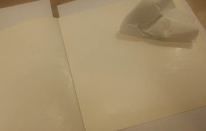
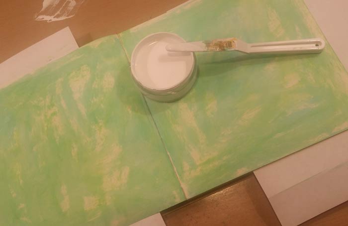
This time I decided to get a head start on Valentine’s Day by incorporating hearts into the page spread, using what I thought would be just one of our Watercolor Hearts Collage Sheets. Eventually I used all three, but I didn’t want to be all Valentine’s Day though so went with cool colors for the background. Once again I’m working with Dylusions Paint and began this spread by applying a coat of White Linen to the entire background using a baby wipe.
I wanted the colors of the background to be soft and I knew the white would do that to the Cut Grass and Vibrant Turquoise. The next three photos show the progression as I applied the colors…
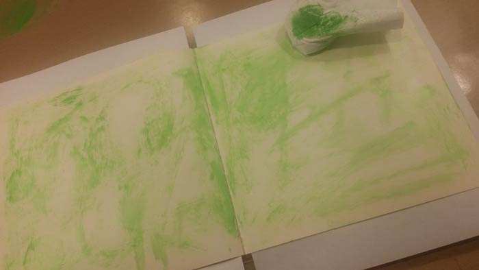
A light, scribbly coat of Cut Grass, then…
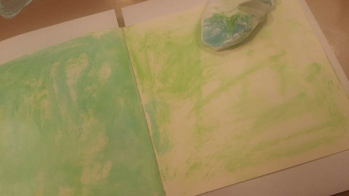
Vibrant Turquoise on the left side of the spread. See that tiny little puddle of color in the upper left corner of the photo? It’s where I softened the Vibrant Turquoise before I even applied it to the spread. I took some of the white on the baby wipe, then dipped it into a tiny bit of the Vibrant Turquoise and smooshed it around on my Nonstick Craft Sheet to blend the color before I applied it to the spread.
Better… both sides are done, but I felt like there wasn’t enough white space so I added some…
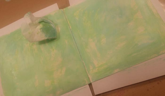
By spreading more of the White Linen on the pages using a Palette Knife to randomly smoosh the color around.
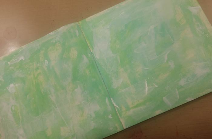
Ah, I like this better.

Time to add some spatters using Waterfall Green Daler-Rowney FW Pearlescent Ink and a Princeton Fan Brush. Using the eyedropper that comes in the cap of the ink, squirt some of it on your surface (shake it well first to distribute all of the pigment!), then pick up some water in the fan brush and thin the ink a bit. Load the brush by dipping the bristles in the puddle of color, then tap it against the finger on the hand you’re not holding it with to make spatters.
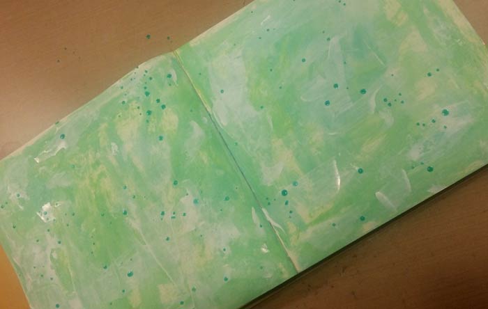
All splattered and waiting for them to dry, but I think the background needs a bit more movement and color, so…
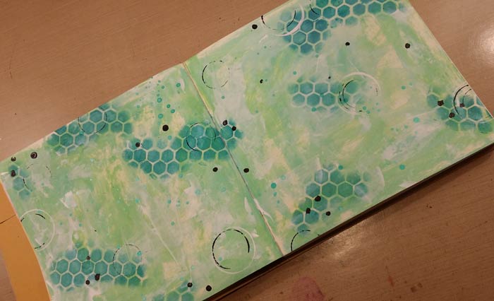
Out comes our Punchinella Trio I Stencil and I used the hexagon section, applying Vibrant Turquoise Dylusions Paint with a Mini Ink Blending Tool. See how much darker the color is right out of the jar? That’s why I decided to soften it with white before applying the color over the background several steps ago. Having done that gives me the freedom to use the color without altering it at all and the contrast is perfect. Some black paint on the end of a paint brush makes the black dots and some black and white circles made with varying sizes of prescription bottles finishes things. On to the hearts.
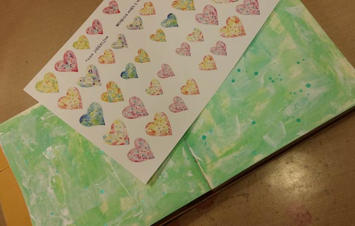
This one is Watercolor Hearts II Minis and was all I thought I as going to work with. Eventually I brought in Watercolor Hearts I which features much larger sized hearts and the sheet named Watercolor Printed Hearts which have a different look and feel. Once I was finished cutting them out and arranging them on the background the spread looked like this…
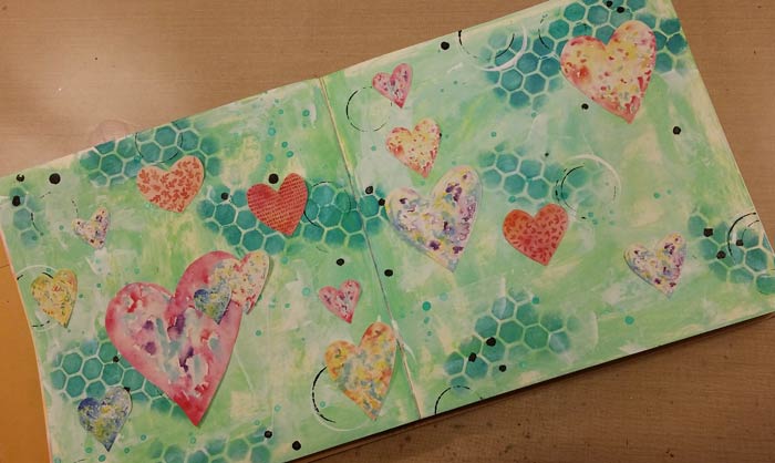
And it was time to glue the hearts in place.
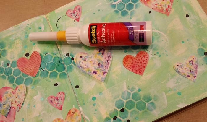
I like Scotch Quick Dry Adhesive for applications like this since the glue is dry almost as soon as you put the piece in place. You have maybe 10 seconds to make adjustments, then it’s in place and you can move on. For a liquid glue of this viscosity, our 18 gauge Fineline Applicator is the best choice. For this 2 ounce bottle of glue you need a 20/410 style. If you want one of them to put on your bottle of glue, click here to go to the exact one you need.

The hearts looked like they were floating on the background, so I used a Charcoal Pencil to apply a dark line around each one – see the red/orange printed one in roughly the center, to the right of the charcoal pencil? Once you draw around them, smudge the dark, black line with your finger to soften it. The ones to the left have had that done. See the difference? That color around each grounds them, settling them on the surface rather than having them look like they’re floating in space.
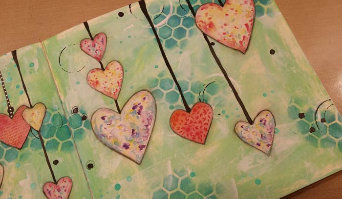
I wanted the hearts to look like they’re dangling from the top of the page, so painted hangers to each. I thought they looked too stark and boring, so added white dots with a Sharpie Paint Pen. You can see just a hint of that on the ones all the way to the left.
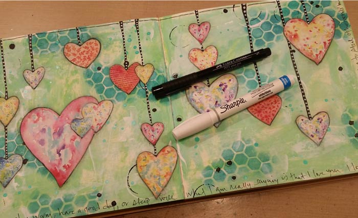
Yup, that looks much better. From there I used a PITT pen to create the border at the top of the page and to write the quote around the other three sides.
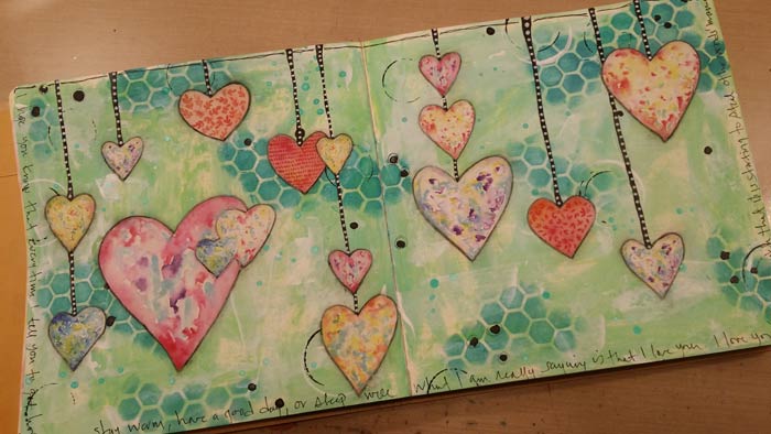
Finished!
21 Comments
very pretty
Love this! I think using heart punches and gelli printed papers would be awesome, too. OR, maybe the alcohol inked deli papers!! I can’t wait to start.
I love this page sooooo much.
Thank you Barb.
Lovely creation like the ‘white linen’ paint for various reasons and the overall effect is wonderful!
Thanks, Happy Week to you ~
Carol ^_^
Oh Barb, this is sooo pretty! Just love it!
Great journal page, Batb! I’m really enjoying your weekly adventure; very inspirational & I appreciate all the techniques. And thanks for the “tip” re: the fine tip applicator for the Scotch Quick Dry.
Your page is beautiful and I especially like that you have them dangling – wonderful.
Barbara this is beautiful! I absolutely love your journalling too it really resonates with the page, adorable xx
this is last weeks entry..I didn’t have a dictionary (not a hardcopy anyway), so I used the Tim Holtz ideology paper.. It was fun to do.
I love your page! Great idea to use the tissue paper.
Thankyou Barb for such a lovely Valentine’s focused page that wasn’t too “gushy” – could almost be a quilt. Thankyou also for your easy t follow instructions that don’t use a huge amount of supplies, I really appreciate it.
Thank you for a great Art Journal page technique and tutorials, Barb. This was very inspiring so I will give it a try. I’l come back with a Picture of my version when I’m done.
Hugs, Anita
Just beautiful! I’m lovin’ the Dylusion paints as well!
Love this idea. Here is my heart page. I changed my mind several times so have many layers of gesso and paint! But am finally happy with the result. This is one of my favorite quotes.
My picture is not great so it is hard to see the last part of the quote. The quote is—-A heart that loves is always young. I had a lot of fun doing this one. I learned a lot too.
I loved this spread and just had to play along, tweaking it a little to make it my own and using what I had available. It was great fun! Thanks for the inspiration, Barb. Now I need to go back and do last week’s prompt 🙂
I always enjoy your posts !!!
Here is my Heart page. I’ve used gesso, Dylusions Paint, Alchohol Ink, Posca Pens, stencil and my own home made Design paper (for the hearts).
I have so much fun making this doble page! 🙂 Thank you Barb for the “Challenge”.
I love all the creations with the hearts ~ I didn’t get to it as ‘life interrupted’ but hope to post one this week ~ Thanks, Barb for your wonderful ideas ~ it give me motivation and I may not do exactly what you do but I am just glad to be painting and/or collaging ~
Happy Week to you ^_^
Love everyone’s colorful pages. I used deli paper for my hearts
Hi, I am new, just love the hearts so thought I would have a go. I am a folk artist so new to art journaling but love the freedom of the work!
Have only limited recourses yet but use what I have.
Thank you very much for sharing your work.