Hi everyone! Welcome to Week 6 of the 2017 Art Journal Adventure. It’s Bonnie here today with a change of pace …for me anyway. The prompt this week is to use a subtle colour palette. I chose a blue-gray, brown including kraft, and cream…a big change from my usual brights, black, and white.
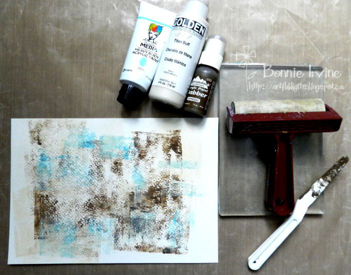
I began with a 7×10 inch rectangle of cold press watercolor paper, choosing the more textured side to brayer my paint onto. Often when I use my brayer to apply paint to the background, I also use my 5 x 7 gel press plate so that I can pull a few prints at the same time. I started with Golden Titan Buff, just skimming the brayer over the paper here and there so that I wouldn’t get solid coverage. While I kept the paint going horizontal and vertical, I did turn the page to change it up a little. Next was Adirondack Espresso, followed by Dina Wakley Media Sky Acrylic Paint.
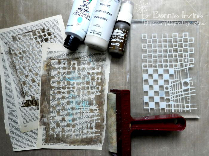
While I had the cream and brown paints on my Gel Press Plate, I layered Carabelle Studio Squares and Circles Art Template over them, pulled a print onto book paper, and then removed the template so I could pull the reverse print onto another sheet of book paper. When I brayered the blue onto the page background, I also scuffed a little onto the book pages.
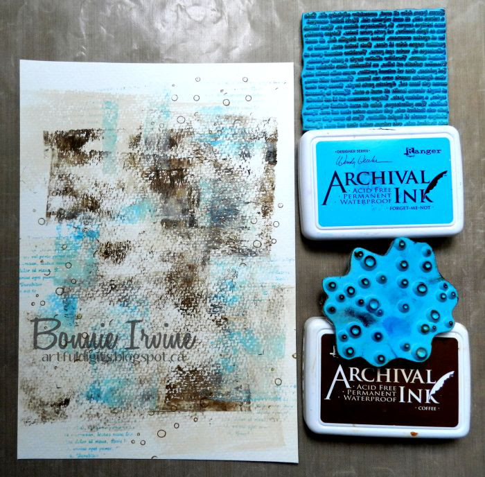
Coffee Archival Ink was used to apply Joggles Background Noise – Circles stamp here and there. Forget-Me-Not Archival Ink was used to stamp Joggles Nonsense Latin Text mainly around the outside because I knew I was covering the middle of the page.
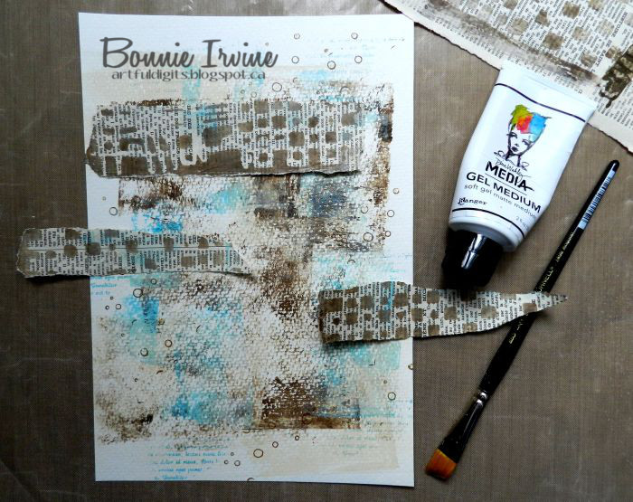
Here’s where those Gel Press prints came into play. They were torn into strips and adhered to the background with Dina Wakley Media Gel Medium to break up the painted areas and add a little more visual texture.
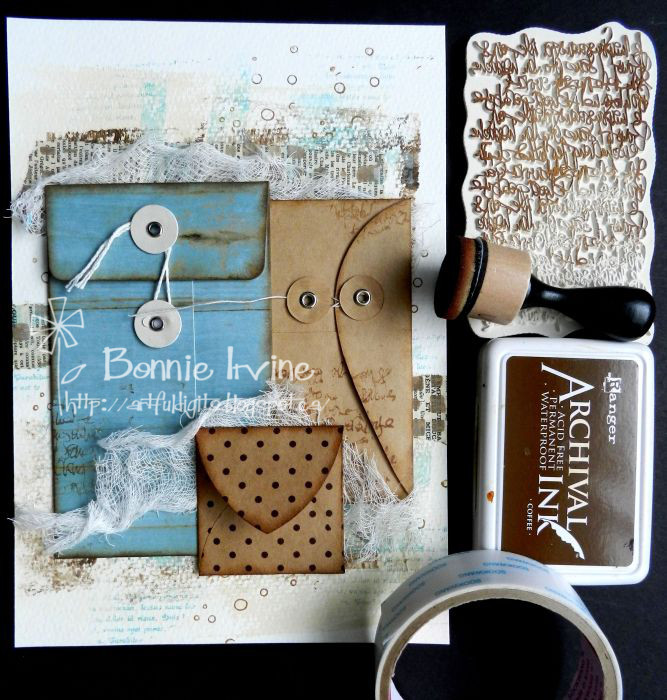
Three envelopes which have been in my stash for years finally made their debut. First the two plain ones were stamped with Carabelle Studio Handwritten in Pen Background stamp and all edges of the three were inked with the same Coffee Archival Ink using a Mini Ink Blender tool. Then two lengths of cheesecloth were added with Scor Tape, one behind the top two envelopes slightly covering the text paper, and one between the smallest envelope and the other two.
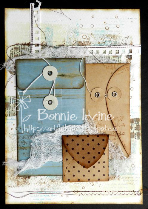
When the watercolour paper was torn from the pad, the top section with the holes was cut off. I hang onto this because I often use it on my pages. I took the background and this strip up to my sewing machine and did a little messy stitching on the page itself at the bottom and also on the strip which I later cut up and adhered to the top of the page.
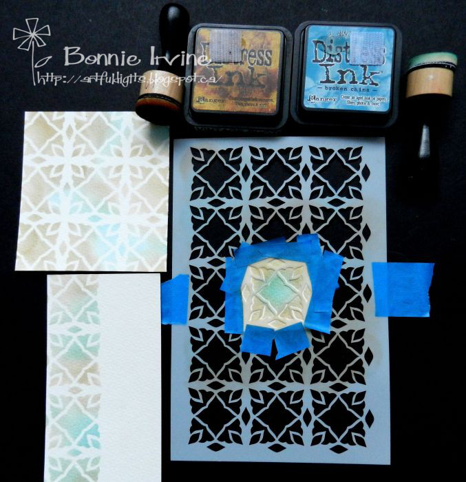
Three inserts for the envelopes were cut from the left over watercolour paper. They were then stencilled using Joggles/Margaret Applin Designs Global #3 stencil with Broken China and Vintage Photo Distress Inks.
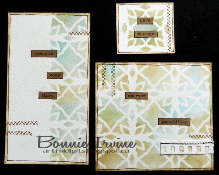
Idea-ology ChitChat Stickers, a little penwork, and some stamping plus a tiny scrap of the sewn strip of watercolour paper and I called them done. I can write on the backs of them if I want later.
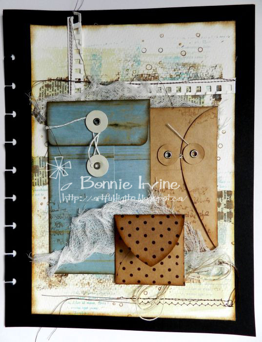
The final detail was to gather some thin twine into a bow and tuck it under the bottom corner of the smallest envelope. The page was then mounted onto my black base (the only black I used for the whole piece by the way!!) and inserted into my art journal. Now it’s your turn to play with a subtle colour palette. I can’t wait to see what you create!
4 Comments
This is lovely – the colours are very restful. Love all that gorgeous texture!
I love painted papers and envelopes! So much fun!
I’ve always had a soft spot for this colour combo, and although I tend towards the brighter clashing tones myself, I have been known to use it on occasion. I love the depth of layering on this deceptively ‘simple’ layout, so much that would go unnoticed at first glance! I also am happy that you found a home for some long term stash items (always a bonus!!) I am playing catch-up and need to do last week’s page too, having worked extra shifts last week!! Thanks for the inspiration xx
Looks like those envelopes were just waiting for this page!