Hi everyone. It’s Bonnie here today subbing for Barb this week. She has a bajillion things on her plate right now and I jumped at the chance to play in her place.
I don’t know about you but sometimes I move away from a technique I really like just to change things up but then forget to return to it. I was thinking about that the other day and realized that I hadn’t done any Resist work in a long time and while I’ve often used Distress inks I don’t know that I had ever done it using spray inks. Aha! I felt an experiment calling me 🙂

I started by layering Joggles/ Margaret Applin Designs Global #1 stencil over each side of my ungessoed journal page and stamping direct to paper through the openings with Versamark Ink. I chose this stencil because I wanted fairly large openings since I wasn’t using an applicator tool. Then I sprinkled the wet Versamark Ink with clear embossing powder and set it with my heat tool. I was happy that the stamping/embossing was imperfect since that’s the look I was going for.
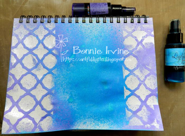
I spritzed Lindy’s Stamp Gang Delphinium Turquoise Starburst Spray mostly in the unembossed center panel and then used Lindy’s French Lilac Violet Starburst Spray on the sides. I did go back and lightly spray the Turquoise on the sides and the Purple in the center to blend the colours a bit. Then I took a paper towel and wiped the spray off the embossed areas. I didn’t use a baby wipe because that would have removed all of the spray from the shiny bits. I liked the texture of the speckled parts.

I wanted to connect the two sides with the same stencilling but didn’t want it to be solid so I hit random areas with Forget-Me-Not Archival Ink and then deepened parts with Deep Purple Archival Ink. Now the two sides were connected. I used the same Deep Purple Archival Ink to add a little texture using KaiserCraft Texture Stamp – Checker Plate.
I fussy cut one of the birds from Joggles Watercolor Blue Titmouse and Bluebird Collage Sheet and matted him with black card stock to help him contrast with the background. Since he needed somewhere to stand, I drew a branch onto brown card stock, shaded the edges with Coffee Archival Ink, and then Faber Castell Pitt Black Big Brush Pen. Grain lines were added with a fine tip black Pitt Artist Pen.
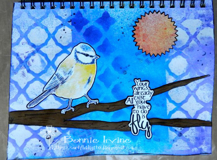
Everything was glued down including a TLC sentiment and a previously coloured Large Starburst Sticky Snippet for the sun. I went back to the wee bird and added a little more of the orange colour from the Sticky Snippet to the bird using a Faber Castell Tangerine Gelato and a water brush. Then I added a little more colour to the bird’s other feathers with Cotton Candy and Blueberry Gelato, partly to pull out the background colours and partly to ramp up the colour intensity of the bird to match that of the Lindy’s Starburst sprays. I also added some black lines to the bird to give him more contrast.
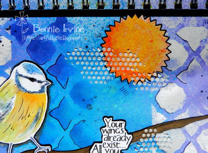
The page still wasn’t doing it for me. It needed more texture, more white, and definitely a pop of black. I added the texture and white with Ranger Texture Paste through one of the Joggles Punchinella Quintet – Minis Stencil designs.
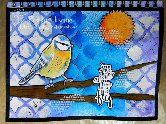
The pops of black I got by outlining some of the embossed stencil design and the tree branch with black Pitt pen, stamping Joggles Background Noise – Dots Cling Mounted Rubber Stamp with Jet Black Archival Ink, as well as adhering 1/4 inch strips of card stock around the edges to provide a frame.
Phew! Finally satisfied 🙂 Thanks for hanging out with me today.
2 Comments
I think this is fabulous! Love the colours you’ve used in the background and the texture too!
Thanks so much, Deborah! I really appreciate your feedback. There’s something about turquoise and purple together that so appeals to me, For the longest time I never used purple. Now I wonder why that was 🙂