Because I have so much to do it’s always a good thing when I can combine two “must dos” in one creative session. Today’s page spread came about as I was filming a video about the new colors of Dylusions Paint. With the line now complete with 24 colors I wanted to display them all, plus think about combinations that looked and worked well together.
Color theory is a huge topic and in no way is this spread meant to do anything more than display some of the very basics. If you’re curious, Google ‘basic color theory’ or ‘basic color schemes’ – without the single quotes – and you’ll discover a wealth of information.
The photos are pretty self-explanatory and you can duplicate what you see on the pages with any line of paint. Just pick colors that mimic the progression and combinations and you’ll get the idea of analogous, monochromatic, and complementary color combos.
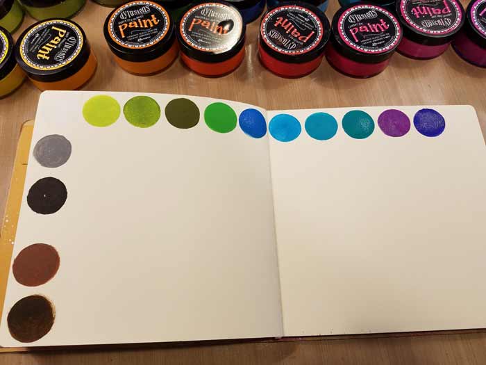
On the left are the colors I’ve designated as neutrals. Technically speaking I don’t think the two browns are, but I needed a way to separate them from the warm and cool colors, so I aligned them on the left side with white, grey, and black.
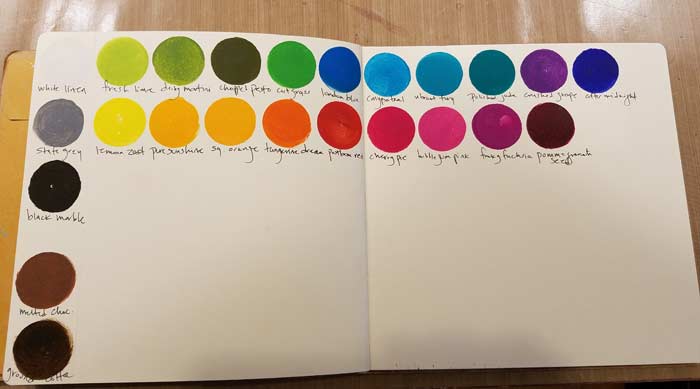
Here I’ve added in the warm colors and labeled everything.
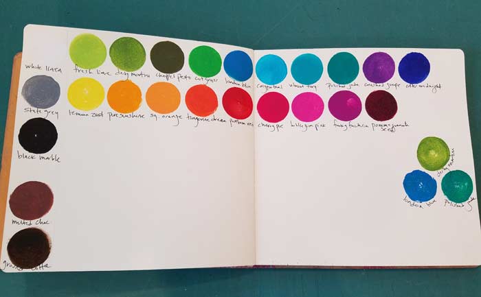
The first analogous triad. With analogous colors you’ll never make a brown, muddy mess when you mix them.

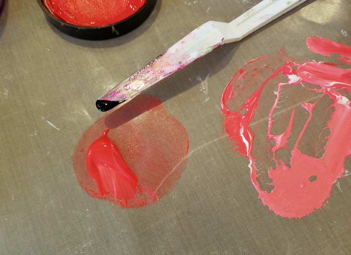
Mixing for the monochromatic scheme. Postbox Red with white.
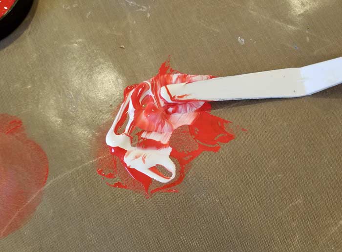
Adding more white. As you’ll see, the first tint I mixed is not all that different than the color straight from the jar.
Getting there.

Adding black to a color creates a shade. Adding grey makes a tone, though I did not mix any for this page.
White + color = tint. Black + color = shade. Grey + color = tone.
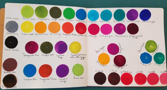
Bottom right is the monochromatic color scheme. The first tint isn’t very different, but you can see the progression. Each one to the right represents another addition of white. Same thing with the shades on the left side of the plain Postbox Red dot. I ran out of room so there are only 2 shades, but you get the idea.
The left side of the spread represents two “more or less” complementary color schemes. Mix them and you’re gonna make a mess. Use them together and you get zippy, colors that pop. A lot!
Comment
I know I will refer back to this when I am doing swatches. Thank you for educating what is a tint, a shade and a tone.